
Write an addon
Storybook addons are a powerful way to extend Storybook's functionality and customize the development experience. They can be used to add new features, customize the UI, or integrate with third-party tools.
What are we going to build?
This reference guide is to help you develop a mental model for how Storybook addons work by building a simple addon based on the popular Outline addon (which is the historical basis for the built-in outline feature). Throughout this guide, you'll learn how addons are structured, Storybook's APIs, how to test your addon locally, and how to publish it.

Addon anatomy
There are two main categories of addons, each with its role:
- UI-based: These addons are responsible for customizing the interface, enabling shortcuts for common tasks, or displaying additional information in the UI.
- Presets: These are pre-configured settings or configurations that enable developers to quickly set up and customize their environment with a specific set of features, functionality, or technology.
UI-based addons
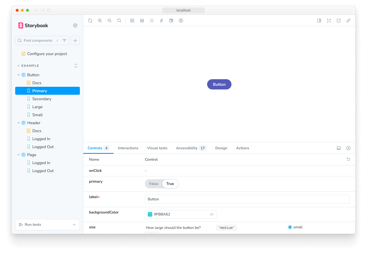
The addon built in this guide is a UI-based addon, specifically a toolbar addon, enabling users to draw outlines around each element in the story through a shortcut or click of a button. UI addons can create other types of UI elements, each with its function: panels and tabs, providing users with various ways to interact with the UI.
import React, { memo, useCallback, useEffect } from 'react';

import { useGlobals, useStorybookApi } from 'storybook/manager-api';
import { ToggleButton } from 'storybook/internal/components';
import { LightningIcon } from '@storybook/icons';

import { ADDON_ID, PARAM_KEY, TOOL_ID } from './constants';

export const Tool = memo(function MyAddonSelector() {
  const [globals, updateGlobals] = useGlobals();
  const api = useStorybookApi();

  const isActive = [true, 'true'].includes(globals[PARAM_KEY]);

  const toggleMyTool = useCallback(() => {
    updateGlobals({
      [PARAM_KEY]: !isActive,
    });
  }, [isActive]);

  useEffect(() => {
    api.setAddonShortcut(ADDON_ID, {
      label: 'Toggle Outline',
      defaultShortcut: ['alt', 'O'],
      actionName: 'outline',
      showInMenu: false,
      action: toggleMyTool,
    });
  }, [toggleMyTool, api]);

  return (
    <ToggleButton
      padding="small"
      variant="ghost"
      key={TOOL_ID}
      pressed={isActive}
      ariaLabel="Addon feature"
      tooltip="Toggle addon feature"
      onClick={toggleMyTool}
    >
      <LightningIcon />
    </ToggleButton>
  );
});Addons with a UI must use the same React version as Storybook. If your component library uses a different React version, you must use addons that are built and published as standalone packages. We'll cover how to do this with the Addon Kit.
Setup
To create your first addon, you're going to use the Addon Kit, a ready-to-use template featuring all the required building blocks, dependencies and configurations to help you get started building your addon. In the Addon Kit repository, click the Use this template button to create a new repository based on the Addon Kit's code.
Clone the repository you just created and install its dependencies. When the installation process finishes, you will be prompted with questions to configure your addon. Answer them, and when you're ready to start building your addon, run the following command to start Storybook in development mode and develop your addon in watch mode:
npm run startThe Addon Kit uses Typescript by default. If you want to use
JavaScript instead, you can run the eject-ts command to convert the project to JavaScript.
Understanding the build system
Addons built in the Storybook ecosystem rely on tsup, a fast, zero-config bundler powered by esbuild to transpile your addon's code into modern JavaScript that can run in the browser. Out of the box, the Addon Kit comes with a pre-configured tsup configuration file that you can use to customize the build process of your addon.
When the build scripts run, it will look for the configuration file and pre-bundle the addon's code based on the configuration provided. Addons can interact with Storybook in various ways. They can define presets to modify the configuration, add behavior to the manager UI, or add behavior to the preview iframe. These different use cases require different bundle outputs because they target different runtimes and environments. Presets are executed in a Node environment. Storybook's manager and preview environments provide certain packages in the global scope, so addons don't need to bundle them or include them as dependencies in their package.json file.
The tsup configuration handles these complexities by default, but you can customize it according to their requirements. For a detailed explanation of the bundling techniques used, please refer to the README of the addon-kit, and check out the default tsup configuration here.
Register the addon
By default, code for the UI-based addons is located in one of the following files, depending on the type of addon built: src/Tool.tsx, src/Panel.tsx, or src/Tab.tsx. Since we're building a toolbar addon, we can safely remove the Panel and Tab files and update the remaining file to the following:
import React, { memo, useCallback, useEffect } from 'react';

import { useGlobals, useStorybookApi } from 'storybook/manager-api';
import { ToggleButton } from 'storybook/internal/components';
import { LightningIcon } from '@storybook/icons';

import { ADDON_ID, PARAM_KEY, TOOL_ID } from './constants';

export const Tool = memo(function MyAddonSelector() {
  const [globals, updateGlobals] = useGlobals();
  const api = useStorybookApi();

  const isActive = [true, 'true'].includes(globals[PARAM_KEY]);

  const toggleMyTool = useCallback(() => {
    updateGlobals({
      [PARAM_KEY]: !isActive,
    });
  }, [isActive]);

  useEffect(() => {
    api.setAddonShortcut(ADDON_ID, {
      label: 'Toggle Addon [8]',
      defaultShortcut: ['8'],
      actionName: 'myaddon',
      showInMenu: false,
      action: toggleMyTool,
    });
  }, [toggleMyTool, api]);

  return (
    <ToggleButton
      padding="small"
      variant="ghost"
      key={TOOL_ID}
      pressed={isActive}
      ariaLabel="Addon feature"
      tooltip="Toggle addon feature"
      onClick={toggleMyTool}
    >
      <LightningIcon />
    </ToggleButton>
  );
});
Going through the code blocks in sequence:
import { useGlobals, useStorybookApi } from 'storybook/manager-api';
import { Button } from 'storybook/internal/components';
import { LightningIcon } from '@storybook/icons';
The useGlobals and useStorybookApi hooks from the manager-api package are used to access the Storybook's APIs, allowing users to interact with the addon, such as enabling or disabling it.
The Button component from the storybook/internal/components module can be used to render the buttons in the toolbar. The @storybook/icons package provides a large set of appropriately sized and styled icons to choose from.
export const Tool = memo(function MyAddonSelector() {
  const [globals, updateGlobals] = useGlobals();
  const api = useStorybookApi();

  const isActive = [true, 'true'].includes(globals[PARAM_KEY]);

  const toggleMyTool = useCallback(() => {
    updateGlobals({
      [PARAM_KEY]: !isActive,
    });
  }, [isActive]);

  useEffect(() => {
    api.setAddonShortcut(ADDON_ID, {
      label: 'Toggle Addon [8]',
      defaultShortcut: ['8'],
      actionName: 'myaddon',
      showInMenu: false,
      action: toggleMyTool,
    });
  }, [toggleMyTool, api]);

  return (
    <Button
      padding="small"
      variant="ghost"
      key={TOOL_ID}
      active={isActive}
      ariaLabel="Enable my addon"
      onClick={toggleMyTool}
    >
      <LightningIcon />
    </Button>
  );
});
The Tool component is the entry point of the addon. It renders the UI elements in the toolbar, registers a keyboard shortcut, and handles the logic to enable and disable the addon.
Moving onto the manager, here we register the addon with Storybook using a unique name and identifier. Since we've removed the Panel and Tab files, we'll need to adjust the file to only reference the addon we're building.
import { addons, types } from 'storybook/manager-api';
import { ADDON_ID, TOOL_ID } from './constants';
import { Tool } from './Tool';

// Register the addon
addons.register(ADDON_ID, () => {
  // Register the tool
  addons.add(TOOL_ID, {
    type: types.TOOL,
    title: 'My addon',
    match: ({ tabId, viewMode }) => !tabId && viewMode === 'story',
    render: Tool,
  });
});
Conditionally render the addon
Notice the match property. It allows you to control the view mode (story or docs) and tab (the story canvas or custom tabs) where the toolbar addon is visible. For example:
({ tabId }) => tabId === 'my-addon/tab'will show your addon when viewing the tab with the IDmy-addon/tab.({ viewMode }) => viewMode === 'story'will show your addon when viewing a story in the canvas.({ viewMode }) => viewMode === 'docs'will show your addon when viewing the documentation for a component.({ tabId, viewMode }) => !tabId && viewMode === 'story'will show your addon when viewing a story in the canvas and not in a custom tab (i.e. whentabId === undefined).
Run the start script to build and start Storybook and verify that the addon is registered correctly and showing in the UI.
Style the addon
In Storybook, applying styles for addons is considered a side-effect. Therefore, we'll need to make some changes to our addon to allow it to use the styles when it is active and remove them when it's disabled. We're going to rely on two of Storybook's features to handle this: decorators and globals. To handle the CSS logic, we must include some helper functions to inject and remove the stylesheets from the DOM. Start by creating the helper file with the following content:
import { global } from '@storybook/global';

export const clearStyles = (selector: string | string[]) => {
  const selectors = Array.isArray(selector) ? selector : [selector];
  selectors.forEach(clearStyle);
};

const clearStyle = (input: string | string[]) => {
  const selector = typeof input === 'string' ? input : input.join('');
  const element = global.document.getElementById(selector);
  if (element && element.parentElement) {
    element.parentElement.removeChild(element);
  }
};

export const addOutlineStyles = (selector: string, css: string) => {
  const existingStyle = global.document.getElementById(selector);
  if (existingStyle) {
    if (existingStyle.innerHTML !== css) {
      existingStyle.innerHTML = css;
    }
  } else {
    const style = global.document.createElement('style');
    style.setAttribute('id', selector);
    style.innerHTML = css;
    global.document.head.appendChild(style);
  }
};
Next, create the file with the styles we want to inject with the following content:
import { dedent } from 'ts-dedent';

export default function outlineCSS(selector: string) {
  return dedent /* css */ `
    ${selector} body {
      outline: 1px solid #2980b9 !important;
    }

    ${selector} article {
      outline: 1px solid #3498db !important;
    }

    ${selector} nav {
      outline: 1px solid #0088c3 !important;
    }

    ${selector} aside {
      outline: 1px solid #33a0ce !important;
    }

    ${selector} section {
      outline: 1px solid #66b8da !important;
    }

    ${selector} header {
      outline: 1px solid #99cfe7 !important;
    }

    ${selector} footer {
      outline: 1px solid #cce7f3 !important;
    }

    ${selector} h1 {
      outline: 1px solid #162544 !important;
    }

    ${selector} h2 {
      outline: 1px solid #314e6e !important;
    }

    ${selector} h3 {
      outline: 1px solid #3e5e85 !important;
    }

    ${selector} h4 {
      outline: 1px solid #449baf !important;
    }

    ${selector} h5 {
      outline: 1px solid #c7d1cb !important;
    }

    ${selector} h6 {
      outline: 1px solid #4371d0 !important;
    }

    ${selector} main {
      outline: 1px solid #2f4f90 !important;
    }

    ${selector} address {
      outline: 1px solid #1a2c51 !important;
    }

    ${selector} div {
      outline: 1px solid #036cdb !important;
    }

    ${selector} p {
      outline: 1px solid #ac050b !important;
    }

    ${selector} hr {
      outline: 1px solid #ff063f !important;
    }

    ${selector} pre {
      outline: 1px solid #850440 !important;
    }

    ${selector} blockquote {
      outline: 1px solid #f1b8e7 !important;
    }

    ${selector} ol {
      outline: 1px solid #ff050c !important;
    }

    ${selector} ul {
      outline: 1px solid #d90416 !important;
    }

    ${selector} li {
      outline: 1px solid #d90416 !important;
    }

    ${selector} dl {
      outline: 1px solid #fd3427 !important;
    }

    ${selector} dt {
      outline: 1px solid #ff0043 !important;
    }

    ${selector} dd {
      outline: 1px solid #e80174 !important;
    }

    ${selector} figure {
      outline: 1px solid #ff00bb !important;
    }

    ${selector} figcaption {
      outline: 1px solid #bf0032 !important;
    }

    ${selector} table {
      outline: 1px solid #00cc99 !important;
    }

    ${selector} caption {
      outline: 1px solid #37ffc4 !important;
    }

    ${selector} thead {
      outline: 1px solid #98daca !important;
    }

    ${selector} tbody {
      outline: 1px solid #64a7a0 !important;
    }

    ${selector} tfoot {
      outline: 1px solid #22746b !important;
    }

    ${selector} tr {
      outline: 1px solid #86c0b2 !important;
    }

    ${selector} th {
      outline: 1px solid #a1e7d6 !important;
    }

    ${selector} td {
      outline: 1px solid #3f5a54 !important;
    }

    ${selector} col {
      outline: 1px solid #6c9a8f !important;
    }

    ${selector} colgroup {
      outline: 1px solid #6c9a9d !important;
    }

    ${selector} button {
      outline: 1px solid #da8301 !important;
    }

    ${selector} datalist {
      outline: 1px solid #c06000 !important;
    }

    ${selector} fieldset {
      outline: 1px solid #d95100 !important;
    }

    ${selector} form {
      outline: 1px solid #d23600 !important;
    }

    ${selector} input {
      outline: 1px solid #fca600 !important;
    }

    ${selector} keygen {
      outline: 1px solid #b31e00 !important;
    }

    ${selector} label {
      outline: 1px solid #ee8900 !important;
    }

    ${selector} legend {
      outline: 1px solid #de6d00 !important;
    }

    ${selector} meter {
      outline: 1px solid #e8630c !important;
    }

    ${selector} optgroup {
      outline: 1px solid #b33600 !important;
    }

    ${selector} option {
      outline: 1px solid #ff8a00 !important;
    }

    ${selector} output {
      outline: 1px solid #ff9619 !important;
    }

    ${selector} progress {
      outline: 1px solid #e57c00 !important;
    }

    ${selector} select {
      outline: 1px solid #e26e0f !important;
    }

    ${selector} textarea {
      outline: 1px solid #cc5400 !important;
    }

    ${selector} details {
      outline: 1px solid #33848f !important;
    }

    ${selector} summary {
      outline: 1px solid #60a1a6 !important;
    }

    ${selector} command {
      outline: 1px solid #438da1 !important;
    }

    ${selector} menu {
      outline: 1px solid #449da6 !important;
    }

    ${selector} del {
      outline: 1px solid #bf0000 !important;
    }

    ${selector} ins {
      outline: 1px solid #400000 !important;
    }

    ${selector} img {
      outline: 1px solid #22746b !important;
    }

    ${selector} iframe {
      outline: 1px solid #64a7a0 !important;
    }

    ${selector} embed {
      outline: 1px solid #98daca !important;
    }

    ${selector} object {
      outline: 1px solid #00cc99 !important;
    }

    ${selector} param {
      outline: 1px solid #37ffc4 !important;
    }

    ${selector} video {
      outline: 1px solid #6ee866 !important;
    }

    ${selector} audio {
      outline: 1px solid #027353 !important;
    }

    ${selector} source {
      outline: 1px solid #012426 !important;
    }

    ${selector} canvas {
      outline: 1px solid #a2f570 !important;
    }

    ${selector} track {
      outline: 1px solid #59a600 !important;
    }

    ${selector} map {
      outline: 1px solid #7be500 !important;
    }

    ${selector} area {
      outline: 1px solid #305900 !important;
    }

    ${selector} a {
      outline: 1px solid #ff62ab !important;
    }

    ${selector} em {
      outline: 1px solid #800b41 !important;
    }

    ${selector} strong {
      outline: 1px solid #ff1583 !important;
    }

    ${selector} i {
      outline: 1px solid #803156 !important;
    }

    ${selector} b {
      outline: 1px solid #cc1169 !important;
    }

    ${selector} u {
      outline: 1px solid #ff0430 !important;
    }

    ${selector} s {
      outline: 1px solid #f805e3 !important;
    }

    ${selector} small {
      outline: 1px solid #d107b2 !important;
    }

    ${selector} abbr {
      outline: 1px solid #4a0263 !important;
    }

    ${selector} q {
      outline: 1px solid #240018 !important;
    }

    ${selector} cite {
      outline: 1px solid #64003c !important;
    }

    ${selector} dfn {
      outline: 1px solid #b4005a !important;
    }

    ${selector} sub {
      outline: 1px solid #dba0c8 !important;
    }

    ${selector} sup {
      outline: 1px solid #cc0256 !important;
    }

    ${selector} time {
      outline: 1px solid #d6606d !important;
    }

    ${selector} code {
      outline: 1px solid #e04251 !important;
    }

    ${selector} kbd {
      outline: 1px solid #5e001f !important;
    }

    ${selector} samp {
      outline: 1px solid #9c0033 !important;
    }

    ${selector} var {
      outline: 1px solid #d90047 !important;
    }

    ${selector} mark {
      outline: 1px solid #ff0053 !important;
    }

    ${selector} bdi {
      outline: 1px solid #bf3668 !important;
    }

    ${selector} bdo {
      outline: 1px solid #6f1400 !important;
    }

    ${selector} ruby {
      outline: 1px solid #ff7b93 !important;
    }

    ${selector} rt {
      outline: 1px solid #ff2f54 !important;
    }

    ${selector} rp {
      outline: 1px solid #803e49 !important;
    }

    ${selector} span {
      outline: 1px solid #cc2643 !important;
    }

    ${selector} br {
      outline: 1px solid #db687d !important;
    }

    ${selector} wbr {
      outline: 1px solid #db175b !important;
    }`;
}
Since the addon can be active in both the story and documentation modes, the DOM node for Storybook's preview iframe is different in these two modes. In fact, Storybook renders multiple story previews on one page when in documentation mode. Therefore, we'll need to choose the correct selector for the DOM node where the styles will be injected and ensure the CSS is scoped to that particular selector. That mechanism is provided as an example within the src/withGlobals.ts file, which we'll use to connect the styling and helper functions to the addon logic. Update the file to the following:
import type {
  Renderer,
  PartialStoryFn as StoryFunction,
  StoryContext,
} from 'storybook/internal/types';

import { useEffect, useMemo, useGlobals } from 'storybook/preview-api';
import { PARAM_KEY } from './constants';

import { clearStyles, addOutlineStyles } from './helpers';

import outlineCSS from './outlineCSS';

export const withGlobals = (StoryFn: StoryFunction<Renderer>, context: StoryContext<Renderer>) => {
  const [globals] = useGlobals();

  const isActive = [true, 'true'].includes(globals[PARAM_KEY]);

  // Is the addon being used in the docs panel
  const isInDocs = context.viewMode === 'docs';

  const outlineStyles = useMemo(() => {
    const selector = isInDocs
      ? `#anchor--${context.id} .docs-story, #anchor--primary--${context.id} .docs-story`
      : '.sb-show-main';

    return outlineCSS(selector);
  }, [context.id]);
  useEffect(() => {
    const selectorId = isInDocs ? `my-addon-docs-${context.id}` : `my-addon`;

    if (!isActive) {
      clearStyles(selectorId);
      return;
    }

    addOutlineStyles(selectorId, outlineStyles);

    return () => {
      clearStyles(selectorId);
    };
  }, [isActive, outlineStyles, context.id]);

  return StoryFn();
};
Packaging and publishing
Storybook addons, similar to most packages in the JavaScript ecosystem, are distributed as NPM packages. However, they have specific criteria that need to be met to be published to NPM and crawled by the integration catalog:
- Have a
distfolder with the transpiled code. - A
package.jsonfile declaring:- Module-related information
- Integration catalog metadata
Module Metadata
The first category of metadata is related to the addon itself. This includes the entry for the module, which files to include when the addon is published. And the required configuration to integrate the addon with Storybook, allowing it to be used by its consumers.
{
  "exports": {
    ".": {
      "types": "./dist/index.d.ts",
      "node": "./dist/index.js",
      "require": "./dist/index.js",
      "import": "./dist/index.mjs"
    },
    "./manager": "./dist/manager.mjs",
    "./preview": "./dist/preview.mjs",
    "./package.json": "./package.json"
  },
  "main": "dist/index.js",
  "module": "dist/index.mjs",
  "types": "dist/index.d.ts",
  "files": ["dist/**/*", "README.md", "*.js", "*.d.ts"],
  "devDependencies": {
    "@storybook/addon-docs": "^9.0.0",
    "storybook": "^9.0.0"
  },
  "bundler": {
    "exportEntries": ["src/index.ts"],
    "managerEntries": ["src/manager.ts"],
    "previewEntries": ["src/preview.ts"]
  }
}
Integration Catalog Metadata
The second metadata category is related to the integration catalog. Most of this information is already pre-configured by the Addon Kit. However, items like the display name, icon, and frameworks must be configured via the storybook property to be displayed in the catalog.
{
  "name": "my-storybook-addon",
  "version": "1.0.0",
  "description": "My first storybook addon",
  "author": "Your Name",
  "storybook": {
    "displayName": "My Storybook Addon",
    "unsupportedFrameworks": ["react-native"],
    "icon": "https://yoursite.com/link-to-your-icon.png"
  },
  "keywords": ["storybook-addon", "appearance", "style", "css", "layout", "debug"]
}The storybook configuration element includes additional properties that help customize the
addon's searchability and indexing. For more information, see the Integration catalog
documentation.
One essential item to note is the keywords property as it maps to the catalog's tag system. Adding the storybook-addon keyword ensures that the addon is discoverable in the catalog when searching for addons. The remaining keywords help with the searchability and categorization of the addon.
Publishing to NPM
Once you're ready to publish your addon to NPM, the Addon Kit comes pre-configured with the Auto package for release management. It generates a changelog and uploads the package to NPM and GitHub automatically. Therefore, you need to configure access to both.
- Authenticate using npm adduser
- Generate a access token with both
readandpublishpermissions. - Create a personal access token with
repoandworkflowscoped permissions. - Create a
.envfile in the root of your project and add the following:
GH_TOKEN=value_you_just_got_from_github
NPM_TOKEN=value_you_just_got_from_npm
Next, run the following command to create labels on GitHub. You'll use these labels to categorize changes to the package.
npx auto create-labelsFinally, run the following command to create a release for your addon. This will build and package the addon code, bump the version, push the release into GitHub and npm, and generate a changelog.
npm run releaseCI automation
By default, the Addon Kit comes pre-configured with a GitHub Actions workflow, enabling you to automate the release management process. This ensures that the package is always up to date with the latest changes and that the changelog is updated accordingly. However, you'll need additional configuration to use your NPM and GitHub tokens to publish the package successfully. In your repository, click the Settings tab, then the Secrets and variables dropdown, followed by the Actions item. You should see the following screen:
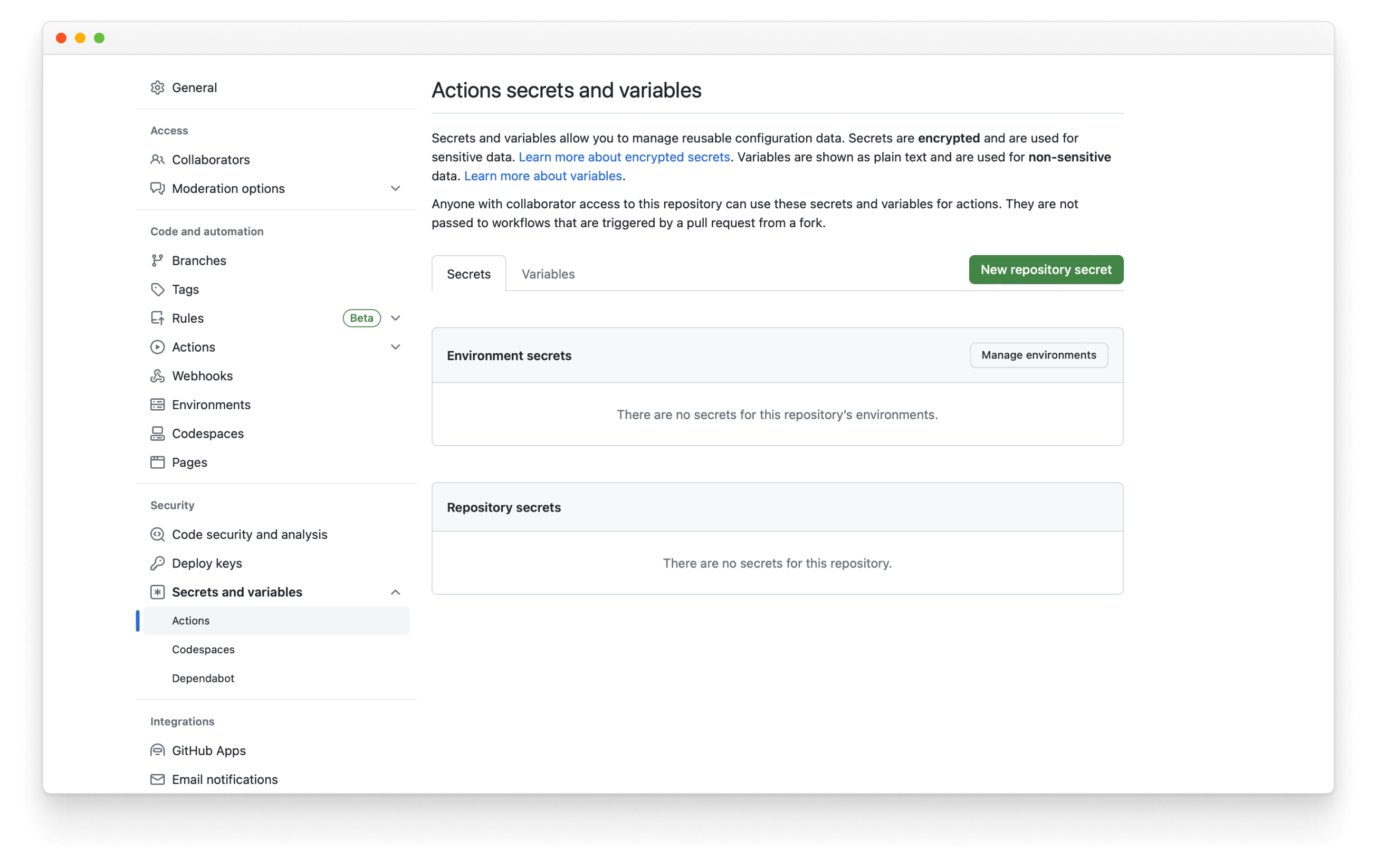
Then, click the New repository secret, name it NPM_TOKEN, and paste the token you generated earlier. Whenever you merge a pull request to the default branch, the workflow will run and publish a new release, automatically incrementing the version number and updating the changelog.
Learn more about the Storybook addon ecosystem
- Types of addons for other types of addons
- Writing addons for the basics of addon development
- Presets for preset development
- Integration catalog for requirements and available recipes
- API reference to learn about the available APIs