
ArgTypes
ArgTypes specify the behavior of args. By specifying the type of an arg, you constrain the values that it can accept and provide information about args that are not explicitly set (i.e., description).
You can also use argTypes to “annotate” args with information used by addons that make use of those args. For instance, to instruct the controls panel to render a color picker, you could specify the 'color' control type.
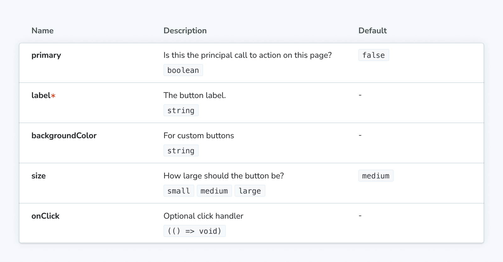
The most concrete realization of argTypes is the ArgTypes doc block (Controls is similar). Each row in the table corresponds to a single argType and the current value of that arg.
Automatic argType inference
If you are using the Storybook docs addon, then Storybook will infer a set of argTypes for each story based on the component specified in the default export of the CSF file.
To do so, Storybook uses various static analysis tools depending on your framework.
| Framework | Static analysis tool |
|---|---|
| React | react-docgen (default) or react-docgen-typescript |
| Vue | vue-docgen-api |
| Angular | compodoc |
| WebComponents | custom-element.json |
| Ember | YUI doc |
The data structure of argTypes is designed to match the output of the these tools. Properties specified manually will override what is inferred.
Manually specifying argTypes
For most Storybook projects, argTypes are automatically inferred from your components. Any argTypes specified manually will override the inferred values.
ArgTypes are most often specified at the meta (component) level, in the default export of the CSF file:
// Replace your-framework with the framework you are using, e.g. react-vite, nextjs, vue3-vite, etc.
import type { Meta } from '@storybook/your-framework';

import { Button } from './Button';

const meta = {
  component: Button,
  argTypes: {
    // 👇 All Button stories expect a label arg
    label: {
      control: 'text',
      description: 'Overwritten description',
    },
  },
} satisfies Meta<typeof Button>;

export default meta;
They can apply to all stories when specified at the project (global) level, in the preview.js|ts configuration file:
// Replace your-framework with the framework you are using, e.g. react-vite, nextjs, vue3-vite, etc.
import type { Preview } from '@storybook/your-framework';

const preview = {
  argTypes: {
    // 👇 All stories expect a label arg
    label: {
      control: 'text',
      description: 'Overwritten description',
    },
  },
} satisfies Preview;

export default preview;
Or they can apply only to a specific story:
// Replace your-framework with the framework you are using, e.g. react-vite, nextjs, vue3-vite, etc.
import type { Meta, StoryObj } from '@storybook/your-framework';

import { Button } from './Button';

const meta = {
  component: Button,
} satisfies Meta<typeof Button>;

export default meta;
type Story = StoryObj<typeof meta>;

export const Basic: Story = {
  argTypes: {
    // 👇 This story expects a label arg
    label: {
      control: 'text',
      description: 'Overwritten description',
    },
  },
} satisfies Story;
argTypes
Type:
{
  [key: string]: {
    control?: ControlType | { type: ControlType; /* See below for more */ } | false;
    description?: string;
    if?: Conditional;
    mapping?: { [key: string]: { [option: string]: any } };
    name?: string;
    options?: string[];
    table?: {
      category?: string;
      defaultValue?: { summary: string; detail?: string };
      disable?: boolean;
      subcategory?: string;
      type?: { summary?: string; detail?: string };
    },
    type?: SBType | SBScalarType['name'];
  }
}
You configure argTypes using an object with keys matching the name of args. The value of each key is an object with the following properties:
control
Type:
| ControlType
| {
    type: ControlType,
    accept?: string;
    labels?: { [option: string]: string };
    max?: number;
    min?: number;
    presetColors?: string[];
    step?: number;
  }
| false
Default:
Specify the behavior of the controls panel for the arg. If you specify a string, it's used as the type of the control. If you specify an object, you can provide additional configuration. Specifying false will prevent the control from rendering.
// Replace your-framework with the framework you are using, e.g. react-vite, nextjs, vue3-vite, etc.
import type { Meta } from '@storybook/your-framework';

import { Example } from './Example';

const meta = {
  component: Example,
  argTypes: {
    value: {
      control: {
        type: 'number',
        min: 0,
        max: 100,
        step: 10,
      },
    },
  },
} satisfies Meta<typeof Example>;

export default meta;
control.type
Type: ControlType | null
Default: Inferred; 'select', if options are specified; falling back to 'object'
Specifies the type of control used to change the arg value with the controls panel. Here are the available types, ControlType, grouped by the type of data they handle:
| Data type | ControlType | Description |
|---|---|---|
| array | 'object' | Provides a JSON-based editor to handle the values of the array. Also allows editing in raw mode.{ control: 'object' } |
| boolean | 'boolean' | Provides a toggle for switching between possible states.{ control: 'boolean' } |
| enum | 'check' | Provides a set of stacked checkboxes for selecting multiple options.{ control: 'check', options: ['email', 'phone', 'mail'] } |
'inline-check' | Provides a set of inlined checkboxes for selecting multiple options.{ control: 'inline-check', options: ['email', 'phone', 'mail'] } | |
'radio' | Provides a set of stacked radio buttons based on the available options.{ control: 'radio', options: ['email', 'phone', 'mail'] } | |
'inline-radio' | Provides a set of inlined radio buttons based on the available options.{ control: 'inline-radio', options: ['email', 'phone', 'mail'] } | |
'select' | Provides a select to choose a single value from the options.{ control: 'select', options: [20, 30, 40, 50] } | |
'multi-select' | Provides a select to choose multiple values from the options.{ control: 'multi-select', options: ['USA', 'Canada', 'Mexico'] } | |
| number | 'number' | Provides a numeric input to include the range of all possible values.{ control: { type: 'number', min:1, max:30, step: 2 } } |
'range' | Provides a range slider to include all possible values.{ control: { type: 'range', min: 1, max: 30, step: 3 } } | |
| object | 'file' | Provides a file input that returns an array of URLs. Can be further customized to accept specific file types.{ control: { type: 'file', accept: '.png' } } |
'object' | Provides a JSON-based editor to handle the object's values. Also allows editing in raw mode.{ control: 'object' } | |
| string | 'color' | Provides a color picker to choose color values. Can be additionally configured to include a set of color presets.{ control: { type: 'color', presetColors: ['red', 'green']} } |
'date' | Provides a datepicker to choose a date.{ control: 'date' } | |
'text' | Provides a freeform text input.{ control: 'text' } |
The date control will convert the date into a UNIX timestamp when the value changes. It's a known limitation that will be fixed in a future release. If you need to represent the actual date, you'll need to update the story's implementation and convert the value into a date object.
control.accept
Type: string
When type is 'file', you can specify the file types that are accepted. The value should be a string of comma-separated MIME types.
control.labels
Type: { [option: string]: string }
Map options to labels. labels doesn't have to be exhaustive. If an option is not in the object's keys, it's used verbatim.
control.max
Type: number
When type is 'number' or 'range', sets the maximum allowed value.
control.min
Type: number
When type is 'number' or 'range', sets the minimum allowed value.
control.presetColors
Type: string[]
When type is 'color', defines the set of colors that are available in addition to the general color picker. The values in the array should be valid CSS color values.
control.step
Type: number
When type is 'number' or 'range', sets the granularity allowed when incrementing/decrementing the value.
description
Type: string
Default: Inferred
Describe the arg. (If you intend to describe the type of the arg, you should use table.type, instead.)
// Replace your-framework with the framework you are using, e.g. react-vite, nextjs, vue3-vite, etc.
import type { Meta } from '@storybook/your-framework';

import { Example } from './Example';

const meta = {
  component: Example,
  argTypes: {
    value: {
      description: 'The value of the slider',
    },
  },
} satisfies Meta<typeof Example>;

export default meta;
if
Type:
{
  [predicateType: 'arg' | 'global']: string;
  eq?: any;
  exists?: boolean;
  neq?: any;
  truthy?: boolean;
}
Conditionally render an argType based on the value of another arg or global.
// Replace your-framework with the framework you are using, e.g. react-vite, nextjs, vue3-vite, etc.
import type { Meta } from '@storybook/your-framework';

import { Example } from './Example';

const meta = {
  component: Example,
  argTypes: {
    parent: { control: 'select', options: ['one', 'two', 'three'] },

    // 👇 Only shown when `parent` arg exists
    parentExists: { if: { arg: 'parent', exists: true } },

    // 👇 Only shown when `parent` arg does not exist
    parentDoesNotExist: { if: { arg: 'parent', exists: false } },

    // 👇 Only shown when `parent` arg value is truthy
    parentIsTruthy: { if: { arg: 'parent' } },
    parentIsTruthyVerbose: { if: { arg: 'parent', truthy: true } },

    // 👇 Only shown when `parent` arg value is not truthy
    parentIsNotTruthy: { if: { arg: 'parent', truthy: false } },

    // 👇 Only shown when `parent` arg value is 'three'
    parentIsEqToValue: { if: { arg: 'parent', eq: 'three' } },

    // 👇 Only shown when `parent` arg value is not 'three'
    parentIsNotEqToValue: { if: { arg: 'parent', neq: 'three' } },

    // Each of the above can also be conditional on the value of a globalType, e.g.:

    // 👇 Only shown when `theme` global exists
    parentExists: { if: { global: 'theme', exists: true } },
  },
} satisfies Meta<typeof Example>;

export default meta;
mapping
Type: { [key: string]: { [option: string]: any } }
Map options to values.
When dealing with non-primitive values, you'll notice that you'll run into some limitations. The most obvious issue is that not every value can be represented as part of the args param in the URL, losing the ability to share and deeplink to such a state. Beyond that, complex values such as JSX cannot be synchronized between the manager (e.g., Controls panel) and the preview (your story).
mapping doesn't have to be exhaustive. If the currently selected option is not listed, it's used verbatim. Can be used with control.labels.
// Replace your-framework with the framework you are using, e.g. react-vite, nextjs, vue3-vite, etc.
import type { Meta } from '@storybook/your-framework';

import { Example } from './Example';

const meta = {
  component: Example,
  argTypes: {
    label: {
      control: { type: 'select' },
      options: ['Normal', 'Bold', 'Italic'],
      mapping: {
        Bold: <b>Bold</b>,
        Italic: <i>Italic</i>,
      },
    },
  },
} satisfies Meta<typeof Example>;

export default meta;
name
Type: string
The argTypes object uses the name of the arg as the key. By default, that key is used when displaying the argType in Storybook. You can override the displayed name by specifying a name property.
// Replace your-framework with the framework you are using, e.g. react-vite, nextjs, vue3-vite, etc.
import type { Meta } from '@storybook/your-framework';

import { Example } from './Example';

const meta = {
  component: Example,
  argTypes: {
    actualArgName: {
      name: 'Friendly name',
    },
  },
} satisfies Meta<typeof Example>;

export default meta;Be careful renaming args in this way. Users of the component you're documenting will not be able to use the documented name as a property of your component and the actual name will not displayed.
For this reason, the name property is best used when defining an argType that is only used for documentation purposes and not an actual property of the component. For example, when providing argTypes for each property of an object.
options
Type: string[]
Default: Inferred
If the arg accepts a finite set of values, you can specify them with options. If those values are complex, like JSX elements, you can use mapping to map them to string values. You can use control.labels to provide custom labels for the options.
// Replace your-framework with the framework you are using, e.g. react-vite, nextjs, vue3-vite, etc.
import type { Meta } from '@storybook/your-framework';

import { Example } from './Example';

const meta = {
  component: Example,
  argTypes: {
    icon: {
      options: ['arrow-up', 'arrow-down', 'loading'],
    },
  },
} satisfies Meta<typeof Example>;

export default meta;
table
Type:
{
  category?: string;
  defaultValue?: {
    detail?: string;
    summary: string;
  };
  disable?: boolean;
  subcategory?: string;
  type?: {
    detail?: string;
    summary: string;
  };
}
Default: Inferred
Specify how the arg is documented in the ArgTypes doc block, Controls doc block, and Controls panel.
// Replace your-framework with the framework you are using, e.g. react-vite, nextjs, vue3-vite, etc.
import type { Meta } from '@storybook/your-framework';

import { Example } from './Example';

const meta = {
  component: Example,
  argTypes: {
    value: {
      table: {
        defaultValue: { summary: 0 },
        type: { summary: 'number' },
      },
    },
  },
} satisfies Meta<typeof Example>;

export default meta;
table.category
Type: string
Default: Inferred, in some frameworks
Display the argType under a category heading, with the label specified by category.
table.defaultValue
Type: { detail?: string; summary: string }
Default: Inferred
The documented default value of the argType. summary is typically used for the value itself, while detail is used for additional information.
table.disable
Type: boolean
Set to true to remove the argType's row from the table.
table.readonly
Type: boolean
Set to true to indicate that the argType is read-only.
table.subcategory
Type: string
Display the argType under a subcategory heading (which displays under the [category] heading), with the label specified by subcategory.
table.type
Type: { detail?: string; summary: string }
Default: Inferred from type
The documented type of the argType. summary is typically used for the type itself, while detail is used for additional information.
If you need to specify the actual, semantic type, you should use type, instead.
type
Type: 'boolean' | 'function' | 'number' | 'string' | 'symbol' | SBType
The full type of SBType is:
SBType
interface SBBaseType {
  required?: boolean;
  raw?: string;
}

type SBScalarType = SBBaseType & {
  name: 'boolean' | 'string' | 'number' | 'function' | 'symbol';
};

type SBArrayType = SBBaseType & {
  name: 'array';
  value: SBType;
};
type SBObjectType = SBBaseType & {
  name: 'object';
  value: Record<string, SBType>;
};
type SBEnumType = SBBaseType & {
  name: 'enum';
  value: (string | number)[];
};
type SBIntersectionType = SBBaseType & {
  name: 'intersection';
  value: SBType[];
};
type SBUnionType = SBBaseType & {
  name: 'union';
  value: SBType[];
};
type SBOtherType = SBBaseType & {
  name: 'other';
  value: string;
};

type SBType =
  | SBScalarType
  | SBEnumType
  | SBArrayType
  | SBObjectType
  | SBIntersectionType
  | SBUnionType
  | SBOtherType;
Default: Inferred
Specifies the semantic type of the argType. When an argType is inferred, the information from the various tools is summarized in this property, which is then used to infer other properties, like control and table.type.
If you only need to specify the documented type, you should use table.type, instead.
// Replace your-framework with the framework you are using, e.g. react-vite, nextjs, vue3-vite, etc.
import type { Meta } from '@storybook/your-framework';

import { Example } from './Example';

const meta = {
  component: Example,
  argTypes: {
    value: { type: 'number' },
  },
} satisfies Meta<typeof Example>;

export default meta;
defaultValue
(⛔️ Deprecated)
Type: any
Define the default value of the argType. Deprecated in favor of defining the arg value directly.
// Replace your-framework with the framework you are using, e.g. react-vite, nextjs, vue3-vite, etc.
import type { Meta } from '@storybook/your-framework';

import { Example } from './Example';

const meta = {
  component: Example,
  argTypes: {
    value: {
      // ❌ Deprecated
      defaultValue: 0,
    },
  },
  // ✅ Do this instead
  args: {
    value: 0,
  },
} satisfies Meta<typeof Example>;

export default meta;