
Doc blocks
Storybook offers several doc blocks to help document your components and other aspects of your project.
There are two common ways to use doc blocks in Storybook, within MDX and as part of the docs page template.
Within MDX
The blocks are most commonly used within Storybook's MDX documentation:
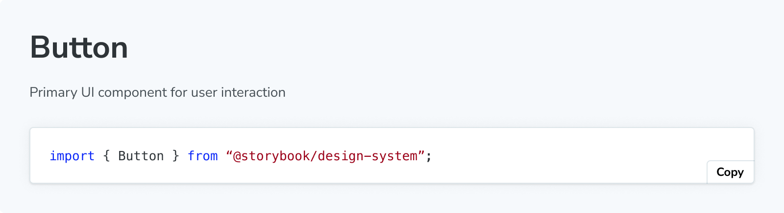
import { Meta, Primary, Controls, Story } from '@storybook/addon-docs/blocks';
import * as ButtonStories from './Button.stories';
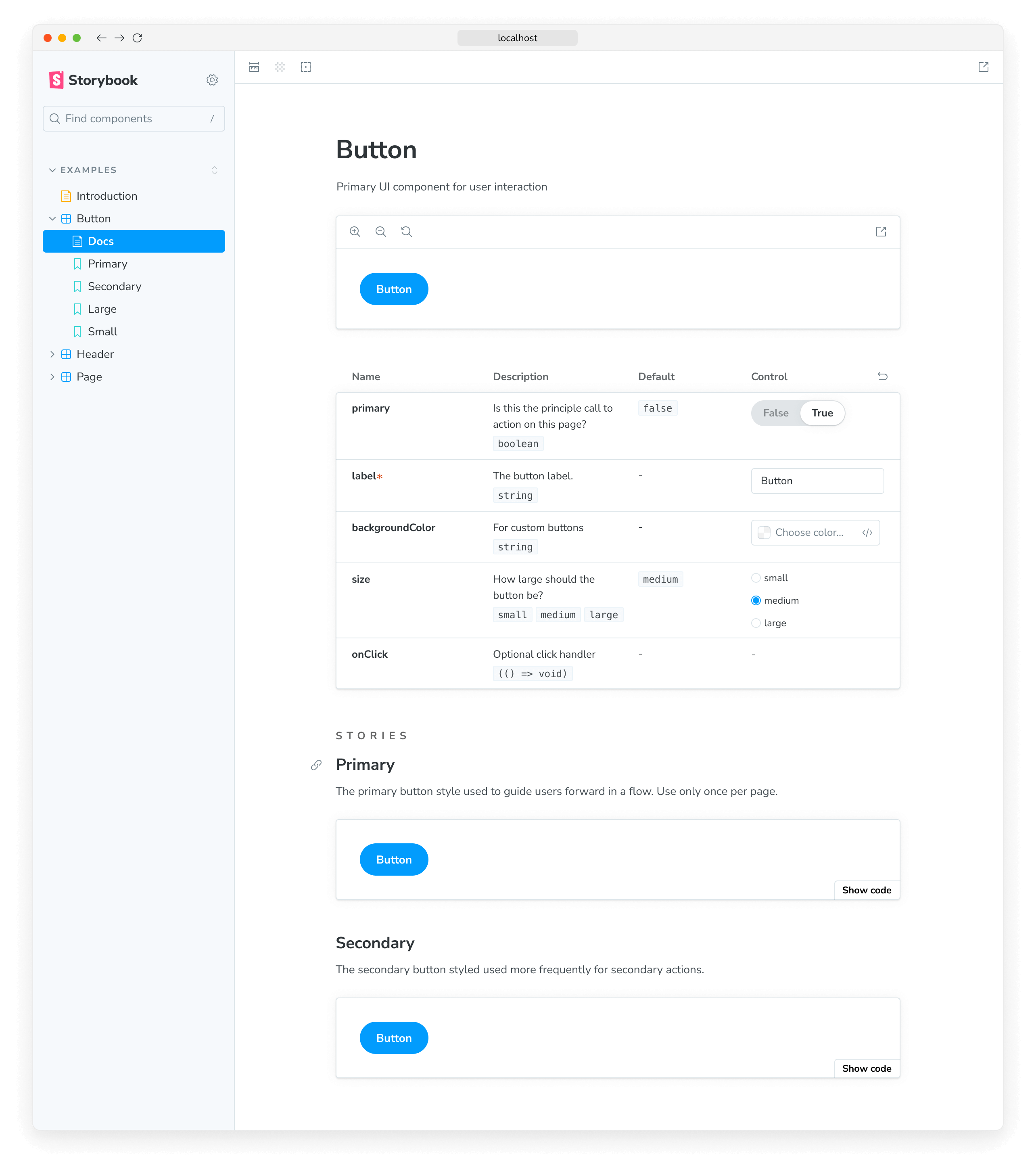
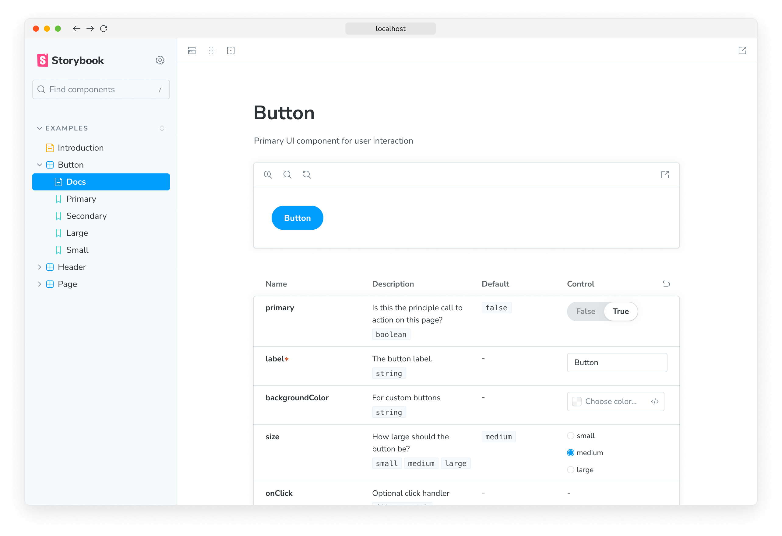
<Meta of={ButtonStories} />
# Button
A button is ...
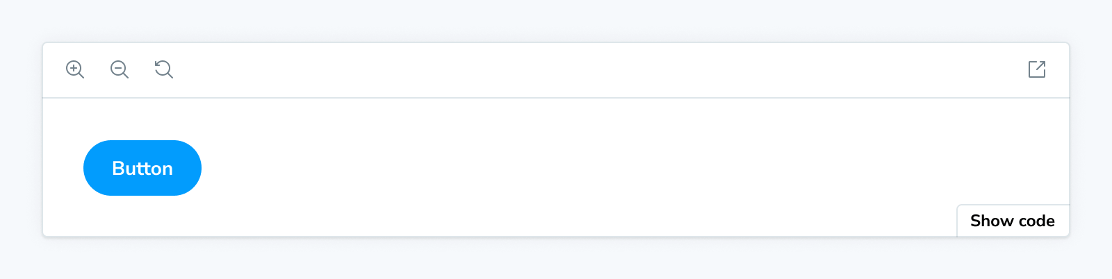
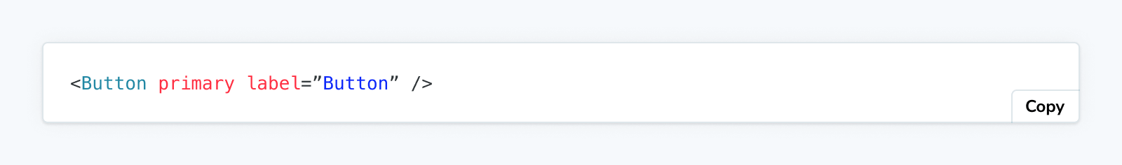
<Primary />
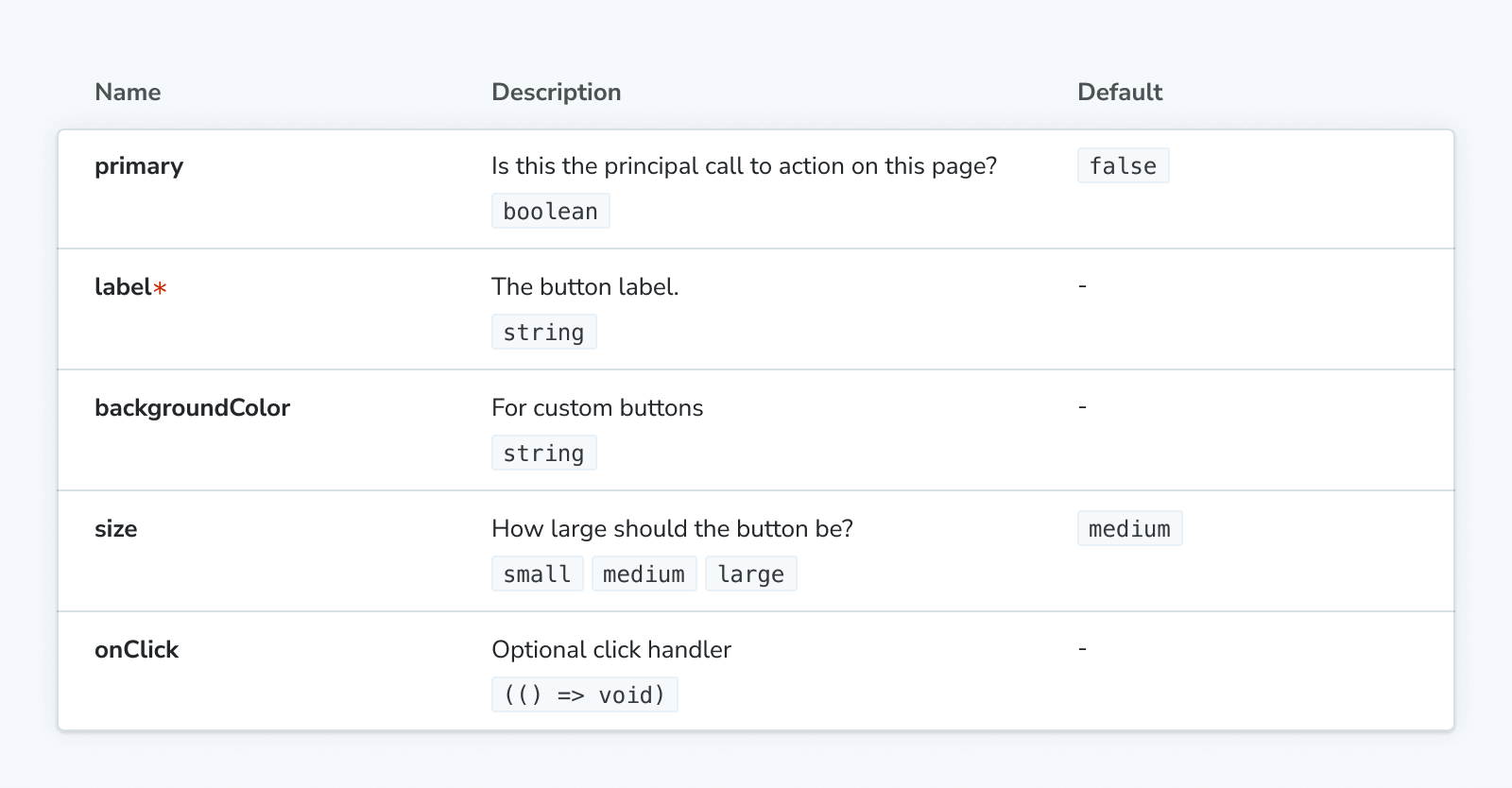
## Props
<Controls />
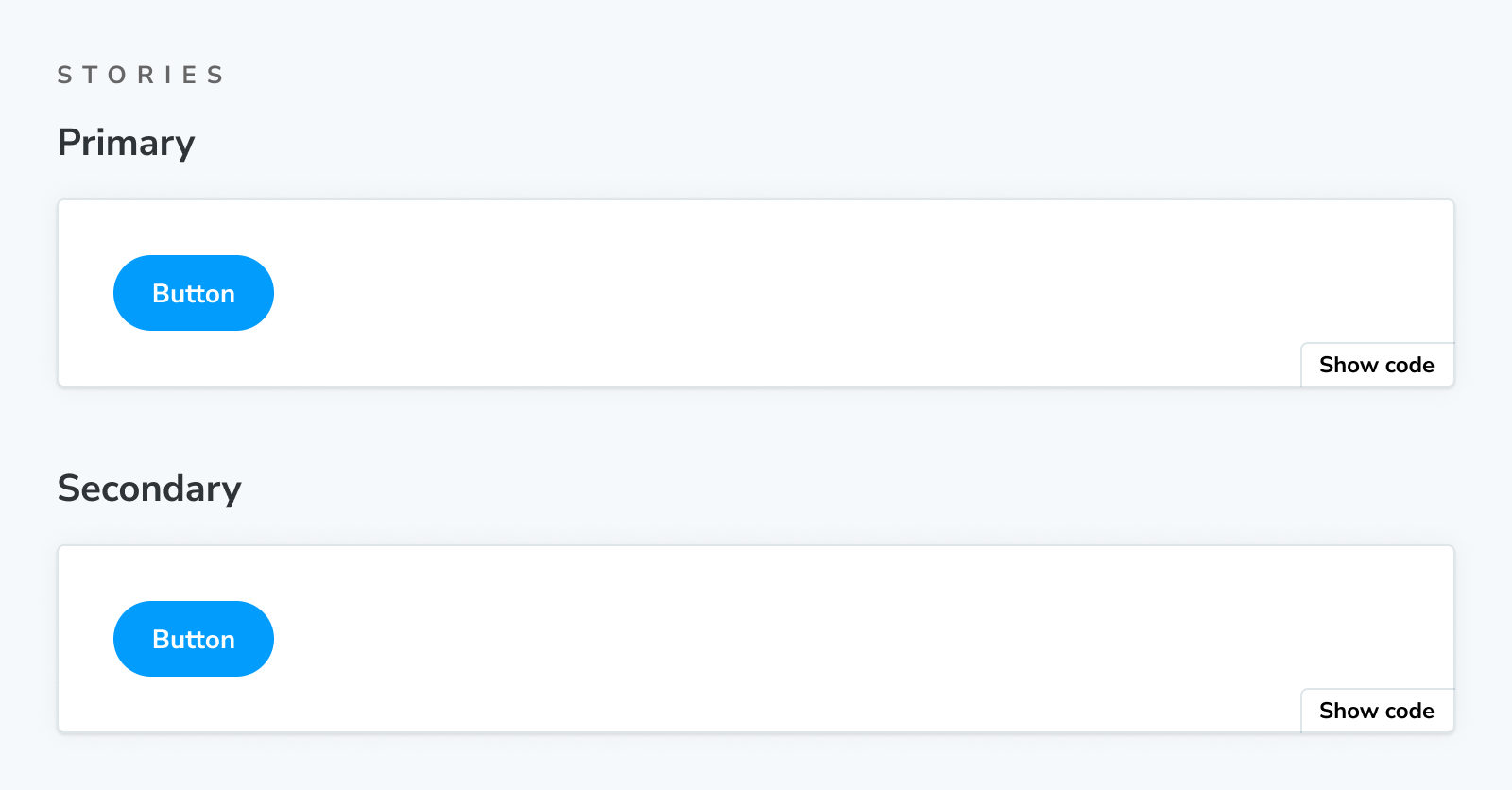
## Stories
### Primary
A button can be of primary importance.
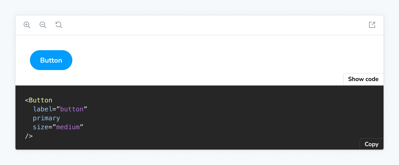
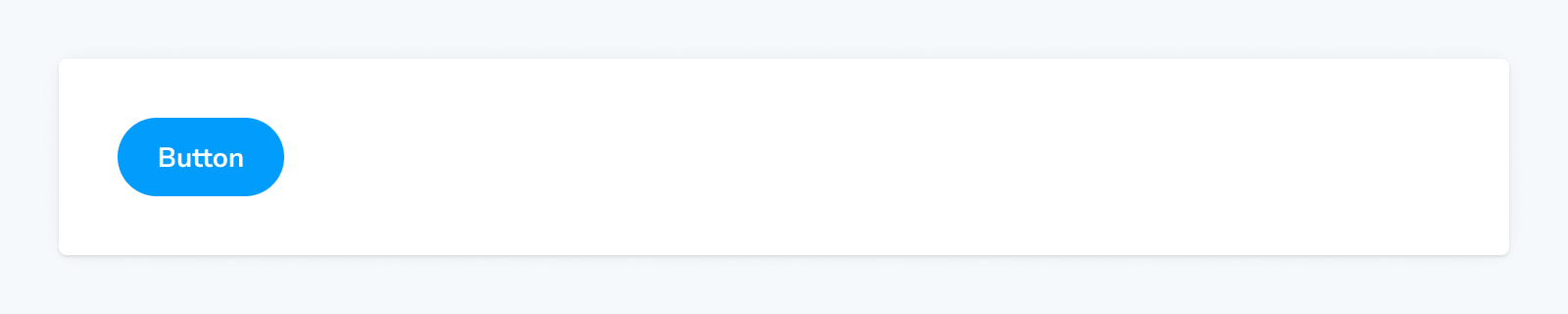
<Story of={ButtonStories.Primary} />
A button can be of secondary importance.
<Story of={ButtonStories.Secondary} />
{/* ... */}Customizing the automatic docs page
The blocks are also used to define the page template for automatics docs. For example, here's the default template:
import { Title, Subtitle, Description, Primary, Controls, Stories } from '@storybook/addon-docs/blocks';

export const autoDocsTemplate = () => (
  <>
    <Title />
    <Subtitle />
    <Description />
    <Primary />
    <Controls />
    <Stories />
  </>
);
If you override the default page template, you can similarly use Doc Blocks to build the perfect documentation page for your project.
Note that some doc blocks render other blocks. For example, the <Stories /> block expands to:
## Stories

<Canvas>
  ### Story name
  <Description />
  <Story />
  <Source />
</Canvas>

{/* ... repeat <Canvas> for each story */}
As a result, for example, customizing the Source block via parameters (see next section) will also affect the Source blocks rendered as part of Canvas blocks.
Customizing doc blocks
In both use cases (MDX and automatic docs), many of the doc blocks can be customized via parameters.
For example, you can filter out the style prop from all Controls tables through your Storybook:
// Replace your-framework with the framework you are using, e.g. react-vite, nextjs, vue3-vite, etc.
import type { Preview } from '@storybook/your-framework';

const preview: Preview = {
  parameters: {
    docs: {
      controls: { exclude: ['style'] },
    },
  },
};

export default preview;The blocks that accept customization via parameters are marked in the list of available blocks below.
When using a doc block in MDX, it can also be customized with its props:
<Controls exclude={['style']}>Available blocks
Each block has a dedicated API reference page detailing usage, available options, and technical details.
ArgTypes
Accepts parameters in the namespace parameters.docs.argTypes.
The ArgTypes block can be used to show a static table of arg types for a given component as a way to document its interface.
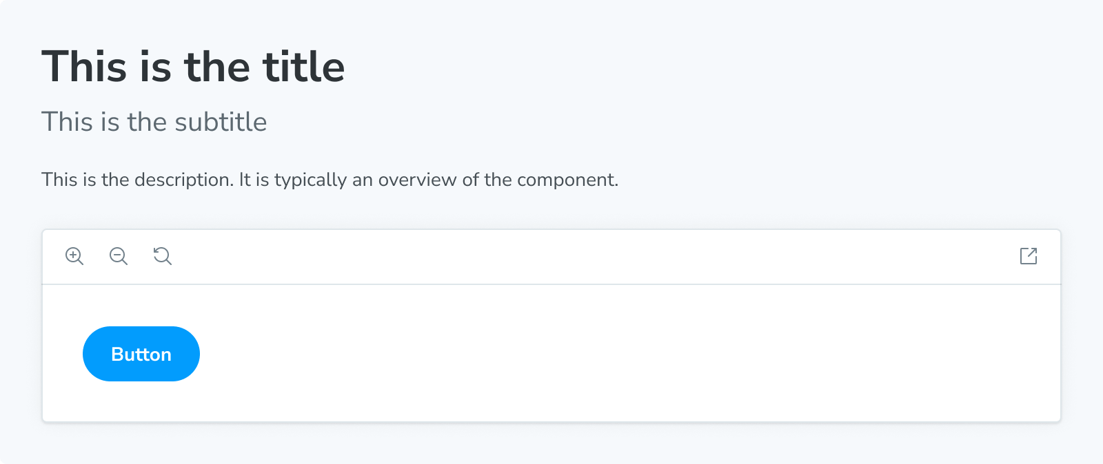
Canvas
Accepts parameters in the namespace parameters.docs.canvas.
The Canvas block is a wrapper around a Story, featuring a toolbar that allows you to interact with its content while automatically providing the required Source snippets.
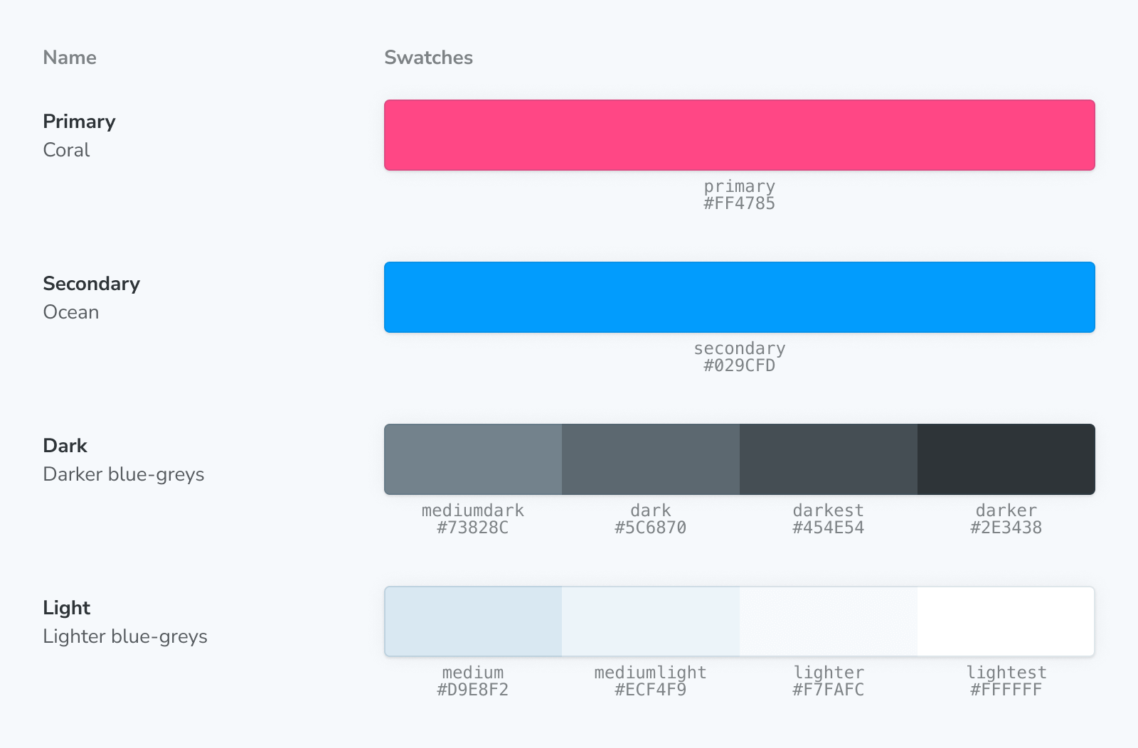
ColorPalette
The ColorPalette block allows you to document all color-related items (e.g., swatches) used throughout your project.
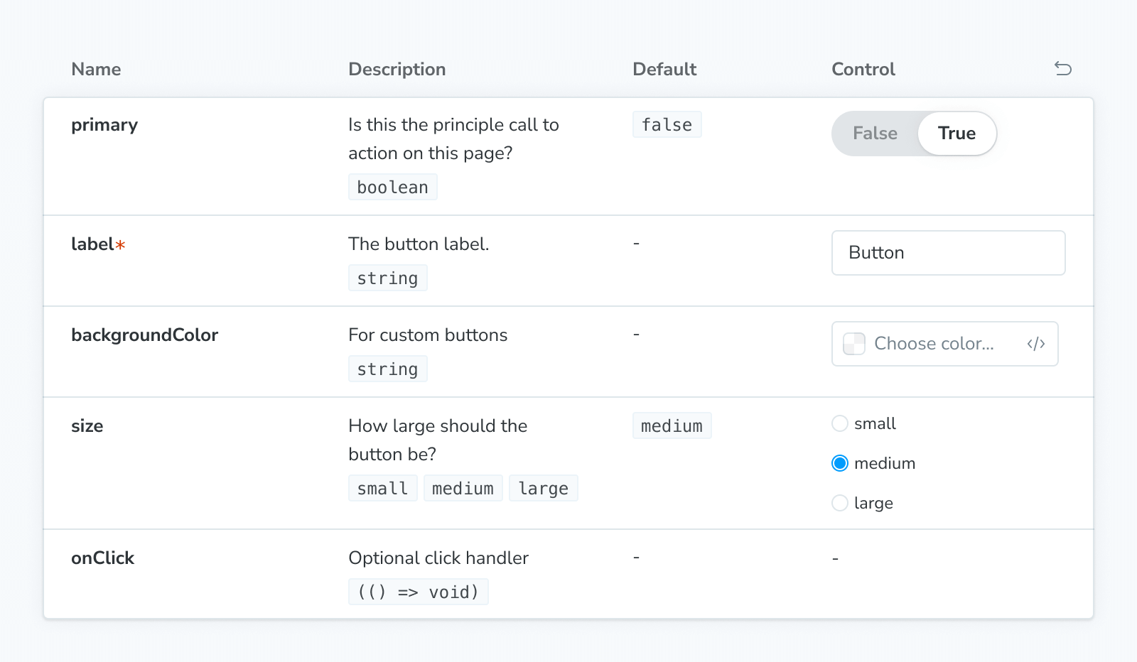
Controls
Accepts parameters in the namespace parameters.docs.controls.
The Controls block can be used to show a dynamic table of args for a given story, as a way to document its interface, and to allow you to change the args for a (separately) rendered story (via the Story or Canvas blocks).
Description
The Description block displays the description for a component, story, or meta obtained from their respective JSDoc comments.
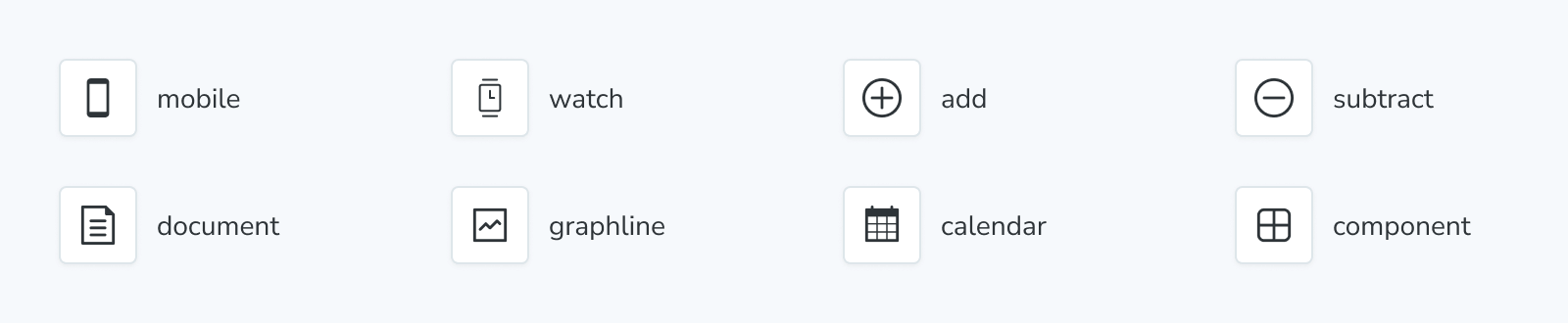
IconGallery
The IconGallery block lets you quickly document all icons associated with your project, displayed in a neat grid.
Markdown
The Markdown block allows you to import and include plain markdown in your MDX files.
Meta
The Meta block is used to attach a custom MDX docs page alongside a component’s list of stories. It doesn’t render any content but serves two purposes in an MDX file:
- Attaches the MDX file to a component and its stories, or
- Controls the location of the unattached docs entry in the sidebar.
Primary
The Primary block displays the primary (first defined in the stories file) story in a Story block. It is typically rendered immediately under the title in a docs entry.
Source
Accepts parameters in the namespace parameters.docs.source.
The Source block is used to render a snippet of source code directly.
Stories
The Stories block renders the full collection of stories in a stories file.
Story
Accepts parameters in the namespace parameters.docs.story.
Stories are Storybook's fundamental building blocks.
In Storybook Docs, you can render any of your stories from your CSF files in the context of an MDX file with all annotations (parameters, args, loaders, decorators, play function) applied using the Story block.
Subtitle
The Subtitle block can serve as a secondary heading for your docs entry.
Title
The Title block serves as the primary heading for your docs entry. It is typically used to provide the component or page name.
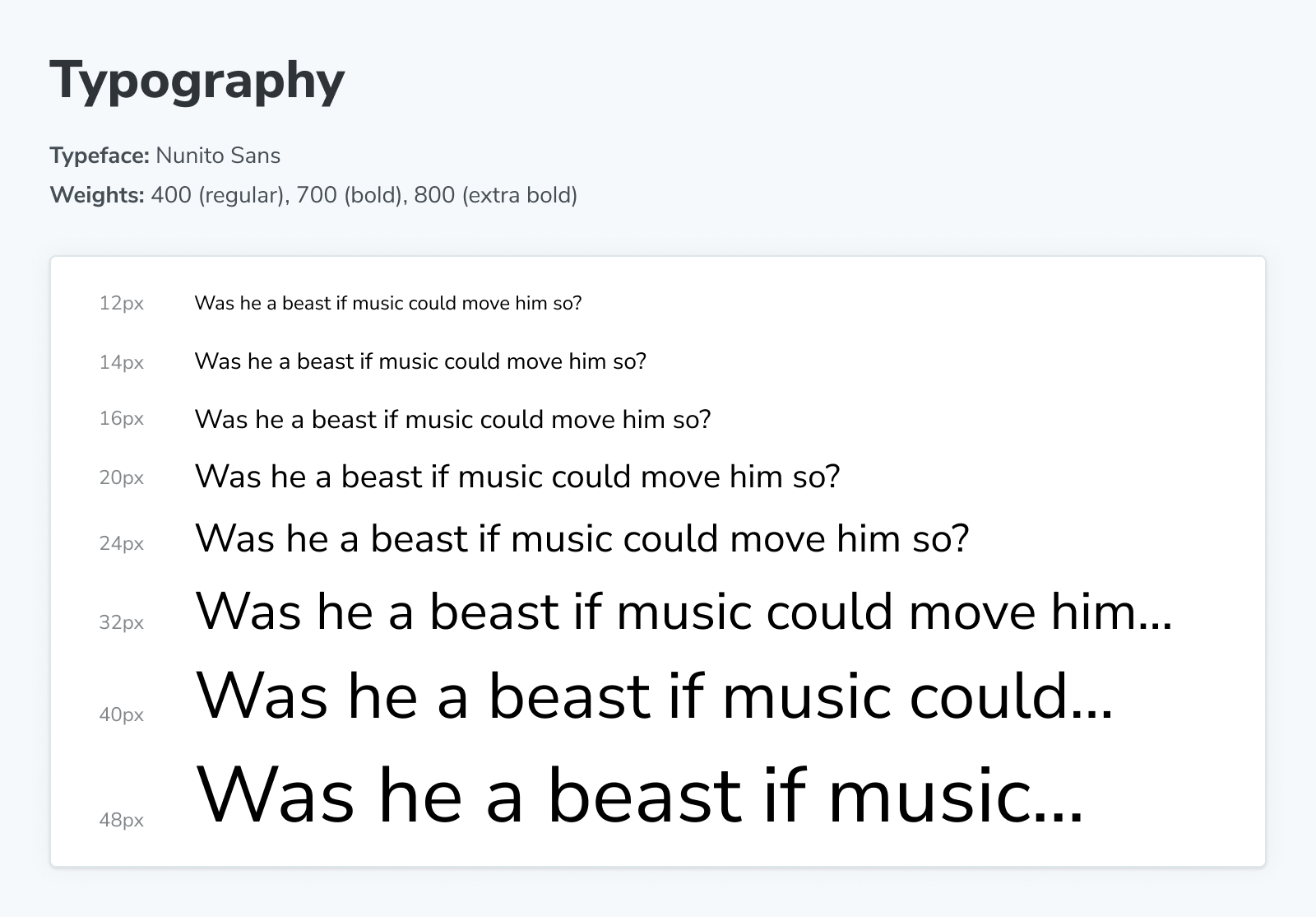
Typeset
The Typeset block helps document the fonts used throughout your project.
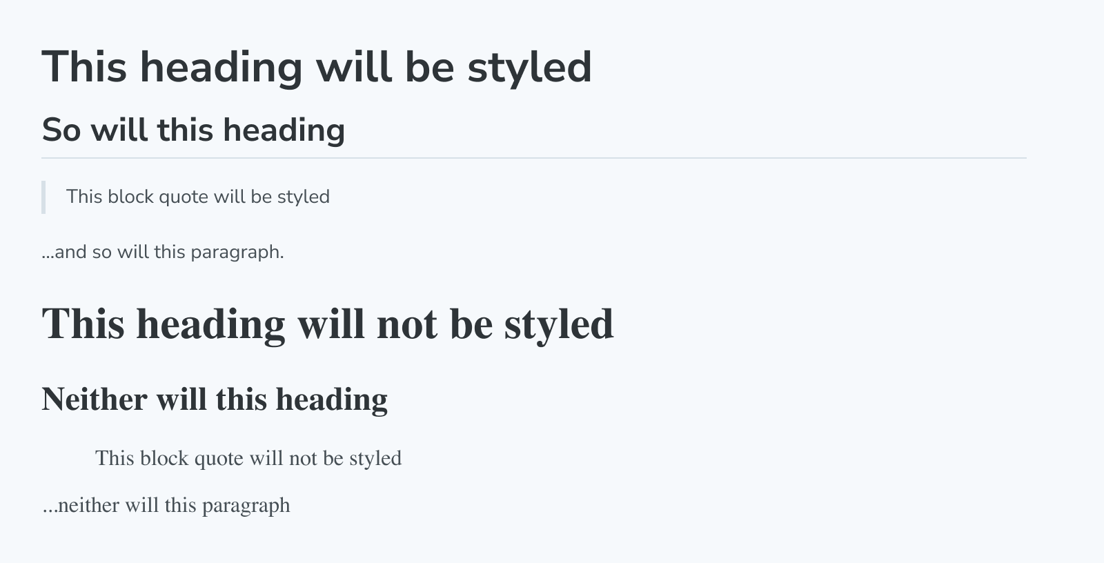
Unstyled
The Unstyled block is a unique block that disables Storybook's default styling in MDX docs wherever it is added.
By default, most elements (like h1, p, etc.) in docs have a few default styles applied to ensure the docs look good. However, sometimes you might want some of your content not to have these styles applied. In those cases, wrap the content with the Unstyled block to remove the default styles.
Make your own Doc Blocks
Storybook also provides a useOf hook to make it easier to create your own blocks that function like the built-in blocks.
Troubleshooting
Why can't I use the Doc Blocks inside my stories?
Storybook's Doc Blocks are highly customizable and helpful building blocks to assist you with building your custom documentation. Although most of them enable you to customize them with parameters or globally to create custom documentation templates, they are primarily designed for MDX files. For example, if you try to add the ColorPalette block to your stories as follows, you'll get an error message when the story loads in Storybook.
// Replace your-framework with the framework you are using, e.g. react-vite, nextjs, vue3-vite, etc.
import type { Meta } from '@storybook/your-framework';

import { ColorItem, ColorPalette } from '@storybook/addon-docs/blocks';

import { MyComponent } from './MyComponent';

const meta = {
  component: MyComponent,
} satisfies Meta<typeof MyComponent>;

export default meta;
type Story = StoryObj<typeof meta>;

const theme = {
  colors: {
    primaryDark: {
      value: '#1C1C1C',
    },
    primaryRegular: {
      value: '#363636',
    },
    primaryLight1: {
      value: '#4D4D4D',
    },
    primaryLight2: {
      value: '#878787',
    },
    primaryLight3: {
      value: '#D1D1D1',
    },
    primaryLight4: {
      value: '#EDEDED',
    },
  },
};

// ❌ Don't use the Doc Blocks inside your stories. It will break Storybook with a cryptic error.
export const Colors: Story = {
  render: () => (
    <ColorPalette>
      {Object.entries(theme.colors).map(([key, { value }]) => (
        <ColorItem
          colors={{
            [key]: value,
          }}
          key={key}
          subtitle={`theme.colors.${key}`}
          title={key}
        />
      ))}
    </ColorPalette>
  ),
};
Learn more about Storybook documentation
- Autodocs for creating documentation for your stories
- MDX for customizing your documentation
- Doc Blocks for authoring your documentation
- Publishing docs to automate the process of publishing your documentation