Types of addons
Each Storybook addon is classified into two general categories, UI-based or Presets. Each type of addons feature is documented here. Use this as a reference when creating your addon.
UI-based addons
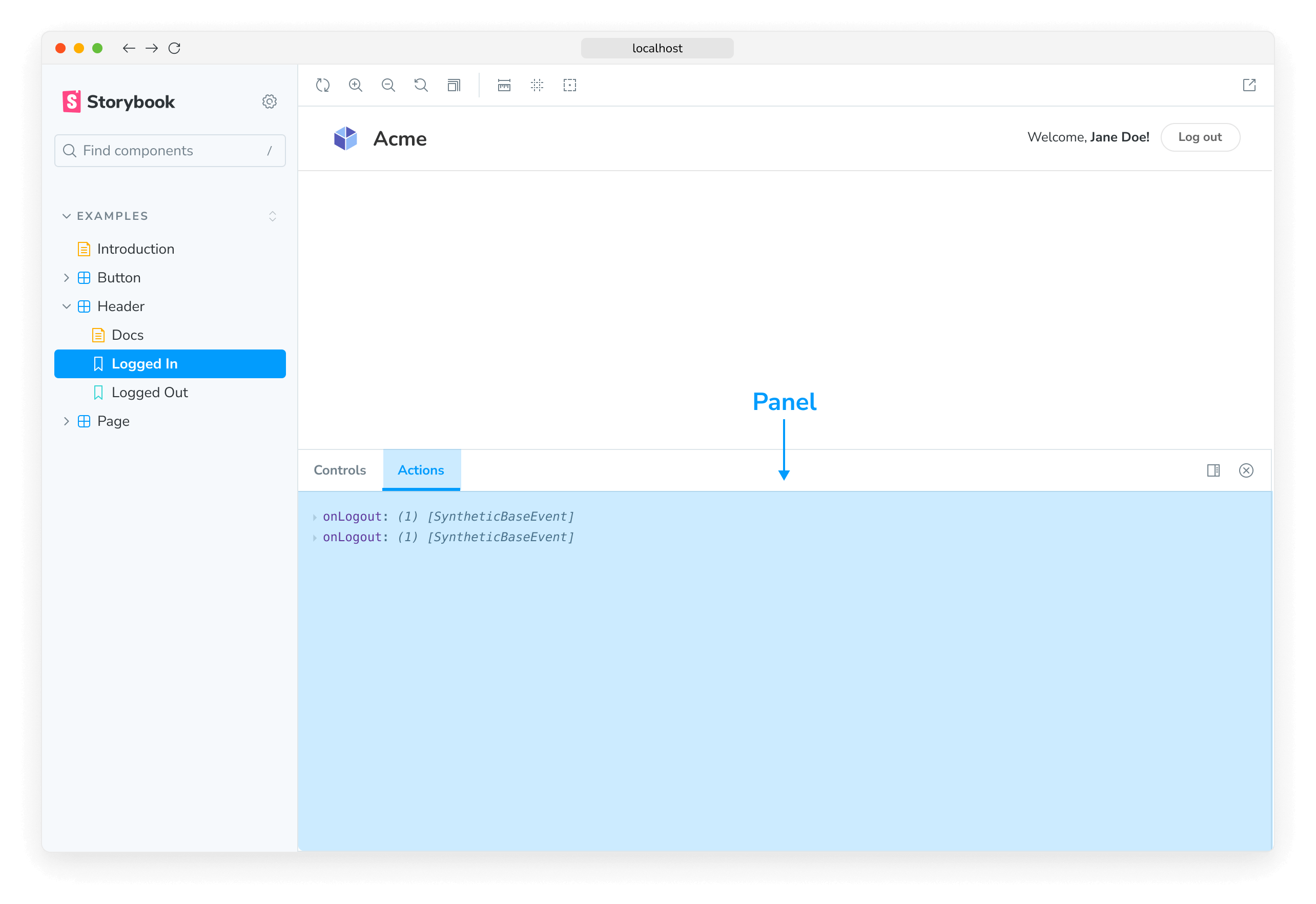
UI-based addons allow you to customize Storybook's UI with the following elements.
Panels
Panel addons allow you to add your own UI in Storybook's addon panel. This is the most common type of addon in the ecosystem. For example, the official @storybook/addon-a11y uses this pattern.

Use this boilerplate code to add a new Panel to Storybook's UI:
import React from 'react';

import { AddonPanel } from 'storybook/internal/components';

import { useGlobals, addons, types } from 'storybook/manager-api';

addons.register('my/panel', () => {
  addons.add('my-panel-addon/panel', {
    title: 'Example Storybook panel',
    //👇 Sets the type of UI element in Storybook
    type: types.PANEL,
    render: ({ active }) => (
      <AddonPanel active={active}>
        <h2>I'm a panel addon in Storybook</h2>
      </AddonPanel>
    ),
  });
});
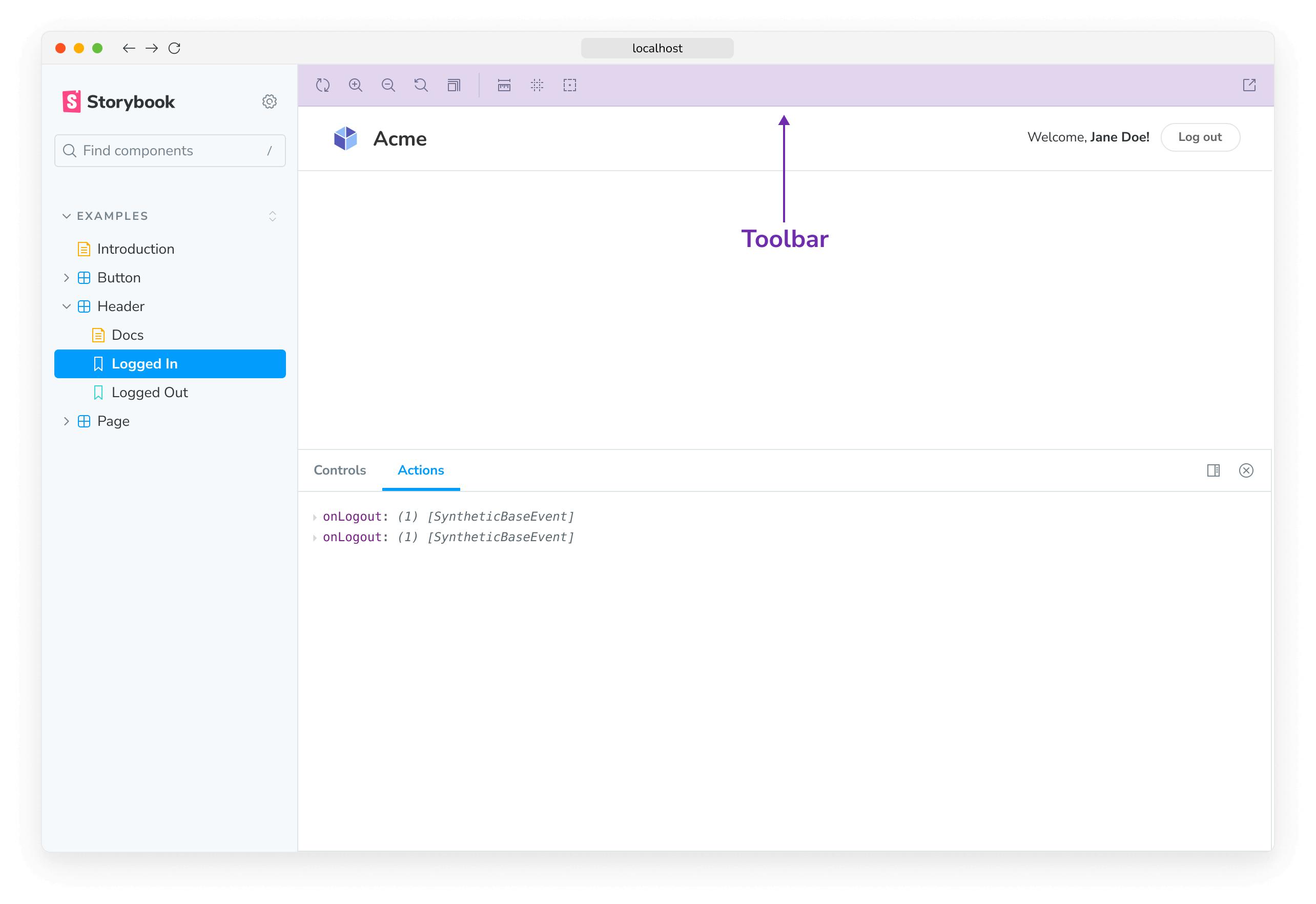
Toolbars
Toolbar addons allow you to add your own custom tools in Storybook's Toolbar. For example, the official @storybook/addon-themes uses this pattern.

Use this boilerplate code to add a new button to Storybook's Toolbar:
import React from 'react';

import { addons, types } from 'storybook/manager-api';
import { IconButton } from 'storybook/internal/components';
import { OutlineIcon } from '@storybook/icons';

addons.register('my-addon', () => {
  addons.add('my-addon/toolbar', {
    title: 'Example Storybook toolbar',
    //👇 Sets the type of UI element in Storybook
    type: types.TOOL,
    //👇 Shows the Toolbar UI element if the story canvas is being viewed
    match: ({ tabId, viewMode }) => !tabId && viewMode === 'story',
    render: ({ active }) => (
      <IconButton active={active} title="Show a Storybook toolbar">
        <OutlineIcon />
      </IconButton>
    ),
  });
});The match property allows you to conditionally render your toolbar addon, based on the current view. The icon element used in the example loads the icons from the storybook/internal/components module. See here for the list of available icons that you can use.
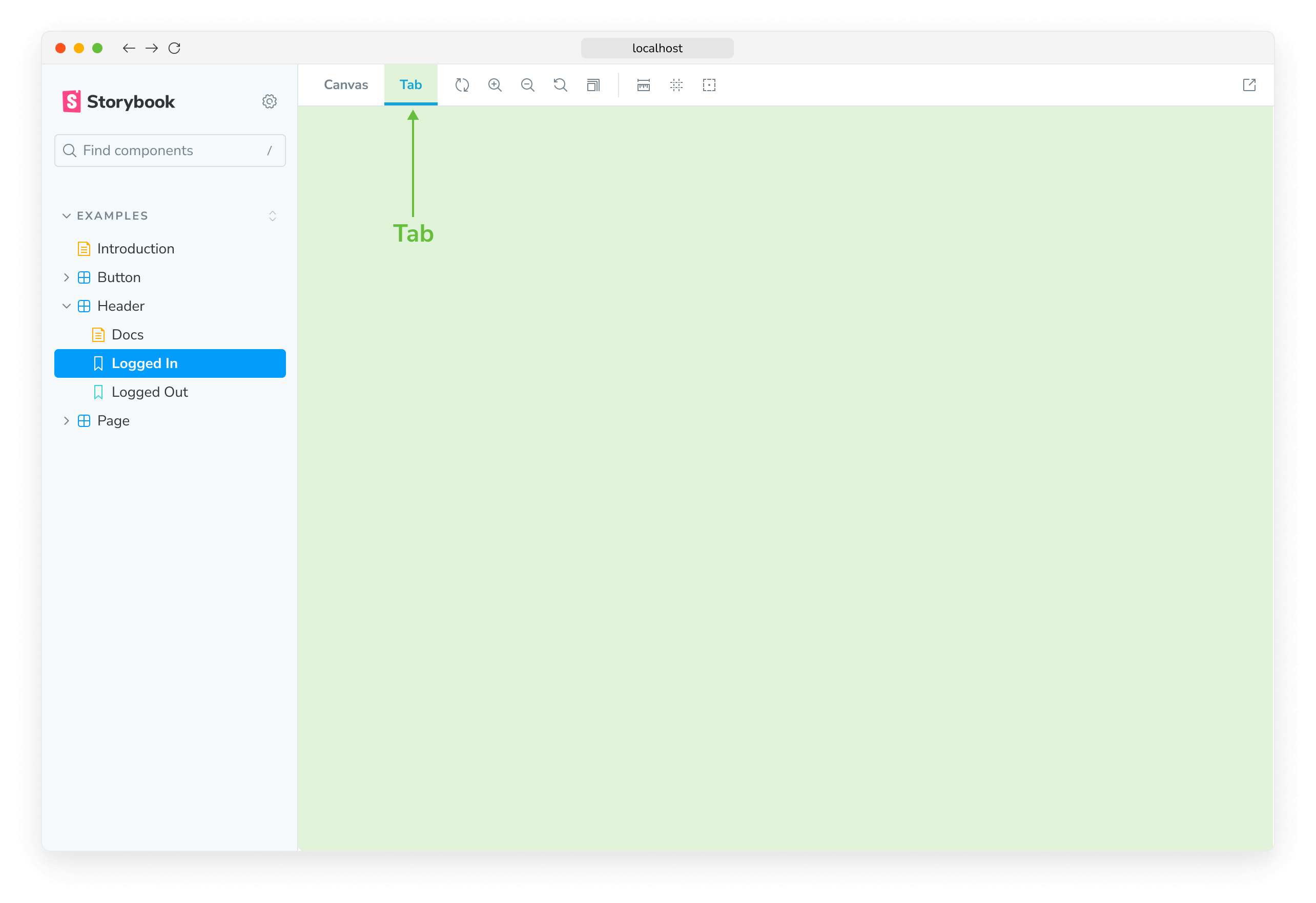
Tabs
Tab addons allow you to create your own custom tabs in Storybook.

Use this boilerplate code to add a new Tab to Storybook's UI:
import React from 'react';

import { addons, types } from 'storybook/manager-api';

addons.register('my-addon', () => {
  addons.add('my-addon/tab', {
    type: types.TAB,
    title: 'Example Storybook tab',
    render: () => (
      <div>
        <h2>I'm a tabbed addon in Storybook</h2>
      </div>
    ),
  });
});Learn how to write your own addon that includes these UI elements here.
Preset addons
Storybook preset addons are grouped collections of babel, webpack, and addons configurations to integrate Storybook and other technologies. For example the official preset-create-react-app.
Use this boilerplate code while writing your own preset addon.
export default {
  managerWebpack: async (config, options) => {
    // Update config here
    return config;
  },
  webpackFinal: async (config, options) => {
    return config;
  },
  babel: async (config, options) => {
    return config;
  },
};
Learn more about the Storybook addon ecosystem
- Types of addons for other types of addons
- Writing addons for the basics of addon development
- Presets for preset development
- Integration catalog for requirements and available recipes
- API reference to learn about the available APIs
