
ColorPalette
The ColorPalette block allows you to document all color-related items (e.g., swatches) used throughout your project.
import { Meta, ColorPalette, ColorItem } from '@storybook/addon-docs/blocks';
<Meta title="Colors" />
<ColorPalette>
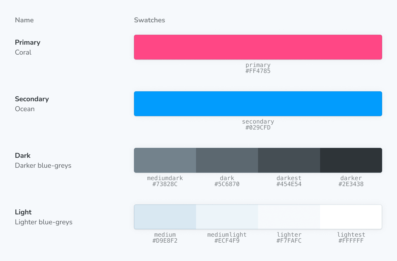
<ColorItem
title="theme.color.greyscale"
subtitle="Some of the greys"
colors={{ White: '#FFFFFF', Alabaster: '#F8F8F8', Concrete: '#F3F3F3' }}
/>
<ColorItem
title="theme.color.primary"
subtitle="Coral"
colors={{ WildWatermelon: '#FF4785' }}
/>
<ColorItem
title="theme.color.secondary"
subtitle="Ocean"
colors={{ DodgerBlue: '#1EA7FD' }}
/>
<ColorItem
title="theme.color.positive"
subtitle="Green"
colors={{
Apple: 'rgba(102,191,60,1)',
Apple80: 'rgba(102,191,60,.8)',
Apple60: 'rgba(102,191,60,.6)',
Apple30: 'rgba(102,191,60,.3)',
}}
/>
<ColorItem
title="gradient"
subtitle="Grayscale"
colors={{
Gradient: 'linear-gradient(to right,white,black)',
}}
/>
<ColorItem
title="gradient"
subtitle="Grayscale"
colors={['linear-gradient(65deg,white,black)']}
/>
</ColorPalette>ColorPalette
import { ColorPalette } from '@storybook/addon-docs/blocks';ColorPalette is configured with the following props:
children
Type: React.ReactNode
ColorPalette expects only ColorItem children.
ColorItem
import { ColorItem } from '@storybook/addon-docs/blocks';ColorItem is configured with the following props:
colors
(Required)
Type: string[] | { [key: string]: string }
Provides the list of colors to be displayed. Accepts any valid CSS color format (hex, RGB, HSL, etc.). When an object is provided, the keys will be displayed above the values. Additionally, it supports gradients such as 'linear-gradient(to right, white, black)' or 'linear-gradient(65deg, white, black)', etc.
subtitle
(Required)
Type: string
Provides an additional description of the color.
title
(Required)
Type: string
Sets the name of the color to be displayed.