
Controls
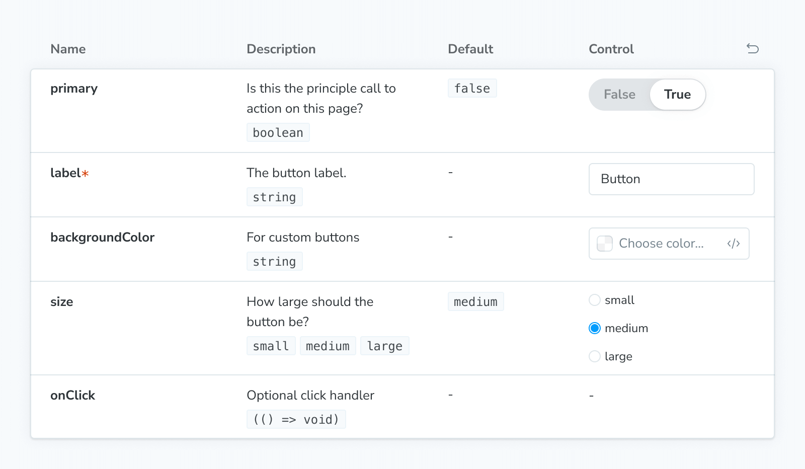
The Controls block can be used to show a dynamic table of args for a given story, as a way to document its interface, and to allow you to change the args for a (separately) rendered story (via the Story or Canvas blocks).
If you’re looking for a static table that shows a component's arg types with no controls, see the ArgTypes block instead.
import { Meta, Canvas, Controls } from '@storybook/addon-docs/blocks';
import * as ButtonStories from './Button.stories'

<Meta of={ButtonStories} />

<Canvas of={ButtonStories.Primary} />

<Controls of={ButtonStories.Primary} />The Controls doc block will only have functioning UI controls if you haven't turned off inline stories with the inline configuration option.
Controls
import { Controls } from '@storybook/addon-docs/blocks';Configuring with props and parameters
ℹ️ Like most blocks, the Controls block is configured with props in MDX. Many of those props derive their default value from a corresponding parameter in the block's namespace, parameters.docs.controls.
The following exclude configurations are equivalent:
// Replace your-framework with the framework you are using, e.g. react-vite, nextjs, vue3-vite, etc.
import type { Meta } from '@storybook/your-framework';

import { Button } from './Button';

const meta = {
  component: Button,
  parameters: {
    docs: {
      controls: { exclude: ['style'] },
    },
  },
} satisfies Meta<typeof Button>;

export default meta;<Controls of={ButtonStories} exclude={['style']} />The example above applied the parameter at the component (or meta) level, but it could also be applied at the project or story level.
This API configures Controls blocks used within docs pages. To configure the Controls addon panel, see the Controls addon docs. To configure individual controls, you can specify argTypes for each.
exclude
Type: string[] | RegExp
Default: parameters.docs.controls.exclude
Specifies which controls to exclude from the args table. Any controls whose names match the regex or are part of the array will be left out.
include
Type: string[] | RegExp
Default: parameters.docs.controls.include
Specifies which controls to include in the args table. Any controls whose names don't match the regex or are not part of the array will be left out.
of
Type: Story export or CSF file exports
Specifies which story to get the controls from. If a CSF file exports is provided, it will use the primary (first) story in the file.
sort
Type: 'none' | 'alpha' | 'requiredFirst'
Default: parameters.docs.controls.sort or 'none'
Specifies how the controls are sorted.
- none: Unsorted, displayed in the same order the controls are processed in
- alpha: Sorted alphabetically, by the arg type's name
- requiredFirst: Same as
alpha, with any required controls displayed first