
Source
The Source block is used to render a snippet of source code directly.
import { Meta, Source } from '@storybook/addon-docs/blocks';
import * as ButtonStories from './Button.stories';
<Meta of={ButtonStories} />
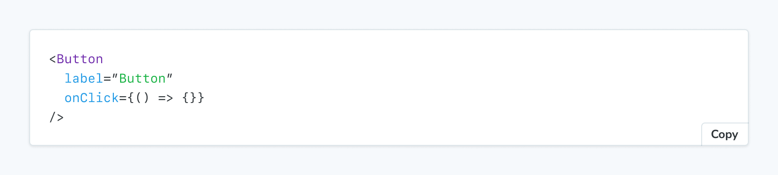
<Source of={ButtonStories.Primary} />Source
import { Source } from '@storybook/addon-docs/blocks';Configuring with props and parameters
ℹ️ Like most blocks, the Source block is configured with props in MDX. Many of those props derive their default value from a corresponding parameter in the block's namespace, parameters.docs.source.
The following language configurations are equivalent:
// Replace your-framework with the framework you are using, e.g. react-vite, nextjs, vue3-vite, etc.
import type { Meta, StoryObj } from '@storybook/your-framework';

import { Button } from './Button';

const meta = {
  component: Button,
} satisfies Meta<typeof Button>;

export default meta;
type Story = StoryObj<typeof meta>;

export const Basic: Story = {
  parameters: {
    docs: {
      source: { language: 'ts' },
    },
  },
};<Source of={ButtonStories.Basic} language="tsx" />The example above applied the parameter at the story level, but it could also be applied at the component (or meta) level or project level.
code
Type: string
Default: parameters.docs.source.code
Provides the source code to be rendered.
import { Meta, Source } from '@storybook/addon-docs/blocks';
import * as ButtonStories from './Button.stories';

<Meta of={ButtonStories} />

<Source code={`const thisIsCustomSource = true;
if (isSyntaxHighlighted) {
  console.log('syntax highlighting is working');
}`} />
dark
Type: boolean
Default: parameters.docs.source.dark
Determines if the snippet is rendered in dark mode.
Light mode is only supported when the Source block is rendered independently. When rendered as part of a Canvas block—like it is in autodocs—it will always use dark mode.
excludeDecorators
Type: boolean
Default: parameters.docs.source.excludeDecorators
Determines if decorators are rendered in the source code snippet.
language
Type:
'jsextra' | 'jsx' | 'json' | 'yml' | 'md' | 'bash' | 'css' | 'html' | 'tsx' | 'typescript' | 'graphql'Default: parameters.docs.source.language or 'jsx'
Specifies the language used for syntax highlighting.
of
Type: Story export
Specifies which story's source is rendered.
transform
Type: (code: string, storyContext: StoryContext) => string | Promise<string>
Default: parameters.docs.source.transform
An async function to dynamically transform the source before being rendered, based on the original source and any story context necessary. The returned string is displayed as-is.
If both code and transform are specified, transform will be ignored.
// Replace your-framework with the framework you are using, e.g., nextjs-vite, vue3-vite, angular, sveltekit, etc.
import type { Preview } from '@storybook/your-framework';

const preview: Preview = {
  parameters: {
    docs: {
      source: {
        transform: async (source) => {
          const prettier = await import('prettier/standalone');
          const prettierPluginBabel = await import('prettier/plugins/babel');
          const prettierPluginEstree = await import('prettier/plugins/estree');

          return prettier.format(source, {
            parser: 'babel',
            plugins: [prettierPluginBabel, prettierPluginEstree],
          });
        },
      },
    },
  },
};

export default preview;
This example shows how to use Prettier to format all source code snippets in your documentation. The transform function is applied globally through the preview configuration, ensuring consistent code formatting across all stories.
type
Type: 'auto' | 'code' | 'dynamic'
Default: parameters.docs.source.type or 'auto'
Specifies how the source code is rendered.
- auto: Same as dynamic, if the story's
renderfunction accepts args inputs and dynamic is supported by the framework in use; otherwise same as code - code: Renders the value of
codeprop, otherwise renders static story source - dynamic: Renders the story source with dynamically updated arg values
Note that dynamic snippets will only work if the story uses args and the Story block for that story is rendered along with the Source block.