
Canvas
The Canvas block is a wrapper around a Story, featuring a toolbar that allows you to interact with its content while automatically providing the required Source snippets.
When using the Canvas block in MDX, it references a story with the of prop:
import { Meta, Canvas } from '@storybook/addon-docs/blocks';
import * as ButtonStories from './Button.stories';

<Meta of={ButtonStories} />

<Canvas of={ButtonStories.Primary} />In previous versions of Storybook it was possible to pass in arbitrary components as children to Canvas. That is deprecated and the Canvas block now only supports a single story.
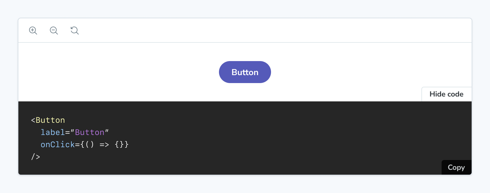
Canvas
import { Canvas } from '@storybook/addon-docs/blocks';Configuring with props and parameters
ℹ️ Like most blocks, the Canvas block is configured with props in MDX. Many of those props derive their default value from a corresponding parameter in the block's namespace, parameters.docs.canvas.
The following sourceState configurations are equivalent:
// Replace your-framework with the framework you are using, e.g. react-vite, nextjs, vue3-vite, etc.
import type { Meta, StoryObj } from '@storybook/your-framework';

import { Button } from './Button';

const meta = {
  component: Button,
} satisfies Meta<typeof Button>;

export default meta;
type Story = StoryObj<typeof meta>;

export const Basic: Story = {
  parameters: {
    docs: {
      canvas: { sourceState: 'shown' },
    },
  },
};<Canvas of={ButtonStories.Basic} sourceState="shown" />The example above applied the parameter at the story level, but it could also be applied at the component (or meta) level or project level.
additionalActions
Type:
Array<{
  title: string | JSX.Element;
  className?: string;
  onClick: () => void;
  disabled?: boolean;
}>;
Default: parameters.docs.canvas.additionalActions
Provides any additional custom actions to show in the bottom right corner. These are simple buttons that do anything you specify in the onClick function.
import { Meta, Story, Canvas, SourceState } from '@storybook/addon-docs/blocks';
import * as ButtonStories from './Button.stories';

<Meta of={ButtonStories} />

{/* With an additional action */}
<Canvas
  additionalActions={[
    {
      title: 'Open in GitHub',
      onClick: () => {
        window.open(
          'https://github.com/storybookjs/storybook/blob/next/code/ui/blocks/src/examples/Button.stories.tsx',
          '_blank'
        );
      },
    }
  ]}
  of={ButtonStories.Primary}
/>
className
Type: string
Default: parameters.docs.canvas.className
Provides HTML class(es) to the preview element, for custom styling.
layout
Type: 'centered' | 'fullscreen' | 'padded'
Default: parameters.layout or parameters.docs.canvas.layout or 'padded'
Specifies how the canvas should layout the story.
- centered: Center the story within the canvas
- padded: (default) Add padding to the story
- fullscreen: Show the story as-is, without padding
In addition to the parameters.docs.canvas.layout property or the layout prop, the Canvas block will respect the parameters.layout value that defines how a story is laid out in the regular story view.
meta
Type: CSF file exports
Specifies the CSF file to which the story is associated.
You can render a story from a CSF file that you haven’t attached to the MDX file (via Meta) by using the meta prop. Pass the full set of exports from the CSF file (not the default export!).
import { Meta, Canvas } from '@storybook/addon-docs/blocks';
import * as ButtonStories from './Button.stories';
import * as HeaderStories from './Header.stories';

<Meta of={ButtonStories} />

{/* Although this MDX file is largely concerned with Button,
    it can render Header stories too */}
<Canvas of={HeaderStories.LoggedIn} meta={HeaderStories} />
of
Type: Story export
Specifies which story's source is displayed.
source
Type: SourceProps['code'] | SourceProps['format'] | SourceProps['language'] | SourceProps['type']
Specifies the props passed to the inner Source block. For more information, see the Source Doc Block documentation.
The dark prop is ignored, as the Source block is always rendered in dark mode when shown as part of a Canvas block.
sourceState
Type: 'hidden' | 'shown' | 'none'
Default: parameters.docs.canvas.sourceState or 'hidden'
Specifies the initial state of the source panel.
- hidden: the source panel is hidden by default
- shown: the source panel is shown by default
- none: the source panel is not available and the button to show it is not rendered
story
Type: StoryProps['inline'] | StoryProps['height'] | StoryProps['autoplay']
Specifies the props passed to the inner Story block. For more information, see the Story Doc Block documentation.
withToolbar
Type: boolean
Default: parameters.docs.canvas.withToolbar
Determines whether to render a toolbar containing tools to interact with the story.