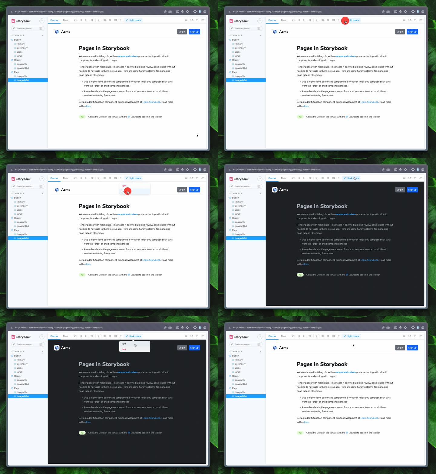
Themes
Storybook's Themes addon allows you to switch between multiple themes for your components inside of the preview in Storybook.

Theme decorators
To make your themes accessible to your stories, @storybook/addon-themes exposes three decorators for different methods of theming.
JSX providers
For libraries that expose themes to components through providers, such as Material UI, Styled-components, and Emotion, use the withThemeFromJSXProvider.
.storybook/preview.ts
// Replace your-framework with the framework you are using, e.g. react-vite, nextjs, vue3-vite, etc.
import { Preview, Renderer } from '@storybook/your-framework';

import { withThemeFromJSXProvider } from '@storybook/addon-themes';

import { createGlobalStyle, ThemeProvider } from 'styled-components';
import { lightTheme, darkTheme } from '../src/themes';

const GlobalStyles = createGlobalStyle`
  body {
    font-family: "Nunito Sans", "Helvetica Neue", Helvetica, Arial, sans-serif;
  }
`;

const preview: Preview = {
  decorators: [
    withThemeFromJSXProvider<Renderer>({
      themes: {
        light: lightTheme,
        dark: darkTheme,
      },
      defaultTheme: 'light',
      Provider: ThemeProvider,
      GlobalStyles,
    }),
  ],
};

export default preview;
CSS classes
For libraries that rely on CSS classes on a parent element to determine the theme, you can use the withThemeByClassName decorator.
.storybook/preview.ts
// Replace your-framework with the framework you are using, e.g. react-vite, nextjs, vue3-vite, etc.
import { Preview, Renderer } from '@storybook/your-framework';

import { withThemeByClassName } from '@storybook/addon-themes';

import '../src/index.css'; // Your application's global CSS file

const preview: Preview = {
  decorators: [
    withThemeByClassName<Renderer>({
      themes: {
        light: '',
        dark: 'dark',
      },
      defaultTheme: 'light',
    }),
  ],
};

export default preview;
Data attributes
For libraries that rely on data attributes on a parent element to determine the theme, you can use the withThemeByDataAttribute decorator.
.storybook/preview.ts
// Replace your-framework with the framework you are using, e.g. react-vite, nextjs, vue3-vite, etc.
import { Preview, Renderer } from '@storybook/your-framework';

import { withThemeByDataAttribute } from '@storybook/addon-themes';

import '../src/index.css'; // Your application's global CSS file

const preview: Preview = {
  decorators: [
    withThemeByDataAttribute<Renderer>({
      themes: {
        light: 'light',
        dark: 'dark',
      },
      defaultTheme: 'light',
      attributeName: 'data-theme',
    }),
  ],
};

export default preview;