
Toolbars & globals
Storybook ships with features to control the viewport and background the story renders in. Similarly, you can use built-in features to create toolbar items which control special “globals”. You can then read the global values to create decorators to control story rendering.
Globals
Globals in Storybook represent “global” (as in not story-specific) inputs to the rendering of the story. As they aren’t specific to the story, they aren’t passed in the args argument to the story function (although they are accessible as context.globals). Instead, they are typically used in decorators, which apply to all stories.
When the globals change, the story re-renders and the decorators rerun with the new values. The easiest way to change globals is to create a toolbar item for them.
Global types and the toolbar annotation
Storybook has a simple, declarative syntax for configuring toolbar menus. In your .storybook/preview.*, you can add your own toolbars by creating globalTypes with a toolbar annotation:
// Replace your-framework with the framework you are using, e.g. react-vite, nextjs, vue3-vite, etc.
import type { Preview } from '@storybook/your-framework';

const preview: Preview = {
  globalTypes: {
    theme: {
      description: 'Global theme for components',
      toolbar: {
        // The label to show for this toolbar item
        title: 'Theme',
        icon: 'circlehollow',
        // Array of plain string values or MenuItem shape (see below)
        items: ['light', 'dark'],
        // Change title based on selected value (recommended for consistency with the Storybook UI)
        dynamicTitle: true,
      },
    },
  },
  initialGlobals: {
    theme: 'light',
  },
};

export default preview;As globals are global you can only set globalTypes and initialGlobals in .storybook/preview.*.
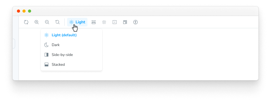
When you start your Storybook, your toolbar should have a new dropdown menu with the light and dark options.
Create a decorator
We have a global implemented. Let's wire it up! We can consume our new theme global in a decorator using the context.globals.theme value.
For example, suppose you are using styled-components. You can add a theme provider decorator to your .storybook/preview.* config:
// Replace your-framework with the framework you are using, e.g. react-vite, nextjs, nextjs-vite, etc.
import type { Preview } from '@storybook/your-framework';

import { ThemeProvider } from 'styled-components';

import { MyThemes } from '../my-theme-folder/my-theme-file';

const preview: Preview = {
  decorators: [
    (Story, context) => {
      const theme = MyThemes[context.globals.theme];
      return (
        <ThemeProvider theme={theme}>
          <Story />
        </ThemeProvider>
      );
    },
  ],
};

export default preview;
Setting globals on a story
When a global value is changed with a toolbar menu in Storybook, that value continues to be used as you navigate between stories. But sometimes a story requires a specific value to render correctly, e.g., when testing against a particular environment.
To ensure that a story always uses a specific global value, regardless of what has been chosen in the toolbar, you can set the globals annotation on a story or component. This overrides the global value for those stories and disables the toolbar menu for that global when viewing the stories.
// Replace your-framework with the name of your framework (e.g., react-vite, vue3-vite, etc.)
import type { Meta, StoryObj } from '@storybook/your-framework';

import { Button } from './Button';

const meta = {
  component: Button,
  globals: {
    // 👇 Set background value for all component stories
    backgrounds: { value: 'gray', grid: false },
  },
} satisfies Meta<typeof Button>;

export default meta;
type Story = StoryObj<typeof meta>;

export const OnDark: Story = {
  globals: {
    // 👇 Override background value for this story
    backgrounds: { value: 'dark' },
  },
};
In the example above, Storybook will force all Button stories to use a gray background color, except the OnDark story, which will use the dark background. For all Button stories, the toolbar menu will be disabled for the backgrounds global, with a tooltip explaining that the global is set at the story level.
Configuring a story's globals annotation to override the project-level global settings is useful but should be used with moderation. Globals that are not defined at the story level can be selected interactively in Storybook's UI, allowing users to explore every existing combination of values (e.g., global values, args). Setting them at the story level will disable that control, preventing users from exploring the available options.
Advanced usage
So far, we've created and used a global inside Storybook.
Now, let's take a look at a more complex example. Suppose we wanted to implement a new global called locale for internationalization, which shows a flag on the right side of the toolbar.
In your .storybook/preview.*, add the following:
// Replace your-framework with the framework you are using, e.g. react-vite, nextjs, vue3-vite, etc.
import type { Preview } from '@storybook/your-framework';

const preview: Preview = {
  globalTypes: {
    locale: {
      description: 'Internationalization locale',
      toolbar: {
        icon: 'globe',
        items: [
          { value: 'en', right: '🇺🇸', title: 'English' },
          { value: 'fr', right: '🇫🇷', title: 'Français' },
          { value: 'es', right: '🇪🇸', title: 'Español' },
          { value: 'zh', right: '🇨🇳', title: '中文' },
          { value: 'kr', right: '🇰🇷', title: '한국어' },
        ],
      },
    },
  },
  initialGlobals: {
    locale: 'en',
  },
};

export default preview;The icon element used in the examples loads the icons from the @storybook/icons package. See here for the list of available icons that you can use.
Adding the configuration element right will display the text on the right side in the toolbar menu once you connect it to a decorator.
Here's a list of the available configuration options.
| MenuItem | Type | Description | Required |
|---|---|---|---|
| value | String | The string value of the menu that gets set in the globals | Yes |
| title | String | The main text of the title | Yes |
| right | String | A string that gets displayed on the right side of the menu | No |
| icon | String | An icon that gets shown in the toolbar if this item is selected | No |
Consuming globals from within a story
We recommend consuming globals from within a decorator and defining a global setting for all stories.
But we're aware that sometimes it's more beneficial to use toolbar options on a per-story basis.
Using the example above, you can modify any story to retrieve the Locale global from the story context:
// Replace your-framework with the framework you are using, e.g. react-vite, nextjs, nextjs-vite, etc.
import type { Meta, StoryObj } from '@storybook/your-framework';

import { MyComponent } from './MyComponent';

const meta = {
  component: MyComponent,
} satisfies Meta<typeof MyComponent>;

export default meta;
type Story = StoryObj<typeof meta>;

const getCaptionForLocale = (locale) => {
  switch (locale) {
    case 'es':
      return 'Hola!';
    case 'fr':
      return 'Bonjour!';
    case 'kr':
      return '안녕하세요!';
    case 'zh':
      return '你好!';
    default:
      return 'Hello!';
  }
};

export const StoryWithLocale = {
  render: (args, { globals: { locale } }) => {
    const caption = getCaptionForLocale(locale);
    return <p>{caption}</p>;
  },
};
Consuming globals from within an addon
If you're working on a Storybook addon and need to retrieve globals, you can do so. The storybook/manager-api module provides a hook for this scenario. You can use the useGlobals() hook to retrieve any globals you want.
Using the ThemeProvider example above, you could expand it to display which theme is active inside a panel as such:
import React from 'react';

import { useGlobals } from 'storybook/manager-api';

import {
  AddonPanel,
  Placeholder,
  Separator,
  Source,
  Spaced,
  Title,
} from 'storybook/internal/components';

import { MyThemes } from '../my-theme-folder/my-theme-file';

// Function to obtain the intended theme
const getTheme = (themeName) => {
  return MyThemes[themeName];
};

const ThemePanel = (props) => {
  const [{ theme: themeName }] = useGlobals();

  const selectedTheme = getTheme(themeName);

  return (
    <AddonPanel {...props}>
      {selectedTheme ? (
        <Spaced row={3} outer={1}>
          <Title>{selectedTheme.name}</Title>
          <p>The full theme object</p>
          <Source
            code={JSON.stringify(selectedTheme, null, 2)}
            language="js"
            copyable
            padded
            showLineNumbers
          />
        </Spaced>
      ) : (
        <Placeholder>No theme selected</Placeholder>
      )}
    </AddonPanel>
  );
};
Updating globals from within an addon
If you're working on a Storybook addon that needs to update the global and refresh the UI, you can do so. As mentioned previously, the storybook/manager-api module provides the necessary hook for this scenario. You can use the updateGlobals function to update any global values you need.
For example, if you were working on a toolbar addon, and you want to refresh the UI and update the global once the user clicks on a button:
import React, { useCallback } from 'react';
import { OutlineIcon } from '@storybook/icons';
import { useGlobals } from 'storybook/manager-api';
import { addons } from 'storybook/preview-api';
import { ToggleButton } from 'storybook/internal/components';
import { FORCE_RE_RENDER } from 'storybook/internal/core-events';

const ExampleToolbar = () => {
  const [globals, updateGlobals] = useGlobals();

  const isActive = globals['my-param-key'] || false;

  // Function that will update the global value and trigger a UI refresh.
  const refreshAndUpdateGlobal = () => {
    // Updates Storybook global value
    updateGlobals({
      ['my-param-key']: !isActive,
    });
    // Invokes Storybook's addon API method (with the FORCE_RE_RENDER) event to trigger a UI refresh
    addons.getChannel().emit(FORCE_RE_RENDER);
  };

  const toggleOutline = useCallback(() => refreshAndUpdateGlobal(), [isActive]);

  return (
    <ToggleButton
      key="Example"
      padding="small"
      variant="ghost"
      pressed={isActive}
      onClick={toggleOutline}
      ariaLabel="Addon feature"
      tooltip="Toggle addon feature"
    >
      <OutlineIcon />
    </ToggleButton>
  );
};