
Naming components and hierarchy
Watch a video tutorial
Storybook provides a powerful way to organize your stories, giving you the necessary tools to categorize, search, and filter your stories based on your organization's needs and preferences.
Structure and hierarchy
When organizing your Storybook, there are two methods of structuring your stories: implicit and explicit. The implicit method involves relying upon the physical location of your stories to position them in the sidebar, while the explicit method involves utilizing the title parameter to place the story.
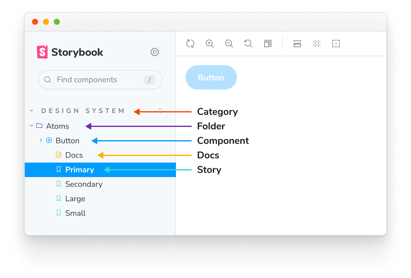
Based on how you structure your Storybook, you can see that the story hierarchy is made up of various parts:
- Category: The top-level grouping of stories and documentation pages generated by Storybook
- Folder: A mid-level organizational unit that groups components and stories in the sidebar, representing a feature or section of your application
- Component: A low-level organizational unit representing the component that the story is testing
- Docs: The automatically generated documentation page for the component
- Story: The individual story testing a specific component state
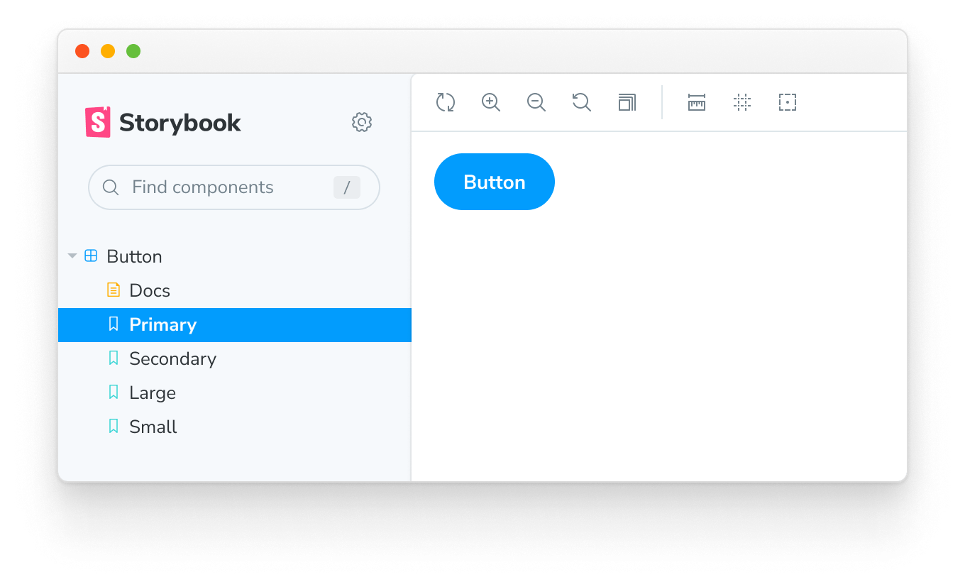
Naming stories
When creating your stories, you can explicitly use the title parameter to define the story's position in the sidebar. It can also be used to group related components together in an expandable interface to help with Storybook organization providing a more intuitive experience for your users. For example:
// Replace your-framework with the name of your framework
import type { Meta } from '@storybook/your-framework';

import { Button } from './Button';

const meta: Meta<typeof Button> = {
  /* 👇 The title prop is optional.
   * See https://storybook.js.org/docs/7/configure#configure-story-loading
   * to learn how to generate automatic titles
   */
  title: 'Button',
  component: Button,
};

export default meta;
Yields this:
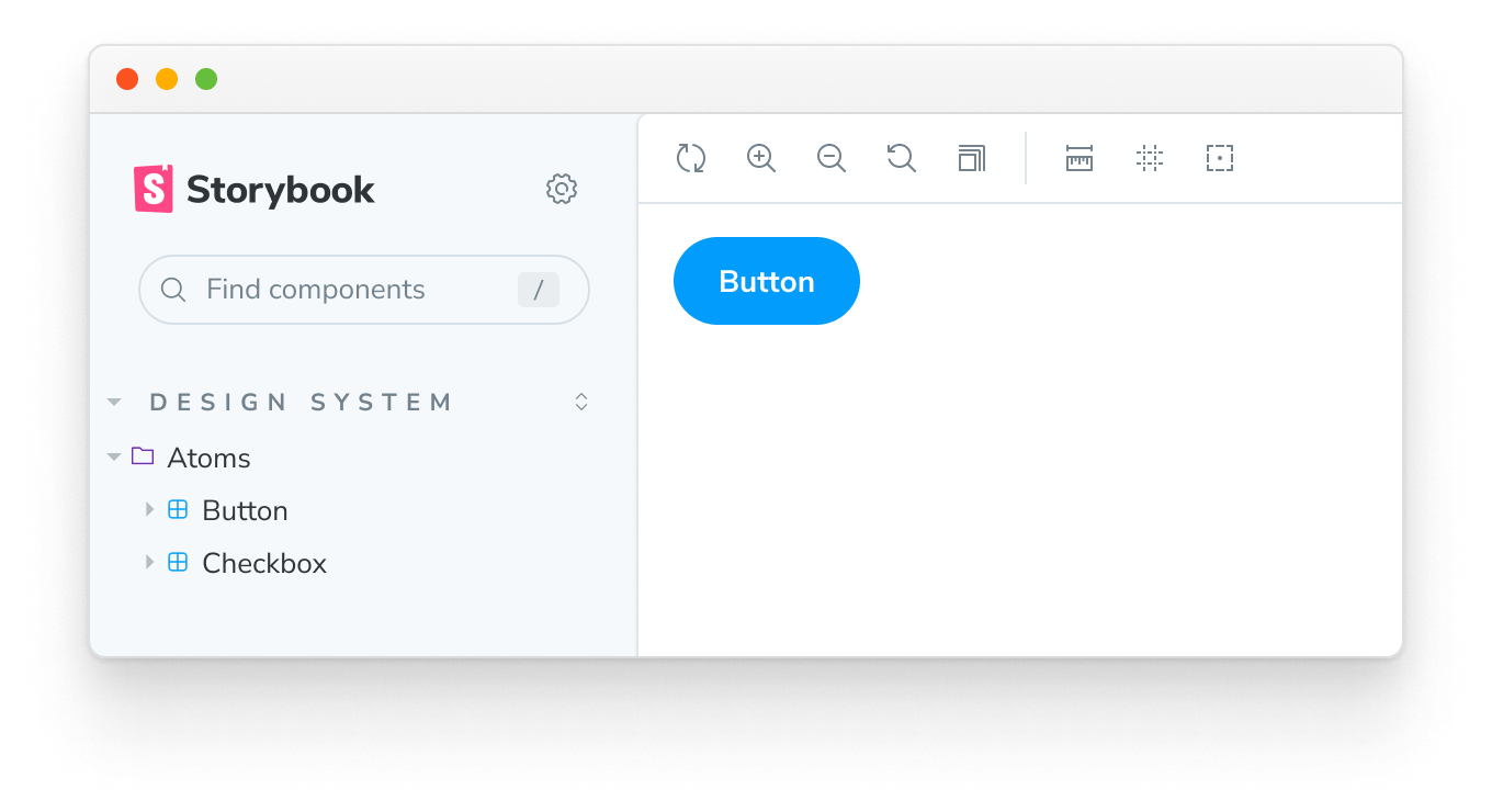
Grouping
It is also possible to group related components in an expandable interface to help with Storybook organization. To do so, use the / as a separator:
// Replace your-framework with the name of your framework
import type { Meta } from '@storybook/your-framework';

import { Button } from './Button';

const meta: Meta<typeof Button> = {
  /* 👇 The title prop is optional.
   * See https://storybook.js.org/docs/7/configure#configure-story-loading
   * to learn how to generate automatic titles
   */
  title: 'Design System/Atoms/Button',
  component: Button,
};

export default meta;// Replace your-framework with the name of your framework
import type { Meta } from '@storybook/your-framework';
import { CheckBox } from './Checkbox';
const meta: Meta<typeof CheckBox> = {
/* 👇 The title prop is optional.
* See https://storybook.js.org/docs/7/configure#configure-story-loading
* to learn how to generate automatic titles
*/
title: 'Design System/Atoms/Checkbox',
component: CheckBox,
};
export default meta;Yields this:
Roots
By default, the top-level grouping will be displayed as “root” in the Storybook UI (i.e., the uppercased, non-expandable items). If you need, you can configure Storybook and disable this behavior. Useful if you need to provide a streamlined experience for your users; nevertheless, if you have a large Storybook composed of multiple component stories, we recommend naming your components according to the file hierarchy.
Single-story hoisting
Single-story components (i.e., component stories without siblings) whose display name exactly matches the component's name (last part of title) are automatically hoisted up to replace their parent component in the UI. For example:
// Replace your-framework with the name of your framework
import type { Meta, StoryObj } from '@storybook/your-framework';

import { Button as ButtonComponent } from './Button';

const meta: Meta<typeof ButtonComponent> = {
  /* 👇 The title prop is optional.
   * See https://storybook.js.org/docs/7/configure#configure-story-loading
   * to learn how to generate automatic titles
   */
  title: 'Design System/Atoms/Button',
  component: ButtonComponent,
};

export default meta;
type Story = StoryObj<typeof ButtonComponent>;

// This is the only named export in the file, and it matches the component name
export const Button: Story = {};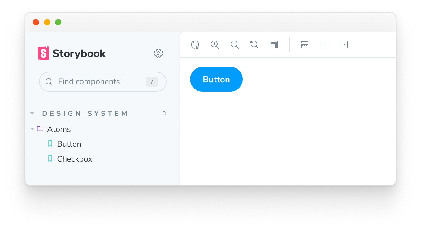
Because story exports are automatically "start cased" (myStory becomes "My Story"), your component name should match that. Alternatively, you can override the story name using myStory.storyName = '...' to match the component name.
Sorting stories
Out of the box, Storybook sorts stories based on the order in which they are imported. However, you can customize this pattern to suit your needs and provide a more intuitive experience by adding storySort to the options parameter in your preview.js file.
// Replace your-framework with the framework you are using (e.g., react, vue3)
import { Preview } from '@storybook/your-framework';

const preview: Preview = {
  parameters: {
    options: {
      // The `a` and `b` arguments in this function have a type of `import('@storybook/types').IndexEntry`. Remember that the function is executed in a JavaScript environment, so use JSDoc for IntelliSense to introspect it.
      storySort: (a, b) =>
        a.id === b.id ? 0 : a.id.localeCompare(b.id, undefined, { numeric: true }),
    },
  },
};

export default preview;Asides from the unique story identifier, you can also use the title, name, and import path to sort your stories using the storySort function.
The storySort can also accept a configuration object.
// Replace your-framework with the framework you are using (e.g., react, vue3)
import { Preview } from '@storybook/your-framework';

const preview: Preview = {
  parameters: {
    options: {
      storySort: {
        method: '',
        order: [],
        locales: '',
      },
    },
  },
};

export default preview;| Field | Type | Description | Required | Default Value | Example |
|---|---|---|---|---|---|
| method | String | Tells Storybook in which order the stories are displayed | No | Storybook configuration | 'alphabetical' |
| order | Array | The stories to be shown, ordered by supplied name | No | Empty Array [] | ['Intro', 'Components'] |
| includeNames | Boolean | Include story name in sort calculation | No | false | true |
| locales | String | The locale required to be displayed | No | System locale | en-US |
To sort your stories alphabetically, set method to 'alphabetical' and optionally set the locales string. To sort your stories using a custom list, use the order array; stories that don't match an item in the order list will appear after the items in the list.
The order array can accept a nested array to sort 2nd-level story kinds. For example:
// Replace your-framework with the framework you are using (e.g., react, vue3)
import { Preview } from '@storybook/your-framework';

const preview: Preview = {
  parameters: {
    options: {
      storySort: {
        order: ['Intro', 'Pages', ['Home', 'Login', 'Admin'], 'Components'],
      },
    },
  },
};

export default preview;
Which would result in this story ordering:
Introand thenIntro/*storiesPagesstoryPages/HomeandPages/Home/*storiesPages/LoginandPages/Login/*storiesPages/AdminandPages/Admin/*storiesPages/*storiesComponentsandComponents/*stories- All other stories
If you want specific categories to sort to the end of the list, you can insert a * into your order array to indicate where "all other stories" should go:
// Replace your-framework with the framework you are using (e.g., react, vue3)
import { Preview } from '@storybook/your-framework';

const preview: Preview = {
  parameters: {
    options: {
      storySort: {
        order: ['Intro', 'Pages', ['Home', 'Login', 'Admin'], 'Components', '*', 'WIP'],
      },
    },
  },
};

export default preview;
In this example, the WIP category would be displayed at the end of the list.
Note that the order option is independent of the method option; stories are sorted first by the order array and then by either the method: 'alphabetical' or the default configure() import order.