
Controls
Watch a video tutorial
Storybook Controls gives you a graphical UI to interact with a component's arguments dynamically without needing to code. It creates an addon panel next to your component examples ("stories"), so you can edit them live.
Controls do not require any modification to your components. Stories for controls are:
- Convenient. Auto-generate controls based on React/Vue/Angular/etc. components.
- Portable. Reuse your interactive stories in documentation, tests, and even in designs.
- Rich. Customize the controls and interactive data to suit your exact needs.
To use the Controls addon, you need to write your stories using args. Storybook will automatically generate UI controls based on your args and what it can infer about your component. Still, you can configure the controls further using argTypes, see below.
If you have stories in the older pre-Storybook 6 style, check the args & controls migration guide to learn how to convert your existing stories for args.
Choosing the control type
By default, Storybook will choose a control for each arg based on its initial value. This will work well with specific arg types (e.g., boolean or string). To enable them, add the component annotation to the default export of your story file and it will be used to infer the controls and auto-generate the matching argTypes for your component using react-docgen or react-docgen-typescript for TypeScript.
import type { Meta } from '@storybook/react';

import { Button } from './Button';

const meta: Meta<typeof Button> = {
  component: Button,
};

export default meta;
For instance, suppose you have a variant arg on your story that should be primary or secondary:
// Replace your-framework with the name of your framework
import type { Meta, StoryObj } from '@storybook/your-framework';

import { Button } from './Button';

const meta: Meta<typeof Button> = {
  component: Button,
};

export default meta;
type Story = StoryObj<typeof Button>;

export const Primary: Story = {
  args: {
    variant: 'primary',
  },
};
By default, Storybook will render a free text input for the variant arg:
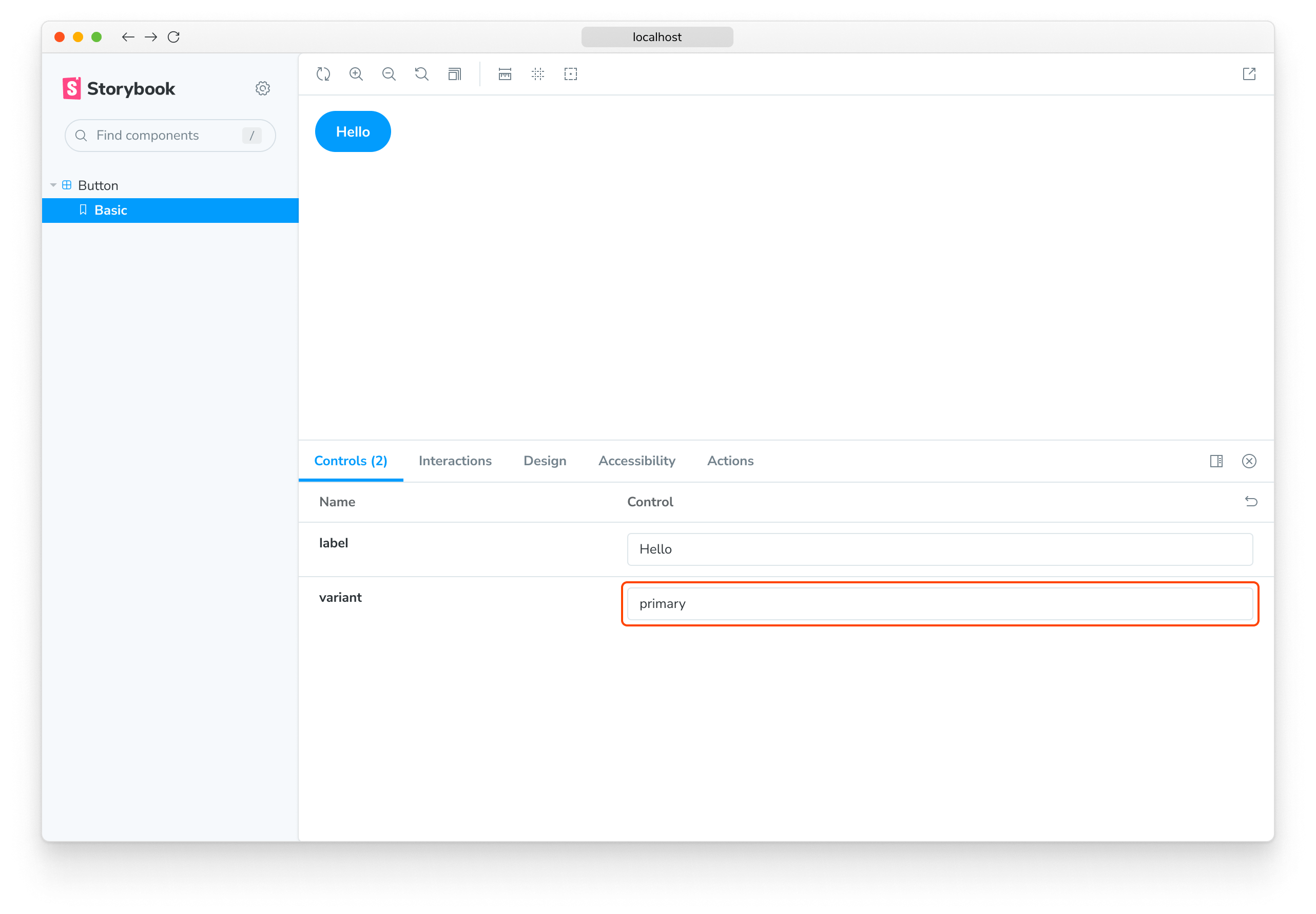
It works as long as you type a valid string into the auto-generated text control. Still, it's not the best UI for our scenario, given that the component only accepts primary or secondary as variants. Let’s replace it with Storybook’s radio component.
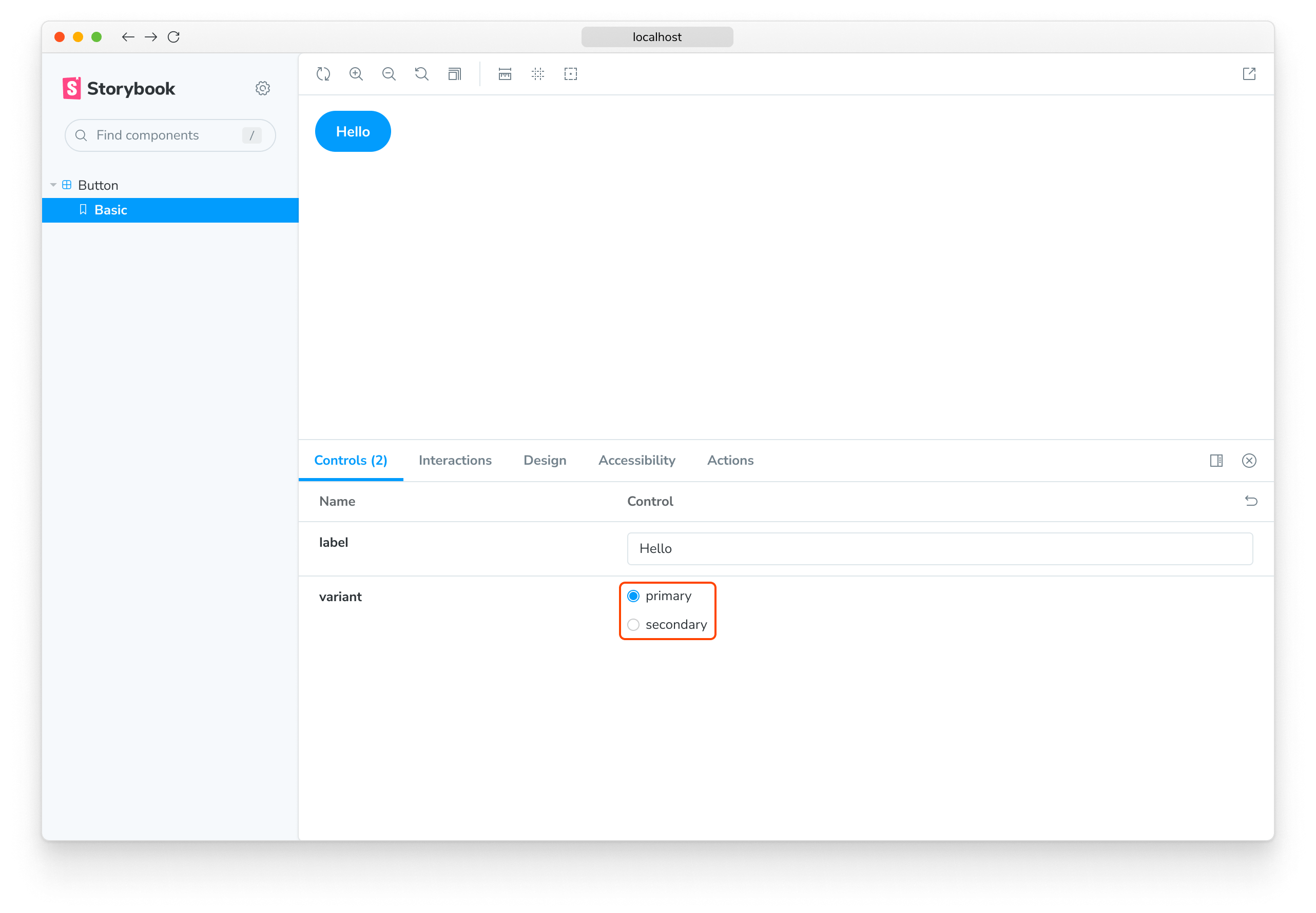
We can specify which controls get used by declaring a custom argType for the variant property. ArgTypes encode basic metadata for args, such as name, description, and defaultValue for an arg. These get automatically filled in by Storybook Docs.
ArgTypes can also contain arbitrary annotations, which the user can override. Since variant is a property of the component, let's put that annotation on the default export.
// Replace your-framework with the name of your framework
import type { Meta } from '@storybook/your-framework';

import { Button } from './Button';

const meta: Meta<typeof Button> = {
  component: Button,
  argTypes: {
    variant: {
      options: ['primary', 'secondary'],
      control: { type: 'radio' },
    },
  },
};

export default meta;ArgTypes are a powerful feature that can be used to customize the controls for your stories. For more information, see the documentation about customizing controls with argTypes annotation.
This replaces the input with a radio group for a more intuitive experience.
Custom control type matchers
Controls can automatically be inferred from arg's name with regex, but currently only for the color picker and date picker controls. If you've used the Storybook CLI to setup your project, it should have automatically created the following defaults in .storybook/preview.js:
| Control | Default regex | Description |
|---|---|---|
| color | /(background|color)$/i | Will display a color picker UI for the args that match it |
| date | /Date$/ | Will display a date picker UI for the args that match it |
If you haven't used the CLI to set the configuration, or if you want to define your patterns, use the matchers property in the controls parameter:
// Replace your-framework with the framework you are using (e.g., react, vue3)
import { Preview } from '@storybook/your-framework';

const preview: Preview = {
  parameters: {
    controls: {
      matchers: {
        color: /(background|color)$/i,
        date: /Date$/,
      },
    },
  },
};

export default preview;
Fully custom args
Until now, we only used auto-generated controls based on the component for which we're writing stories. If we are writing complex stories, we may want to add controls for args that aren’t part of the component. For example, here's how you could use a footer arg to populate a child component:
import type { Meta, StoryObj } from '@storybook/react';
import { Page } from './Page';
type PagePropsAndCustomArgs = React.ComponentProps<typeof Page> & { footer?: string };
const meta: Meta<PagePropsAndCustomArgs> = {
component: Page,
render: ({ footer, ...args }) => (
<Page {...args}>
<footer>{footer}</footer>
</Page>
),
};
export default meta;
type Story = StoryObj<PagePropsAndCustomArgs>;
export const CustomFooter: Story = {
args: {
footer: 'Built with Storybook',
},
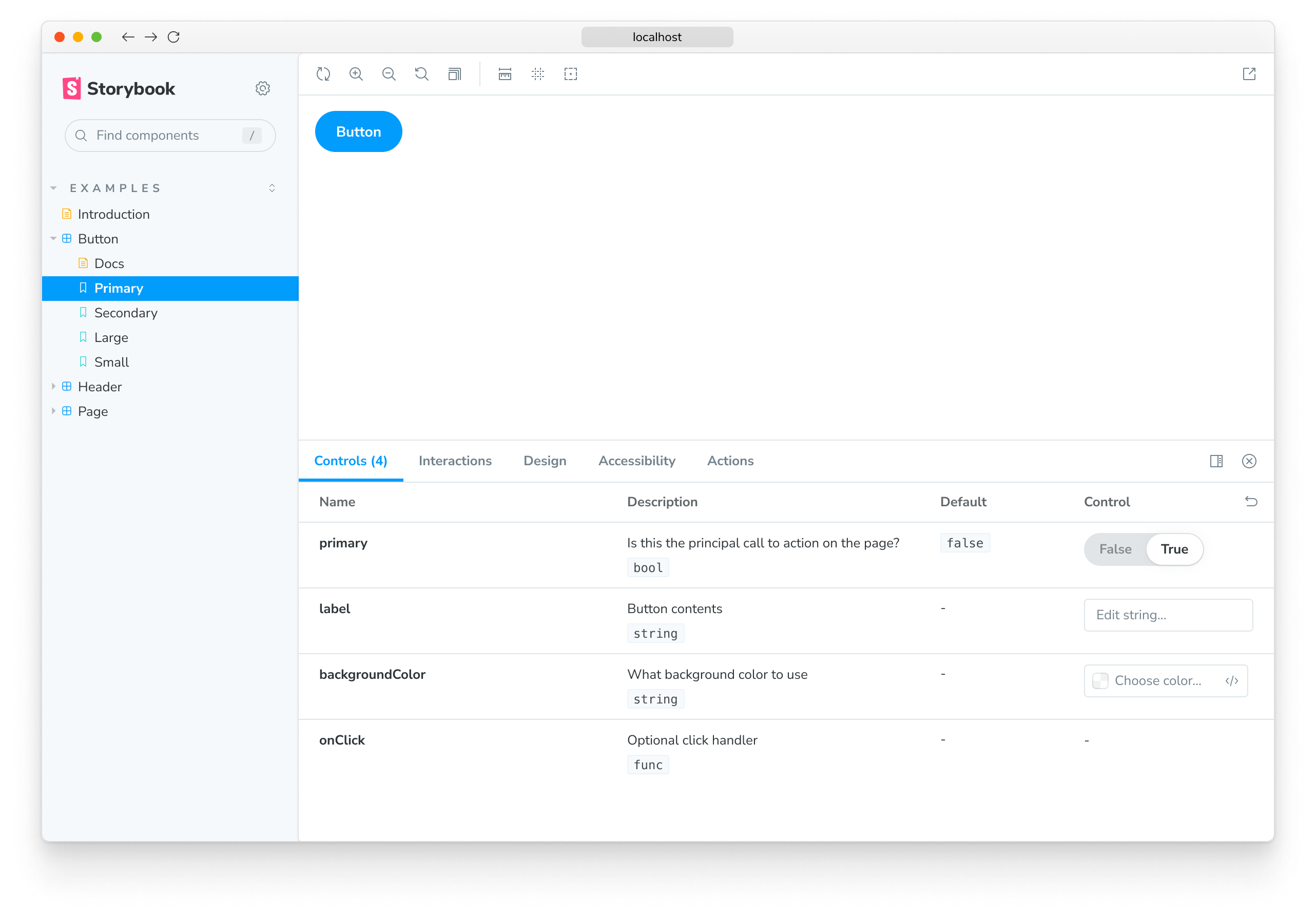
};By default, Storybook will add controls for all args that:
-
It infers from the component definition if your framework supports it.
-
Appear in the list of args for your story.
Using argTypes, you can change the display and behavior of each control.
Dealing with complex values
When dealing with non-primitive values, you'll notice that you'll run into some limitations. The most obvious issue is that not every value can be represented as part of the args param in the URL, losing the ability to share and deeplink to such a state. Beyond that, complex values such as JSX cannot be synchronized between the manager (e.g., Controls addon) and the preview (your story).
One way to deal with this is to use primitive values (e.g., strings) as arg values and add a custom render function to convert these values to their complex counterpart before rendering. It isn't the nicest way to do it (see below), but certainly the most flexible.
import type { Meta, StoryObj } from '@storybook/react';

import { YourComponent } from './your-component';

const meta: Meta<typeof YourComponent> = {
  component: YourComponent,
  //👇 Creates specific argTypes with options
  argTypes: {
    propertyA: {
      options: ['Item One', 'Item Two', 'Item Three'],
      control: { type: 'select' }, // Automatically inferred when 'options' is defined
    },
    propertyB: {
      options: ['Another Item One', 'Another Item Two', 'Another Item Three'],
    },
  },
};

export default meta;
type Story = StoryObj<typeof YourComponent>;

const someFunction = (valuePropertyA, valuePropertyB) => {
  // Do some logic here
};

export const ExampleStory: Story = {
  render: (args) => {
    const { propertyA, propertyB } = args;
    //👇 Assigns the function result to a variable
    const someFunctionResult = someFunction(propertyA, propertyB);

    return <YourComponent {...args} someProperty={someFunctionResult} />;
  },
  args: {
    propertyA: 'Item One',
    propertyB: 'Another Item One',
  },
};
Unless you need the flexibility of a function, an easier way to map primitives to complex values before rendering is to define a mapping; additionally, you can specify control.labels to configure custom labels for your checkbox, radio, or select input.
// Replace your-framework with the name of your framework
import type { Meta } from '@storybook/your-framework';

import { Button } from './Button';

import { ArrowUp, ArrowDown, ArrowLeft, ArrowRight } from './icons';

const arrows = { ArrowUp, ArrowDown, ArrowLeft, ArrowRight };

const meta: Meta<typeof Button> = {
  component: Button,
  argTypes: {
    arrow: {
      options: Object.keys(arrows), // An array of serializable values
      mapping: arrows, // Maps serializable option values to complex arg values
      control: {
        type: 'select', // Type 'select' is automatically inferred when 'options' is defined
        labels: {
          // 'labels' maps option values to string labels
          ArrowUp: 'Up',
          ArrowDown: 'Down',
          ArrowLeft: 'Left',
          ArrowRight: 'Right',
        },
      },
    },
  },
};

export default meta;
Note that both mapping and control.labels don't have to be exhaustive. If the currently selected option is not listed, it's used verbatim.
Configuration
The Controls addon can be configured in two ways:
- Individual controls can be configured via control annotations.
- The addon's appearance can be configured via parameters.
Annotation
As shown above, you can configure individual controls with the “control" annotation in the argTypes field of either a component or story. Below is a condensed example and table featuring all available controls.
| Data Type | Control | Description |
|---|---|---|
| boolean | boolean | Provides a toggle for switching between possible states.argTypes: { active: { control: 'boolean' }} |
| number | number | Provides a numeric input to include the range of all possible values.argTypes: { even: { control: { type: 'number', min:1, max:30, step: 2 } }} |
range | Provides a range slider component to include all possible values.argTypes: { odd: { control: { type: 'range', min: 1, max: 30, step: 3 } }} | |
| object | object | Provides a JSON-based editor component to handle the object's values. Also allows edition in raw mode. argTypes: { user: { control: 'object' }} |
| array | object | Provides a JSON-based editor component to handle the values of the array. Also allows edition in raw mode. argTypes: { odd: { control: 'object' }} |
file | Provides a file input component that returns an array of URLs. Can be further customized to accept specific file types. argTypes: { avatar: { control: { type: 'file', accept: '.png' } }} | |
| enum | radio | Provides a set of radio buttons based on the available options.argTypes: { contact: { control: 'radio', options: ['email', 'phone', 'mail'] }} |
inline-radio | Provides a set of inlined radio buttons based on the available options.argTypes: { contact: { control: 'inline-radio', options: ['email', 'phone', 'mail'] }} | |
check | Provides a set of checkbox components for selecting multiple options.argTypes: { contact: { control: 'check', options: ['email', 'phone', 'mail'] }} | |
inline-check | Provides a set of inlined checkbox components for selecting multiple options.argTypes: { contact: { control: 'inline-check', options: ['email', 'phone', 'mail'] }} | |
select | Provides a drop-down list component to handle single value selection. argTypes: { age: { control: 'select', options: [20, 30, 40, 50] }} | |
multi-select | Provides a drop-down list that allows multiple selected values. argTypes: { countries: { control: 'multi-select', options: ['USA', 'Canada', 'Mexico'] }} | |
| string | text | Provides a freeform text input. argTypes: { label: { control: 'text' }} |
color | Provides a color picker component to handle color values. Can be additionally configured to include a set of color presets. argTypes: { color: { control: { type: 'color', presetColors: ['red', 'green']} }} | |
date | Provides a datepicker component to handle date selection. argTypes: { startDate: { control: 'date' }} |
The date control will convert the date into a UNIX timestamp when the value changes. It's a known limitation that will be fixed in a future release. If you need to represent the actual date, you'll need to update the story's implementation and convert the value into a date object.
// Replace your-framework with the name of your framework
import type { Meta } from '@storybook/your-framework';

import { Gizmo } from './Gizmo';

const meta: Meta<typeof Gizmo> = {
  component: Gizmo,
  argTypes: {
    canRotate: {
      control: 'boolean',
    },
    width: {
      control: { type: 'number', min: 400, max: 1200, step: 50 },
    },
    height: {
      control: { type: 'range', min: 200, max: 1500, step: 50 },
    },
    rawData: {
      control: 'object',
    },
    coordinates: {
      control: 'object',
    },
    texture: {
      control: {
        type: 'file',
        accept: '.png',
      },
    },
    position: {
      control: 'radio',
      options: ['left', 'right', 'center'],
    },
    rotationAxis: {
      control: 'check',
      options: ['x', 'y', 'z'],
    },
    scaling: {
      control: 'select',
      options: [10, 50, 75, 100, 200],
    },
    label: {
      control: 'text',
    },
    meshColors: {
      control: {
        type: 'color',
        presetColors: ['#ff0000', '#00ff00', '#0000ff'],
      },
    },
    revisionDate: {
      control: 'date',
    },
  },
};

export default meta;Numeric data types will default to a number control unless additional configuration is provided.
Parameters
Controls supports the following configuration parameters, either globally or on a per-story basis:
Show full documentation for each property
Since Controls is built on the same engine as Storybook Docs, it can also show property documentation alongside your controls using the expanded parameter (defaults to false). This means you embed a complete Controls doc block in the controls panel. The description and default value rendering can be customized like the doc block.
To enable expanded mode globally, add the following to .storybook/preview.js:
// Replace your-framework with the framework you are using (e.g., react, vue3)
import { Preview } from '@storybook/your-framework';

const preview: Preview = {
  parameters: {
    controls: { expanded: true },
  },
};

export default preview;
Here's what the resulting UI looks like:
Specify initial preset color swatches
For color controls, you can specify an array of presetColors, either on the control in argTypes, or as a parameter under the controls namespace:
// Replace your-framework with the framework you are using (e.g., react, vue3)
import { Preview } from '@storybook/your-framework';

const preview: Preview = {
  parameters: {
    controls: {
      presetColors: [{ color: '#ff4785', title: 'Coral' }, 'rgba(0, 159, 183, 1)', '#fe4a49'],
    },
  },
};

export default preview;
Color presets can be defined as an object with color and title or a simple CSS color string. These will then be available as swatches in the color picker. When you hover over the color swatch, you'll be able to see its title. It will default to the nearest CSS color name if none is specified.
Filtering controls
In specific cases, you may be required to display only a limited number of controls in the controls panel or all except a particular set.
To make this possible, you can use optional include and exclude configuration fields in the controls parameter, which you can define as an array of strings or a regular expression.
Consider the following story snippets:
// Replace your-framework with the name of your framework
import type { Meta, StoryObj } from '@storybook/your-framework';

import { YourComponent } from './YourComponent';

const meta: Meta<typeof YourComponent> = {
  component: YourComponent,
};

export default meta;
type Story = StoryObj<typeof YourComponent>;

export const ArrayInclude: Story = {
  parameters: {
    controls: { include: ['foo', 'bar'] },
  },
};

export const RegexInclude: Story = {
  parameters: {
    controls: { include: /^hello*/ },
  },
};

export const ArrayExclude: Story = {
  parameters: {
    controls: { exclude: ['foo', 'bar'] },
  },
};

export const RegexExclude: Story = {
  parameters: {
    controls: { exclude: /^hello*/ },
  },
};
Sorting controls
By default, controls are unsorted and use whatever order the args data is processed in (none). Additionally, you can sort them alphabetically by the arg's name (alpha) or with the required args first (requiredFirst).
Consider the following snippet to force required args first:
// Replace your-framework with the name of your framework
import type { Meta } from '@storybook/your-framework';

import { YourComponent } from './YourComponent';

const meta: Meta<typeof YourComponent> = {
  component: YourComponent,
  parameters: { controls: { sort: 'requiredFirst' } },
};

export default meta;
Hide NoControls warning
If you don't plan to handle the control args inside your story, you can remove the warning with:
// Replace your-framework with the name of your framework
import type { Meta, StoryObj } from '@storybook/your-framework';

import { Button } from './Button';

const meta: Meta<typeof Button> = {
  component: Button,
};

export default meta;
type Story = StoryObj<typeof Button>;

export const Large: Story = {
  parameters: {
    controls: { hideNoControlsWarning: true },
  },
};
Disable controls for specific properties
Aside from the features already documented here, Controls can also be disabled for individual properties.
Suppose you want to turn off Controls for a property called foo in a component's story. The following example illustrates how:
// Replace your-framework with the name of your framework
import type { Meta } from '@storybook/your-framework';

import { YourComponent } from './YourComponent';

const meta: Meta<typeof YourComponent> = {
  component: YourComponent,
  argTypes: {
    // foo is the property we want to remove from the UI
    foo: {
      table: {
        disable: true,
      },
    },
  },
};

export default meta;
Resulting in the following change in Storybook UI:
The previous example also removed the prop documentation from the table. In some cases, this is fine. However, sometimes you might want to render the prop documentation without a control. The following example illustrates how:
// Replace your-framework with the name of your framework
import type { Meta } from '@storybook/your-framework';

import { YourComponent } from './YourComponent';

const meta: Meta<typeof YourComponent> = {
  component: YourComponent,
  argTypes: {
    // foo is the property we want to remove from the UI
    foo: {
      control: false,
    },
  },
};

export default meta;As with other Storybook properties, such as decorators, you can apply the same pattern at a story level for more granular cases.
Conditional controls
In some cases, it's useful to be able to conditionally exclude a control based on the value of another control. Controls supports basic versions of these use cases with the if, which can take a simple query object to determine whether to include the control.
Consider a collection of "advanced" settings only visible when the user toggles an "advanced" toggle.
// Replace your-framework with the name of your framework
import type { Meta } from '@storybook/your-framework';

import { Button } from './Button';

const meta: Meta<typeof Button> = {
  component: Button,
  argTypes: {
    label: { control: 'text' }, // Always shows the control
    advanced: { control: 'boolean' },
    // Only enabled if advanced is true
    margin: { control: 'number', if: { arg: 'advanced' } },
    padding: { control: 'number', if: { arg: 'advanced' } },
    cornerRadius: { control: 'number', if: { arg: 'advanced' } },
  },
};

export default meta;
Or consider a constraint where if the user sets one control value, it doesn't make sense for the user to be able to set another value.
// Replace your-framework with the name of your framework
import type { Meta } from '@storybook/your-framework';

import { Button } from './Button';

const meta: Meta<typeof Button> = {
  component: Button,
  argTypes: {
    // Button can be passed a label or an image, not both
    label: {
      control: 'text',
      if: { arg: 'image', truthy: false },
    },
    image: {
      control: { type: 'select', options: ['foo.jpg', 'bar.jpg'] },
      if: { arg: 'label', truthy: false },
    },
  },
};

export default meta;
The query object must contain either an arg or global target:
| field | type | meaning |
|---|---|---|
| arg | string | The ID of the arg to test. |
| global | string | The ID of the global to test. |
It may also contain at most one of the following operators:
| operator | type | meaning |
|---|---|---|
| truthy | boolean | Is the target value truthy? |
| exists | boolean | Is the target value defined? |
| eq | any | Is the target value equal to the provided value? |
| neq | any | Is the target value NOT equal to the provided value? |
If no operator is provided, that is equivalent to { truthy: true }.
API
Parameters
This addon contributes the following parameters to Storybook, under the controls namespace:
disable
Type: boolean
Disable this addon's behavior. If you wish to disable this addon for the entire Storybook, you should do so when registering addon-essentials. See the essential addon's docs for more information.
This parameter is most useful to allow overriding at more specific levels. For example, if this parameter is set to true at the project level, it could then be re-enabled by setting it to false at the meta (component) or story level.
exclude
Type: string[] | RegExp
Specifies which properties to exclude from the Controls addon panel. Any properties whose names match the regex or are part of the array will be left out. See usage example, above.
expanded
Type: boolean
Show the full documentation, including description and default value, for each property in the Controls addon panel. See usage example, above.
hideNoControlsWarning
Type: boolean
Hide the warning that appears when no controls are defined for a story. See usage example, above.
include
Type: string[] | RegExp
Specifies which properties to include in the Controls addon panel. Any properties whose names don't match the regex or are not part of the array will be left out. See usage example, above.
presetColors
Type: (string | { color: string; title?: string })[]
Specify preset color swatches for the color picker control. Color value many be any valid CSS color. See usage example, above.
sort
Type: 'none' | 'alpha' | 'requiredFirst'
Default: 'none'
Specifies how the controls are sorted.
- none: Unsorted, displayed in the same order the arg types are processed in
- alpha: Sorted alphabetically, by the arg type's name
- requiredFirst: Same as
alpha, with any required arg types displayed first