
Install addons
Storybook has hundreds of reusable addons that are packaged as NPM modules. Let's walk through how to extend Storybook by installing and registering addons.
Using addons
With the exception of preset addons, all addons have the same installation process: install and register.
For example, to include accessibility testing in Storybook, run the following command to install the necessary addon:
npm install @storybook/addon-a11y --save-devNext, update .storybook/main.js|ts to the following:
// Replace your-framework with the framework you are using (e.g., react-webpack5, vue3-vite)
import type { StorybookConfig } from '@storybook/your-framework';

const config: StorybookConfig = {
  framework: '@storybook/your-framework',
  stories: ['../src/**/*.mdx', '../src/**/*.stories.@(js|jsx|mjs|ts|tsx)'],
  addons: [
    // Other Storybook addons
    '@storybook/addon-a11y', //👈 The a11y addon goes here
  ],
};

export default config;Addons may also require addon-specific configuration. Read their respective READMEs.
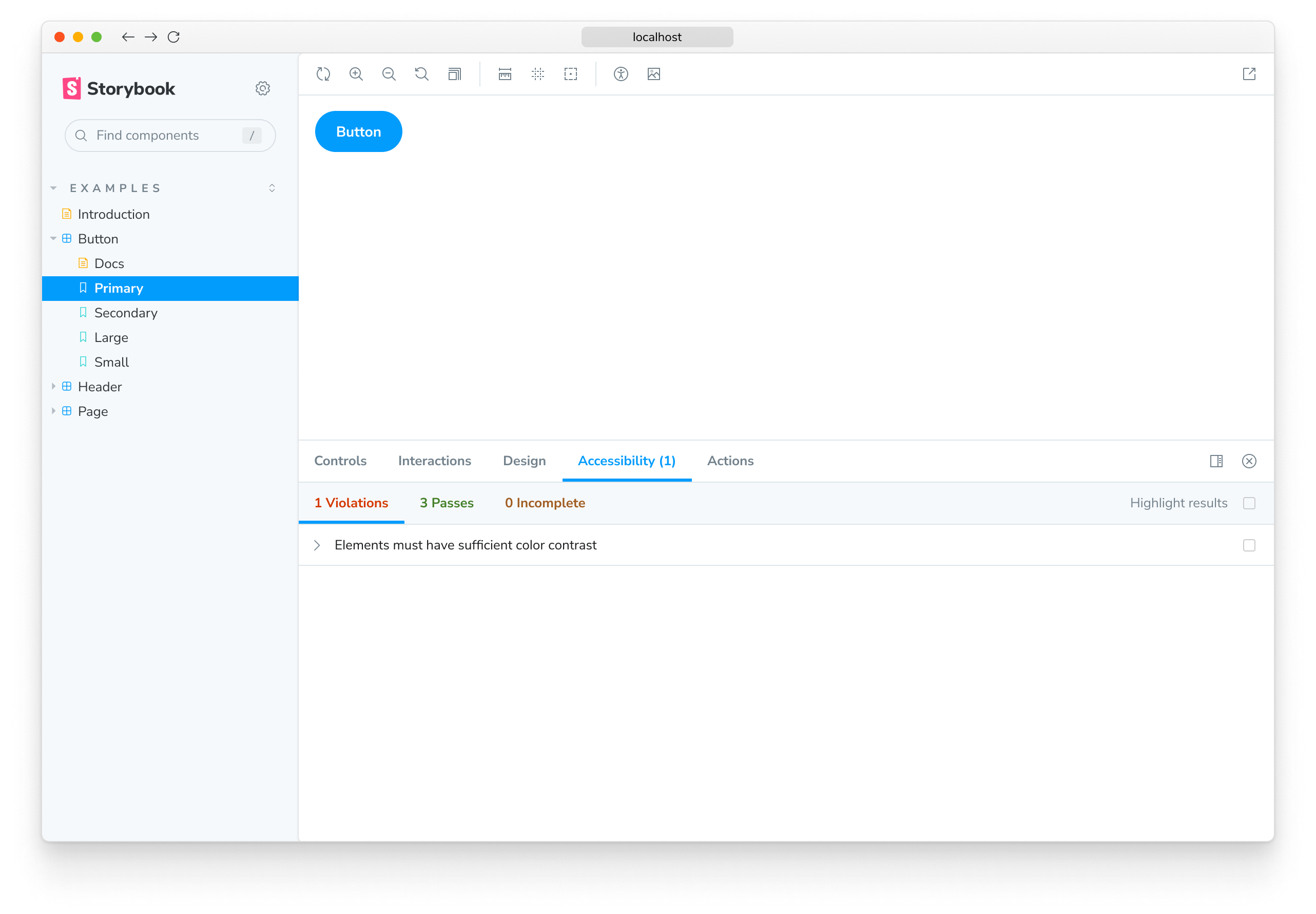
Now when you run Storybook the accessibility testing addon will be enabled.
Using preset addons
Storybook preset addons are grouped collections of specific babel, webpack and addons configurations for distinct use cases. Each one with its own set of instructions. Preset addons have a three-step installation process: install, register and optionally configuration.
For example, to use SCSS styling, run the following command to install the addon and the required dependencies:
# With npm
npm install @storybook/preset-scss css-loader@5.2.7 sass sass-loader@10.1.1 style-loader@2.0.0 --save-dev

# With yarn
yarn add --dev @storybook/preset-scss css-loader@5.2.7 sass sass-loader@10.1.1 style-loader@2.0.0

# With pnpm
pnpm add --save-dev @storybook/preset-scss css-loader@5.2.7 sass sass-loader@10.1.1 style-loader@2.0.0Use the Webpack 5 snippet only if your framework already includes support for this version. Otherwise, use the Webpack 4 snippet.
Next, update .storybook/main.js|ts to the following:
// Replace your-framework with the framework you are using (e.g., react-webpack5, vue3-vite)
import type { StorybookConfig } from '@storybook/your-framework';

const config: StorybookConfig = {
  framework: '@storybook/your-framework',
  stories: ['../src/**/*.mdx', '../src/**/*.stories.@(js|jsx|mjs|ts|tsx)'],
  addons: ['@storybook/preset-scss'],
};

export default config;
Now when you run Storybook it will configure itself to use SCSS styling. No further configuration is needed.
Optional configuration
Most preset addons can also take additional parameters. The most common use cases are:
- Addon configuration
- Webpack loader configuration
Consider the following example:
// Replace your-framework with the framework you are using (e.g., react-webpack5, vue3-vite)
import type { StorybookConfig } from '@storybook/your-framework';

const config: StorybookConfig = {
  // Replace your-framework with the framework you are using (e.g., react-webpack5, vue3-vite)
  framework: '@storybook/your-framework',
  stories: ['../src/**/*.mdx', '../src/**/*.stories.@(js|jsx|mjs|ts|tsx)'],
  addons: [
    {
      name: '@storybook/preset-scss',
      options: {
        cssLoaderOptions: {
          modules: { localIdentName: '[name]__[local]--[hash:base64:5]' },
        },
      },
    },
  ],
};

export default config;Preset addons may also have addon-specific configurations. Read their respective READMEs.
Now, when Storybook starts up, it will update webpack's CSS loader to use modules and adjust how styling is defined.