
Story layout
The layout parameter allows you to configure how stories are positioned in Storybook's Canvas tab.
Global layout
You can add the parameter to your ./storybook/preview.js, like so:
.storybook/preview.ts
// Replace your-framework with the framework you are using (e.g., react, vue3)
import { Preview } from '@storybook/your-framework';

const preview: Preview = {
  parameters: {
    layout: 'centered',
  },
};

export default preview;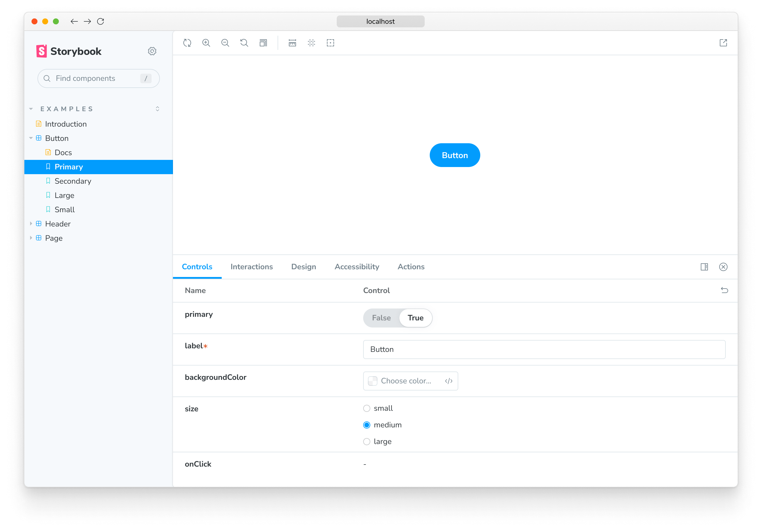
In the example above, Storybook will center all stories in the UI. layout accepts these options:
centered: center the component horizontally and vertically in the Canvasfullscreen: allow the component to expand to the full width and height of the Canvaspadded: (default) Add extra padding around the component
Component layout
You can also set it at a component level like so:
Button.stories.ts|tsx
// Replace your-framework with the name of your framework
import type { Meta } from '@storybook/your-framework';

import { Button } from './Button';

const meta: Meta<typeof Button> = {
  component: Button,
  // Sets the layout parameter component wide.
  parameters: {
    layout: 'centered',
  },
};

export default meta;
Story layout
Or even apply it to specific stories like so:
Button.stories.ts|tsx
// Replace your-framework with the name of your framework
import type { Meta, StoryObj } from '@storybook/your-framework';

import { Button } from './Button';

const meta: Meta<typeof Button> = {
  component: Button,
};

export default meta;
type Story = StoryObj<typeof Button>;

export const WithLayout: Story = {
  parameters: {
    layout: 'centered',
  },
};