
Actions
Watch a video tutorial
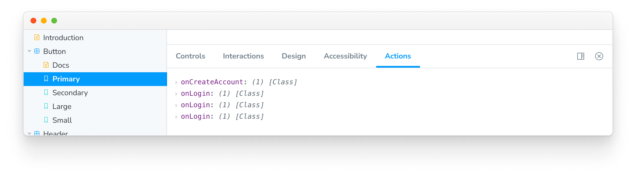
The actions addon is used to display data received by event handler (callback) arguments in your stories.
Action args
Actions work via supplying special Storybook-generated “action” arguments (referred to as "args" for short) to your stories. There are two ways to get an action arg:
Action argType annotation
You can use argTypes to tell Storybook that an arg to your story should be an action. Usually, it makes sense to do this at the component level (although you can apply it per individual story):
// Replace your-framework with the name of your framework
import type { Meta } from '@storybook/your-framework';

import { Button } from './Button';

const meta: Meta<typeof Button> = {
  component: Button,
  argTypes: { onClick: { action: 'clicked' } },
};

export default meta;
When Storybook sees this argType, it will create an arg set to a special “action” callback. If your component calls this arg (based on the user's interaction or through the play function), the event will show up in the action panel:
Automatically matching args
Another option is to use a global parameter to match all argTypes that match a certain pattern. The following configuration automatically creates actions for each on argType (which you can either specify manually or can be inferred automatically).
// Replace your-framework with the framework you are using (e.g., react, vue3)
import { Preview } from '@storybook/your-framework';

const preview: Preview = {
  parameters: {
    actions: { argTypesRegex: '^on.*' },
  },
};

export default preview;
If you need more granular control over which argTypes are matched, you can adjust your stories and include the argTypes parameter. For example:
// Replace your-framework with the name of your framework
import type { Meta } from '@storybook/your-framework';

import { Button } from './Button';

const meta: Meta<typeof Button> = {
  component: Button,
  parameters: { actions: { argTypesRegex: '^on.*' } },
};

export default meta;If you're generating argTypes with another addon (like docs, which is the common behavior), ensure the actions addon AFTER the other addon. You can do this by listing it later in the addons registration code in .storybook/main.js. This is default in essentials.
Action event handlers
It is also possible to detect if your component is emitting the correct HTML events using the parameters.actions.handles parameter.
// Replace your-framework with the name of your framework
import type { Meta } from '@storybook/your-framework';

import { withActions } from '@storybook/addon-actions/decorator';

import { Button } from './Button';

const meta: Meta<typeof Button> = {
  component: Button,
  parameters: {
    actions: {
      handles: ['mouseover', 'click .btn'],
    },
  },
  decorators: [withActions],
};

export default meta;
This will bind a standard HTML event handler to the outermost HTML element rendered by your component and trigger an action when the event is called for a given selector. The format is <eventname> <selector>. The selector is optional; it defaults to all elements.
API
Parameters
This addon contributes the following parameters to Storybook, under the actions namespace:
argTypesRegex
Type: string
Create actions for each arg that matches the regex. Please note the significant limitations of this approach, as described above.
disable
Type: boolean
Disable this addon's behavior. If you wish to disable this addon for the entire Storybook, you should do so when registering addon-essentials. See the essential addon's docs for more information.
This parameter is most useful to allow overriding at more specific levels. For example, if this parameter is set to true at the project level, it could then be re-enabled by setting it to false at the meta (component) or story level.
handles
Type: string[]
Binds a standard HTML event handler to the outermost HTML element rendered by your component and triggers an action when the event is called for a given selector. The format is <eventname> <selector>. The selector is optional; it defaults to all elements.
See the action event handlers section, above, for more information.
Exports
This addon contributes the following exports to Storybook:
import { action } from '@storybook/addon-actions';action
Type: (name?: string) => void
Allows you to create an action that appears in the actions panel of the Storybook UI when clicked. The action function takes an optional name parameter, which is used to identify the action in the UI.
// Replace your-framework with the name of your framework
import type { Meta } from '@storybook/your-framework';
import { action } from '@storybook/addon-actions';

import Button from './Button';

const meta: Meta<typeof Button> {
  component: Button,
  args: {
    // 👇 Create an action that appears when the onClick event is fired
    onClick: action('on-click'),
  },
};

export default meta;
Advanced / legacy usage
There are also some older ways to use actions as documented in the advanced README.