
Toolbars & globals
Watch a video tutorial
Storybook ships with toolbar addons to control the viewport and background the story renders in. You can also create your own toolbar items which control special “globals” which you can then read to create decorators to control story rendering.
Globals
Globals in Storybook represents “global” (as in not story-specific) inputs to the rendering of the story. As they aren’t specific to the story, they aren’t passed in the args argument to the story function (although they are accessible as context.globals), but typically you use them in decorators, which apply to all stories.
When the globals change, the story re-renders, and the decorators rerun with the new values. The easiest way to change globals is to create a toolbar item for them.
Global types and the toolbar annotation
Storybook has a simple, declarative syntax for configuring toolbar menus. In your .storybook/preview.js|ts, you can add your own toolbars by creating globalTypes with a toolbar annotation:
// Replace your-framework with the framework you are using (e.g., react, vue3)
import { Preview } from '@storybook/your-framework';

const preview: Preview = {
  globalTypes: {
    theme: {
      description: 'Global theme for components',
      defaultValue: 'light',
      toolbar: {
        // The label to show for this toolbar item
        title: 'Theme',
        icon: 'circlehollow',
        // Array of plain string values or MenuItem shape (see below)
        items: ['light', 'dark'],
        // Change title based on selected value
        dynamicTitle: true,
      },
    },
  },
};

export default preview;As globals are global you can only set globalTypes in .storybook/preview.js|ts.
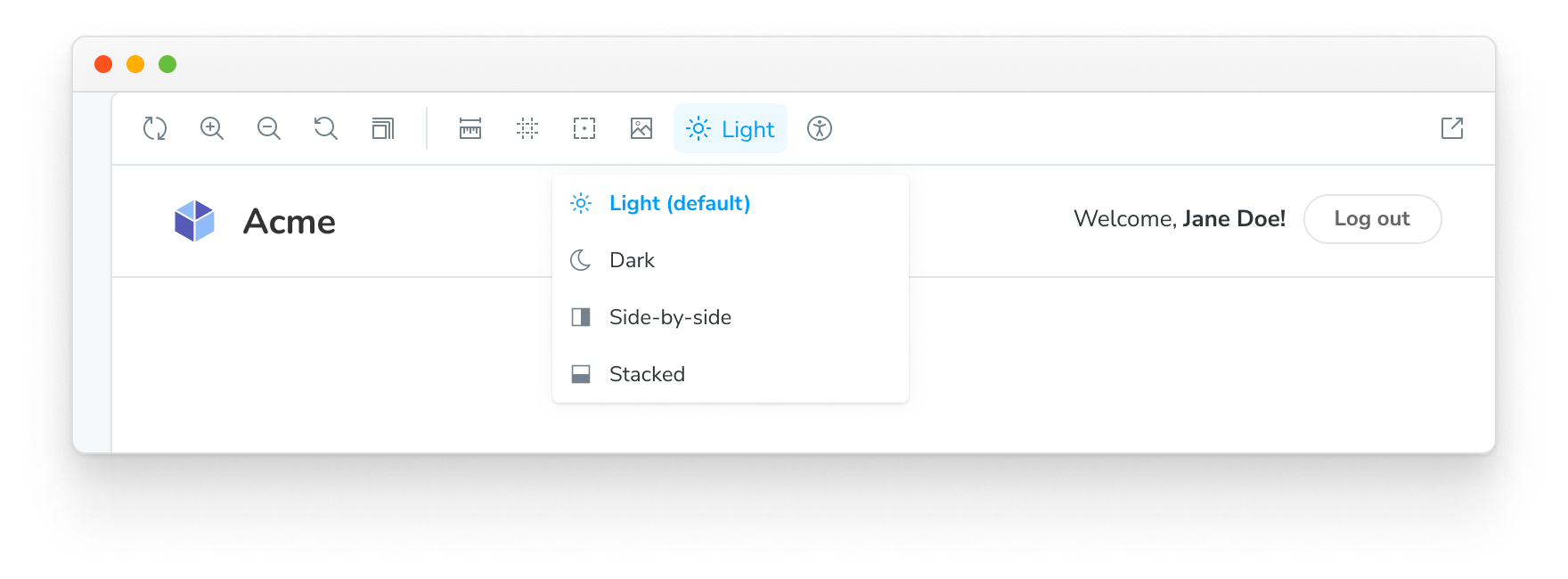
When you start your Storybook, you should see a new dropdown with the light and dark options in your toolbar.
Create a decorator
We have a global implemented. Let's wire it up! We can consume our new theme global in a decorator using the context.globals.theme value.
For example, suppose you are using styled-components. You can add a theme provider decorator to your .storybook/preview.js|ts config:
// Replace your-framework with the framework you are using (e.g., solid, qwik)
import { Preview } from '@storybook/your-framework';

import { MyThemes } from '../my-theme-folder/my-theme-file';

const preview: Preview = {
  decorators: [
    (story, context) => {
      const selectedTheme = context.globals.theme || 'light';
      const theme = MyThemes[selectedTheme];
      return (
        // Your theme provider and other context providers go here
      )
    },
  ],
};

export default preview;
Advanced usage
So far, we've managed to create and consume a global inside Storybook.
Now let's take a look at a more complex example. Let's suppose we wanted to implement a new global called locale for internationalization, which shows a flag on the right side of the toolbar.
In your .storybook/preview.js|ts, add the following:
// Replace your-framework with the framework you are using (e.g., react, vue3)
import { Preview } from '@storybook/your-framework';

const preview: Preview = {
  globalTypes: {
    locale: {
      description: 'Internationalization locale',
      defaultValue: 'en',
      toolbar: {
        icon: 'globe',
        items: [
          { value: 'en', right: '🇺🇸', title: 'English' },
          { value: 'fr', right: '🇫🇷', title: 'Français' },
          { value: 'es', right: '🇪🇸', title: 'Español' },
          { value: 'zh', right: '🇨🇳', title: '中文' },
          { value: 'kr', right: '🇰🇷', title: '한국어' },
        ],
      },
    },
  },
};

export default preview;The icon element used in the examples loads the icons from the @storybook/components package. See here for the list of available icons that you can use.
The @storybook/addon-toolbars addon is required to use toolbars. The toolbars addon is included by default in @storybook/addon-essentials.
By adding the configuration element right, the text will be displayed on the right side in the toolbar menu once you connect it to a decorator.
Here's a list of the configuration options available.
| MenuItem | Type | Description | Required |
|---|---|---|---|
| value | String | The string value of the menu that gets set in the globals | Yes |
| title | String | The main text of the title | Yes |
| left | String | A string that gets shown on the left side of the menu | No |
| right | String | A string that gets displayed on the right side of the menu | No |
| icon | String | An icon that gets shown in the toolbar if this item is selected | No |
Consuming globals from within a story
We recommend consuming globals from within a decorator and define a global setting for all stories.
But we're aware that sometimes it's more beneficial to use toolbar options on a per-story basis.
Using the example above, you can modify any story to retrieve the Locale global from the story context:
import type { Meta, StoryObj } from '@storybook/react';

import { MyComponent } from './MyComponent';

const meta: Meta<typeof MyComponent> = {
  component: MyComponent,
};

export default meta;
type Story = StoryObj<typeof MyComponent>;

const getCaptionForLocale = (locale) => {
  switch (locale) {
    case 'es':
      return 'Hola!';
    case 'fr':
      return 'Bonjour!';
    case 'kr':
      return '안녕하세요!';
    case 'zh':
      return '你好!';
    default:
      return 'Hello!';
  }
};

export const StoryWithLocale = {
  render: (args, { globals: { locale } }) => {
    const caption = getCaptionForLocale(locale);
    return <p>{caption}</p>;
  },
};In Storybook 6.0, if you set the global option passArgsFirst: false for backward compatibility, the story context is passed as the first argument:
export const StoryWithLocale = ({ globals: { locale } }) => {
  const caption = getCaptionForLocale(locale);
  return <p>{caption}</p>;
};
Consuming globals from within an addon
If you're working on a Storybook addon and need to retrieve globals, you can do so. The @storybook/manager-api package provides a hook for this scenario. You can use the useGlobals() hook to retrieve any globals you want.
Using the ThemeProvider example above, you could expand it to display which theme is active inside a panel as such:
import React from 'react';

import { useGlobals } from '@storybook/manager-api';

import { AddonPanel, Placeholder, Separator, Source, Spaced, Title } from '@storybook/components';

import { MyThemes } from '../my-theme-folder/my-theme-file';

// Function to obtain the intended theme
const getTheme = (themeName) => {
  return MyThemes[themeName];
};

const ThemePanel = (props) => {
  const [{ theme: themeName }] = useGlobals();

  const selectedTheme = getTheme(themeName);

  return (
    <AddonPanel {...props}>
      {selectedTheme ? (
        <Spaced row={3} outer={1}>
          <Title>{selectedTheme.name}</Title>
          <p>The full theme object</p>
          <Source
            code={JSON.stringify(selectedTheme, null, 2)}
            language="js"
            copyable
            padded
            showLineNumbers
          />
        </Spaced>
      ) : (
        <Placeholder>No theme selected</Placeholder>
      )}
    </AddonPanel>
  );
};
Updating globals from within an addon
If you're working on a Storybook addon that needs to update the global and refreshes the UI, you can do so. As mentioned previously, the @storybook/manager-api package provides the necessary hook for this scenario. You can use the updateGlobals function to update any global values you need.
For example, if you were working on a toolbar addon, and you want to refresh the UI and update the global once the user clicks on a button:
import React, { useCallback } from 'react';

import { FORCE_RE_RENDER } from '@storybook/core-events';
import { useGlobals } from '@storybook/manager-api';

import { IconButton, Icons } from '@storybook/components';

import { addons } from '@storybook/preview-api';

const ExampleToolbar = () => {
  const [globals, updateGlobals] = useGlobals();

  const isActive = globals['my-param-key'] || false;

  // Function that will update the global value and trigger a UI refresh.
  const refreshAndUpdateGlobal = () => {
    // Updates Storybook global value
    updateGlobals({
      ['my-param-key']: !isActive,
    }),
      // Invokes Storybook's addon API method (with the FORCE_RE_RENDER) event to trigger a UI refresh
      addons.getChannel().emit(FORCE_RE_RENDER);
  };

  const toggleOutline = useCallback(() => refreshAndUpdateGlobal(), [isActive]);

  return (
    <IconButton
      key="Example"
      active={isActive}
      title="Show a Storybook toolbar"
      onClick={toggleOutline}
    >
      <Icons icon="outline" />
    </IconButton>
  );
};