
Title
Watch a video tutorial
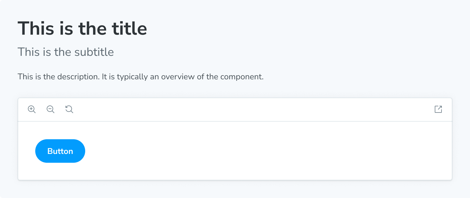
The Title block serves as the primary heading for your docs entry. It is typically used to provide the component or page name.
import { Title } from '@storybook/blocks';

<Title>This is the title</Title>
Title
import { Title } from '@storybook/blocks';Title is configured with the following props:
children
Type: JSX.Element | string
Provides the content. Falls back to value of title in an attached CSF file (or value derived from autotitle), trimmed to the last segment. For example, if the title value is 'path/to/components/Button', the default content is 'Button'.