
Theming
Watch a video tutorial
Storybook is theme-able using a lightweight theming API.
Global theming
It's possible to theme Storybook globally.
Storybook includes two themes that look good out of the box: "light" and "dark". Unless you've set your preferred color scheme as dark, Storybook will use the light theme as default.
Make sure you have installed @storybook/manager-api and @storybook/theming packages.
npm install --save-dev @storybook/manager-api @storybook/themingAs an example, you can tell Storybook to use the "dark" theme by modifying .storybook/manager.js:
import { addons } from '@storybook/manager-api';
import { themes } from '@storybook/theming';

addons.setConfig({
  theme: themes.dark,
});
When setting a theme, set a complete theme object. The theme is replaced, not combined.
Theming docs
Storybook Docs uses the same theme system as Storybook’s UI but is themed independently from the main UI.
Supposing you have a Storybook theme defined for the main UI in .storybook/manager.js:
import { addons } from '@storybook/manager-api';
import { themes } from '@storybook/theming';

addons.setConfig({
  theme: themes.dark,
});
Here's how you'd specify the same theme for docs in .storybook/preview.js:
// Replace your-framework with the framework you are using (e.g., react, vue3)
import { Preview } from '@storybook/your-framework';

import { themes } from '@storybook/theming';

const preview: Preview = {
  parameters: {
    docs: {
      theme: themes.dark,
    },
  },
};

export default preview;
Continue to read if you want to learn how to create your theme.
Create a theme quickstart
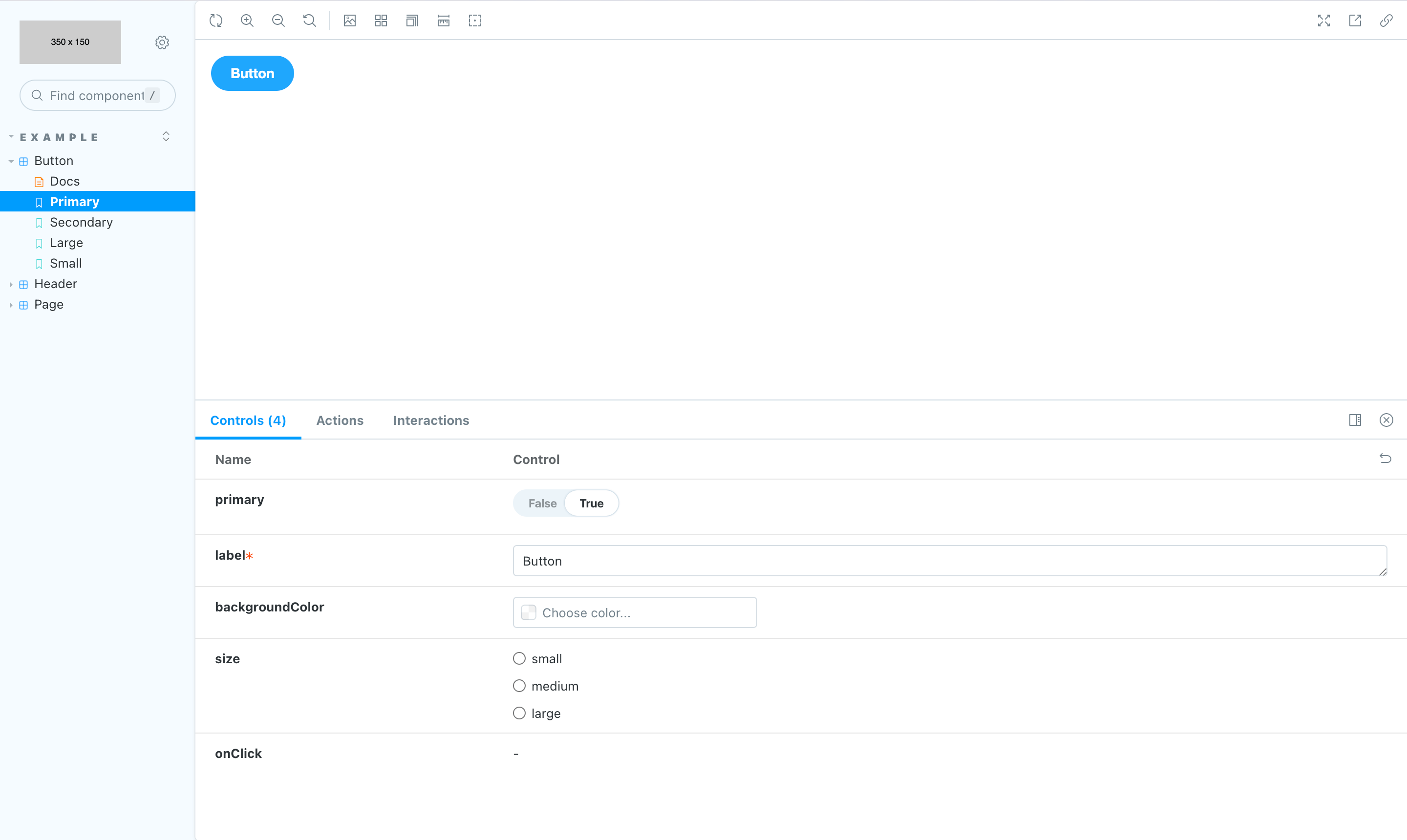
The easiest way to customize Storybook is to generate a new theme using the create() function from storybook/theming. This function includes shorthands for the most common theme variables. Here's how to use it:
Inside your .storybook directory, create a new file called YourTheme.js and add the following:
import { create } from '@storybook/theming/create';

export default create({
  base: 'light',
  brandTitle: 'My custom Storybook',
  brandUrl: 'https://example.com',
  brandImage: 'https://storybook.js.org/images/placeholders/350x150.png',
  brandTarget: '_self',
});If you're using brandImage to add your custom logo, you can use any of the most common image formats.
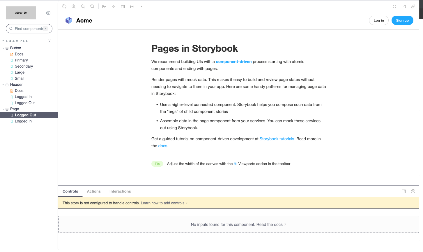
Above, we're creating a new theme that will:
- Use Storybook's
lighttheme as a baseline. - Replace Storybook's logo in the sidebar with our own (defined in the brandImage variable).
- Add custom branding information.
- Set the brand link to open in the same window (as opposed to a new one), via the
targetattribute.
Finally, we'll need to import the theme into Storybook. Create a new file called manager.js in your .storybook directory and add the following:
import { addons } from '@storybook/manager-api';
import yourTheme from './YourTheme';

addons.setConfig({
  theme: yourTheme,
});
Now your custom theme will replace Storybook's default theme, and you'll see a similar set of changes in the UI.
Let's take a look at a more complex example. Copy the code below and paste it in .storybook/YourTheme.js.
import { create } from '@storybook/theming/create';

export default create({
  base: 'light',
  // Typography
  fontBase: '"Open Sans", sans-serif',
  fontCode: 'monospace',

  brandTitle: 'My custom Storybook',
  brandUrl: 'https://example.com',
  brandImage: 'https://storybook.js.org/images/placeholders/350x150.png',
  brandTarget: '_self',

  //
  colorPrimary: '#3A10E5',
  colorSecondary: '#585C6D',

  // UI
  appBg: '#ffffff',
  appContentBg: '#ffffff',
  appPreviewBg: '#ffffff',
  appBorderColor: '#585C6D',
  appBorderRadius: 4,

  // Text colors
  textColor: '#10162F',
  textInverseColor: '#ffffff',

  // Toolbar default and active colors
  barTextColor: '#9E9E9E',
  barSelectedColor: '#585C6D',
  barBg: '#ffffff',

  // Form colors
  inputBg: '#ffffff',
  inputBorder: '#10162F',
  inputTextColor: '#10162F',
  inputBorderRadius: 2,
});
Above, we're updating the theme with the following changes:
- A custom color palette (defined in the
appandcolorvariables). - Custom fonts (defined in the
fontandtextvariables).
With the new changes introduced, the custom theme should yield a similar result.
Many theme variables are optional, the base property is NOT.
The @storybook/theming package is built using TypeScript, which should help create a valid theme for TypeScript users. The types are part of the package itself.
CSS escape hatches
The Storybook theme API is narrow by design. If you want to have fine-grained control over the CSS, all UI and Docs components are tagged with class names to make this possible. Use at your own risk as this is an advanced feature.
To style these elements, insert style tags into:
- For Storybook’s UI, use
.storybook/manager-head.html - For Storybook Docs, use
.storybook/preview-head.html
The same way as you can adjust your preview’s head tag, Storybook allows you to modify the code on the manager's side, through .storybook/manager-head.html. It can be helpful when adding theme styles that target Storybook's HTML, but it comes with a cost as Storybook's inner HTML can change at any time through the release cycle.
MDX component overrides
If you're using MDX for docs, there's one more level of "themability". MDX allows you to completely override the rendered components from Markdown using a components parameter. It's an advanced usage that we don't officially support in Storybook, but it's a powerful construct if you need it.
Here's how you might insert a custom code renderer for code blocks on the page, in .storybook/preview.js:
// Replace your-framework with the framework you are using (e.g., react, vue3)
import { Preview } from '@storybook/your-framework';

import { CodeBlock } from './CodeBlock';

const preview: Preview = {
  parameters: {
    docs: {
      components: {
        code: CodeBlock,
      },
    },
  },
};

export default preview;
You can even override a Storybook block component.
Here's how you might insert a custom <Canvas /> block:
// Replace your-framework with the framework you are using (e.g., react, vue3)
import { Preview } from '@storybook/your-framework';

import { MyCanvas } from './MyCanvas';

const preview: Preview = {
  parameters: {
    docs: {
      components: {
        Canvas: MyCanvas,
      },
    },
  },
};

export default preview;
Addons and theme creation
Some addons require specific theme variables that a Storybook user must add. If you share your theme with the community, make sure to support the official API and other popular addons, so your users have a consistent experience.
For example, the popular Actions addon uses react-inspector, which has themes of its own. Supply additional theme variables to style it like so:
addonActionsTheme: {
  ...chromeLight,
  BASE_FONT_FAMILY: typography.fonts.mono,
  BASE_BACKGROUND_COLOR: 'transparent',
}
Using the theme for addon authors
Reuse the theme variables above for a native Storybook developer experience. The theming engine relies on emotion, a CSS-in-JS library.
import { styled } from '@storybook/theming';Use the theme variables in object notation:
const Component = styled.div(({ theme }) => ({
  background: theme.background.app,
  width: 0,
}));
Or with template literals:
const Component = styled.div`
  background: `${props => props.theme.background.app}`
  width: 0;
`;