
Manifests
While they are in preview, Storybook's AI capabilities (specifically, the manifests and MCP server) are currently only supported for React projects.
Additionally, the API may change in future releases. We welcome feedback and contributions to help improve this feature.
Your Storybook holds a wealth of information about your components: their names, descriptions, API, usage examples, and more. Manifests are JSON objects that describe the contents of your Storybook in a concise, structured way that is easy for AI agents to understand and use. The manifests are generated automatically from your Storybook's CSF and MDX files, and they are designed to be comprehensive and up-to-date representations of your Storybook's contents.
There are two types of manifests generated by Storybook: components and docs.
Components manifest
The components manifest is generated from static analysis of the CSF files in your Storybook and prop type extraction from their associated component source code. It contains information about the components you have documented, such as their names, descriptions, props, and usage examples. This manifest is designed to help AI agents understand which components are available and how to use them.
For prop type extraction, the manifest generation will use whatever is specified in the reactDocgen option, or react-docgen by default. We recommend using react-docgen-typescript for most projects, because it provides more accurate and comprehensive information about your components' props. If manifest generation seems too slow, you can switch to react-docgen, which is faster but less detailed.
When experimentalDocgenServer is enabled, prop type extraction runs server-side via React Component Meta instead, and manifests use a ref-based format with per-component JSON snapshots when combined with componentsManifest.
While the types themselves provide a basic level of information, JSDoc comments in your component source code can provide additional metadata for the manifest, which can be helpful for AI agents. We highly recommend adding JSDoc comments to your components and their props to provide as much context as possible for the agents. For example:
import React from 'react';

type ButtonProps = {
  /**
   * Optional click handler
   */
  onClick?: () => void;
};

/**
 * Button is used for user interactions that do not navigate to another route.
 * For navigation, use [Link](?path=/docs/link--default) instead.
 */
export const Button: React.FC<ButtonProps> = ({ onClick }) => {
  //...
};Check the best practices guide for tips on writing effective JSDoc comments for your components and other ways to provide helpful context for the agents.
If a story file declares subcomponents, the components manifest will also include a subcomponents object for that component. This gives agents supplemental API documentation for child components, even when those subcomponents are only meant to be used together with the parent.
The raw JSON components manifest can be accessed at http://localhost:6006/manifests/components.json (your port may vary) when your Storybook is running or at the /manifests/components.json route in a built Storybook.
Example components manifest entry
While in preview, this manifest schema is not yet stable and should not be considered a public API. We include it here only as an aid for understanding.
{
  "components": {
    "components-button": {
      "id": "components-button",
      "name": "Button",
      "path": "./src/components/Button/Button.stories.tsx",
      "stories": [
        {
          "id": "components-button--default",
          "name": "Default",
          "snippet": "const Default = () =\u003E \u003CButton\u003EButton\u003C/Button\u003E;"
        },
        {
          "id": "components-button--disabled",
          "name": "Disabled",
          "snippet": "const Disabled = () =\u003E \u003CButton disabled\u003EButton\u003C/Button\u003E;"
        }
      ],
      "import": "import { Button } from \"@mealdrop/ui\";",
      "jsDocTags": {},
      "description": "Primary UI component for user interaction",
      "reactDocgen": {
        "description": "Primary UI component for user interaction",
        "methods": [],
        "displayName": "Button",
        "definedInFile": "/path/to/project/src/components/Button/Button.tsx",
        "actualName": "Button",
        "exportName": "Button",
        "props": {
          "clear": {
            "required": false,
            "tsType": {
              "name": "boolean"
            },
            "description": "Clear button styles leaving just a text",
            "defaultValue": {
              "value": "false",
              "computed": false
            }
          },
          "round": {
            "required": false,
            "tsType": {
              "name": "boolean"
            },
            "description": "",
            "defaultValue": {
              "value": "false",
              "computed": false
            }
          },
          "large": {
            "required": false,
            "tsType": {
              "name": "boolean"
            },
            "description": "Is the button large?",
            "defaultValue": {
              "value": "false",
              "computed": false
            }
          },
          "icon": {
            "required": false,
            "tsType": {
              "name": "union",
              "raw": "| 'arrow-right'\n| 'arrow-left'\n| 'cross'\n| 'cart'\n| 'minus'\n| 'plus'\n| 'moon'\n| 'sun'\n| 'star'",
              "elements": [
                {
                  "name": "literal",
                  "value": "'arrow-right'"
                },
                {
                  "name": "literal",
                  "value": "'arrow-left'"
                },
                {
                  "name": "literal",
                  "value": "'cross'"
                },
                {
                  "name": "literal",
                  "value": "'cart'"
                },
                {
                  "name": "literal",
                  "value": "'minus'"
                },
                {
                  "name": "literal",
                  "value": "'plus'"
                },
                {
                  "name": "literal",
                  "value": "'moon'"
                },
                {
                  "name": "literal",
                  "value": "'sun'"
                },
                {
                  "name": "literal",
                  "value": "'star'"
                }
              ]
            },
            "description": "Does the button have an icon?"
          },
          "iconSize": {
            "required": false,
            "tsType": {
              "name": "number"
            },
            "description": "Size of the icon"
          },
          "disabled": {
            "required": false,
            "tsType": {
              "name": "boolean"
            },
            "description": "Is the button disabled?"
          },
          "children": {
            "required": false,
            "tsType": {
              "name": "union",
              "raw": "string | React.ReactNode",
              "elements": [
                {
                  "name": "string"
                },
                {
                  "name": "ReactReactNode",
                  "raw": "React.ReactNode"
                }
              ]
            },
            "description": "The content of the button"
          },
          "onClick": {
            "required": false,
            "tsType": {
              "name": "signature",
              "type": "function",
              "raw": "() =\u003E void",
              "signature": {
                "arguments": [],
                "return": {
                  "name": "void"
                }
              }
            },
            "description": "Optional click handler"
          }
        }
      }
    }
  }
}
Docs (MDX) manifest
The docs manifest is generated from the MDX files in your Storybook. These files are used to document specific components or to create standalone documentation pages (e.g. a "Getting Started" guide, accessibility guidelines, design tokens, etc.), all of which can offer helpful context to the agent.
The raw JSON docs manifest can be accessed at http://localhost:6006/manifests/docs.json (your port may vary) when your Storybook is running or at the /manifests/docs.json route in a built Storybook.
Check the best practices guide for tips on writing effective documentation and providing helpful context for the agents.
Example docs manifest entry
While in preview, this manifest schema is not yet stable and should not be considered a public API. We include it here only as an aid for understanding.
{
  "docs": {
    "design-system-typography--docs": {
      "id": "design-system-typography--docs",
      "name": "Docs",
      "path": "./src/docs/Typography.mdx",
      "title": "Design System/Typography",
      "content": "import { Meta, Typeset } from '@storybook/addon-docs/blocks'\n\n\u003CMeta title=\"Design System/Typography\" /\u003E\n\n# Typography\n\n## Font: Hind\n\nUsed for body texts, descriptions and general info\n\n**Weight:** 400(regular)\n\n\u003CTypeset\n  sampleText=\"Feel like having pizza, sushi or your favourite dish from Tatooine?\"\n  fontSizes={[12, 14, 18, 24]}\n  fontWeight={400}\n  fontFamily=\"Hind\"\n/\u003E\n\n**Weight:** 500(medium)\n\n\u003CTypeset\n  sampleText=\"Feel like having pizza, sushi or your favourite dish from Tatooine?\"\n  fontSizes={[12, 14, 18, 24]}\n  fontWeight={500}\n  fontFamily=\"Hind\"\n/\u003E\n\n## Font: Montserrat\n\nUsed for headings and titles\n\n**Weight:** 400 (regular)\n\n\u003CTypeset\n  sampleText=\"Feel like having pizza, sushi or your favourite dish from Tatooine?\"\n  fontSizes={[12, 14, 18, 24]}\n  fontWeight={400}\n  fontFamily=\"Montserrat\"\n/\u003E\n\n**Weight:** 500 (medium)\n\n\u003CTypeset\n  sampleText=\"Feel like having pizza, sushi or your favourite dish from Tatooine?\"\n  fontSizes={[12, 14, 18, 24]}\n  fontWeight={500}\n  fontFamily=\"Montserrat\"\n/\u003E\n\n**Weight:** 700 (bold)\n\n\u003CTypeset\n  sampleText=\"Feel like having pizza, sushi or your favourite dish from Tatooine?\"\n  fontSizes={[12, 14, 18, 24]}\n  fontWeight={700}\n  fontFamily=\"Montserrat\"\n/\u003E\n\n**Weight:** 900 (black)\n\n\u003CTypeset\n  sampleText=\"Feel like having pizza, sushi or your favourite dish from Tatooine?\"\n  fontSizes={[12, 14, 18, 24]}\n  fontWeight={900}\n  fontFamily=\"Montserrat\"\n/\u003E\n"
    }
  }
}
Debugging
To help you get a better picture of what is and is not in the manifests, Storybook provides a combined manifest debugger at http://localhost:6006/manifests/components.html (your port may vary). This page shows the contents of both the component and docs manifests in a human-readable format, along with any errors or warnings that were encountered during manifest generation.
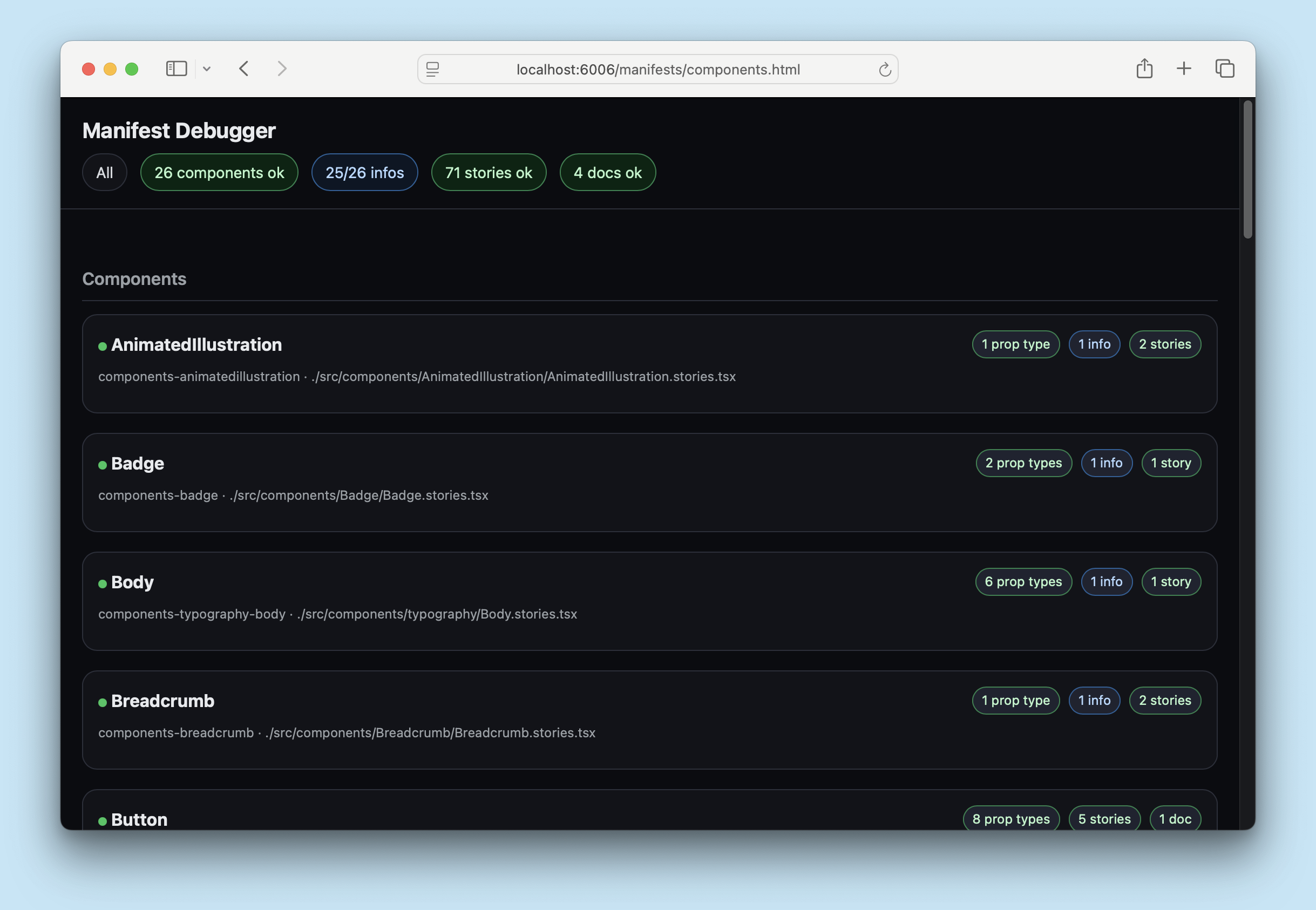
At the top of the page, you can see any errors or warnings that were encountered during manifest generation. You can click these buttons to filter the manifest to show only the relevant entries, which can be helpful for debugging.
Curating
By default, all stories and independent docs pages have the manifest tag applied, which means they will be included in the manifests. You can curate what is included in the manifests by adding or removing the manifest tag from your stories and docs pages. For example, if you have a story that is for instructional purposes only and the agent should not be aware of it, you can remove the manifest tag from that story to exclude it from the manifests:
// Replace your-framework with the framework you are using, e.g. react-vite, nextjs, nextjs-vite, etc.
import type { Meta, StoryObj } from '@storybook/your-framework';

import { MyComponent } from './MyComponent';

const meta = {
  component: MyComponent,
} satisfies Meta<typeof MyComponent>;

export default meta;

type Story = StoryObj<typeof meta>;

// 👇 This story will be included in the manifest because it has the implicit 'manifest' tag
export const Basic = {};

export const ForInstructionOnly = {
  tags: ['!manifest'], // 👈 Remove the 'manifest' tag to exclude this story from the manifests
};
You can also remove an entire component from the manifest by removing the tag in the file's meta (or default export), which will exclude all stories in that file from the manifests.
Similarly, to exclude an entire MDX docs page from the manifests, you can remove the manifest tag from the page's metadata:
import { Meta } from '@storybook/addon-docs/blocks';

<Meta title="Doc for Humans Only" tags={['!manifest']} />
More AI resources