
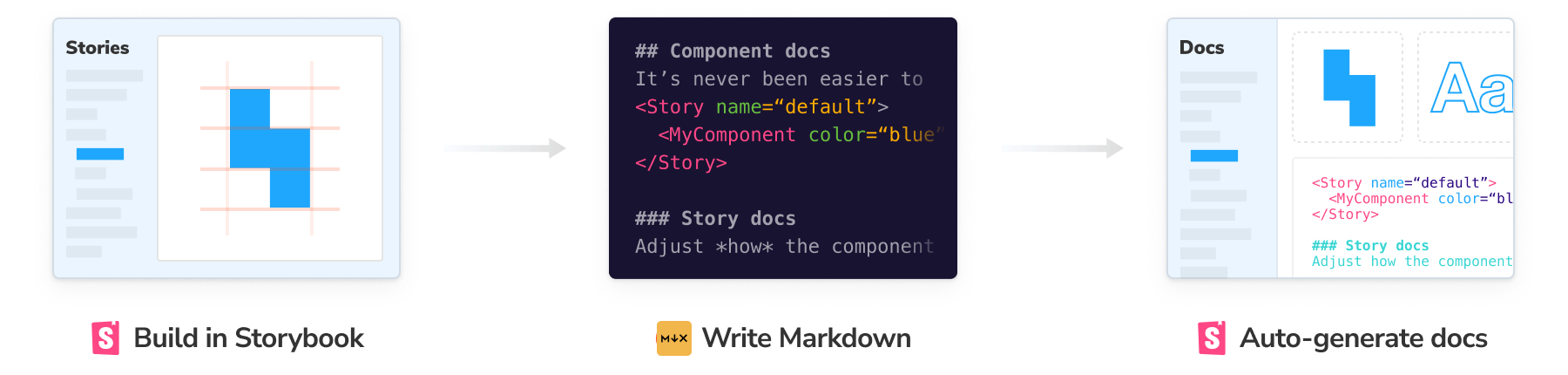
MDX
MDX files mix Markdown and Javascript/JSX to create rich interactive documentation. You can use Markdown’s readable syntax (such as # heading) for your documentation, include stories defined in Component Story Format (CSF), and freely embed JSX component blocks at any point in the file. All at once.
In addition, you can write pure documentation pages in MDX and add them to Storybook alongside your stories.
Basic example
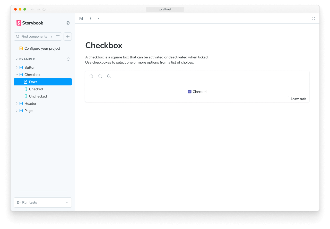
Let's start with an example, Checkbox.mdx, combining Markdown with a single story.
import { Canvas, Meta } from '@storybook/addon-docs/blocks';

import * as CheckboxStories from './Checkbox.stories';

<Meta of={CheckboxStories} />

# Checkbox

A checkbox is a square box that can be activated or deactivated when ticked.

Use checkboxes to select one or more options from a list of choices.

<Canvas of={CheckboxStories.Unchecked} />
This MDX file references a story file, Checkbox.stories.js|ts, that is written in Component Story Format (CSF):
// Replace your-framework with the framework you are using, e.g. react-vite, nextjs, vue3-vite, etc.
import type { Meta, StoryObj } from '@storybook/your-framework';

import { Checkbox } from './Checkbox';

const meta = {
  component: Checkbox,
} satisfies Meta<typeof Checkbox>;

export default meta;
type Story = StoryObj<typeof meta>;

export const Unchecked: Story = {
  args: {
    label: 'Unchecked',
  },
};
And here's how that's rendered in Storybook:
There’s a lot going on here. We're writing Markdown, we're writing JSX, and we're also defining and referencing Storybook stories that are drop-in compatible with the entire Storybook ecosystem.
Let’s break it down.
MDX and CSF
The first thing you'll notice is that the component documentation is divided into distinct formats: one for writing component stories describing each possible component state and the second one for documenting how to use them. This split leverages the best qualities of each format:
- CSF is great for succinctly defining stories (component examples). If you use TypeScript, it also provides type safety and auto-completion.
- MDX is great for writing structured documentation and composing it with interactive JSX elements.
Anatomy of MDX
Assuming you’re already familiar with writing stories with CSF, we can dissect the MDX side of things in greater detail.
The document consists of a number of blocks separated by blank lines. Since MDX mixes a few different languages together, it uses those blank lines to help distinguish where one starts, and the next begins. Failing to separate blocks by whitespace can cause (sometimes cryptic) parse errors.
Going through the code blocks in sequence:
{/* Checkbox.mdx */}Comments in MDX are JSX blocks that contain JS comments.
import { Canvas, Meta } from '@storybook/addon-docs/blocks';

import * as CheckboxStories from './Checkbox.stories';
Imports the components and stories that will be used in the JSX throughout the rest of the file.
import { Meta } from '@storybook/addon-docs/blocks';

import * as CheckboxStories from './Checkbox.stories';

<Meta of={CheckboxStories} />When providing the of prop to the Meta block, make sure that you're referencing the full set of exports of the story file and not the component itself to prevent render issues with the generated documentation.
The Meta block defines where the document will be placed in the sidebar. In this case, it is adjacent to the Checkbox’s stories. By default, the docs sidebar node is titled "Docs", but this can be customized by passing a name prop (e.g., <Meta of={CheckboxStories} name="Info" />). If you want to place a docs node at an arbitrary point in the navigation hierarchy, you can use the title prop (e.g., <Meta title="path/to/node" />).
# Checkbox

A checkbox is a square box that can be activated or deactivated when ticked.

Use checkboxes to select one or more options from a list of choices.
MDX supports standard markdown ("commonmark") by default and can be extended to support GitHub Flavored Markdown (GFM) and other extensions (see the Troubleshooting section to learn more about some of the current limitations).
import { Canvas } from '@storybook/addon-docs/blocks';

import * as CheckboxStories from './Checkbox.stories';

<Canvas of={CheckboxStories.Unchecked} />
Finally, MDX supports blocks of arbitrary JSX.
In this case, we are leveraging “Doc Blocks”, a library of documentation components designed to work with Storybook stories to show your stories, your component APIs & controls for interacting with your components inside your documentation, among other utilities.
In addition to Doc Blocks, MDX can incorporate arbitrary React components, making it a very flexible documentation system. Suppose you want a stylized list of “dos and don’ts” for your component; you can use off-the-shelf components or write your own.
<Guidelines>
  <Dos>
    - Use buttons for the main actions on your page
    - Identify the primary action and make it `primary`
  </Dos>
  <Donts>
    - Use a button when a link will do (e.g., for navigation-only actions)
    - Use multiple `primary` buttons in a single UI state
  </Donts>
</Guidelines>
Known limitations
While MDX supports a variety of runtimes (React, Preact, Vue), Storybook’s implementation is React-only. That means your documentation is rendered in React, while your stories render in the runtime of your choice (React, Vue, Angular, Web Components, Svelte, etc.).
Setup custom documentation
In addition, to document your components with MDX, you can also extend it to write other types of content, such as guidelines or best practices on how to use them. To enable custom documentation for your stories with this format, start by updating your Storybook configuration file (i.e., .storybook/main.js|ts|cjs).
// Replace your-framework with the framework you are using, e.g. react-vite, nextjs, vue3-vite, etc.
import type { StorybookConfig } from '@storybook/your-framework';

const config: StorybookConfig = {
  // Replace your-framework with the framework you are using, e.g. react-vite, nextjs, vue3-vite, etc.
  framework: '@storybook/your-framework',
  stories: [
    //👇 Your documentation written in MDX along with your stories goes here
    '../src/**/*.mdx',
    '../src/**/*.stories.@(js|jsx|mjs|ts|tsx)',
  ],
  addons: ['@storybook/addon-docs'],
};

export default config;
Create an MDX file to add your custom documentation. Depending on how you want your documentation to render in the UI, you'll need to consider the following use cases.
Using the Meta Doc Block
If you need to match the component documentation to an existing story, you can configure the Meta Doc Block to control how the documentation gets rendered. Out of the box, it allows you to define a custom title or a reference to the story you need to document (i.e., via the of prop). For example:
import { Meta, Controls } from '@storybook/addon-docs/blocks';

<Meta title="Button" />

# Definition

Button is a clickable interactive element that triggers a response.

You can place text and icons inside of a button.

Buttons are often used for form submissions and to toggle elements into view.

## Usage

The component comes in different variants such as `primary`, `secondary`, `large` and `small` which you can use to alter the look and feel of the button.

## Inputs

Button has the following properties:

<Controls />
Writing unattached documentation
Suppose you're documenting an existing component and only provide the Meta Doc Block without additional props or other blocks. In that case, Storybook will consider it as "unattached" documentation, or in other words, a "documentation-only" page, and it will render it differently in the sidebar navigation menu:
import { Meta } from '@storybook/addon-docs/blocks';

import * as ExampleComponentStories from './ExampleComponent.stories';

{/* 👇 Documentation-only page */}

<Meta title="Documentation" />

{/* 👇 Component documentation page */}

<Meta of={ExampleComponentStories} />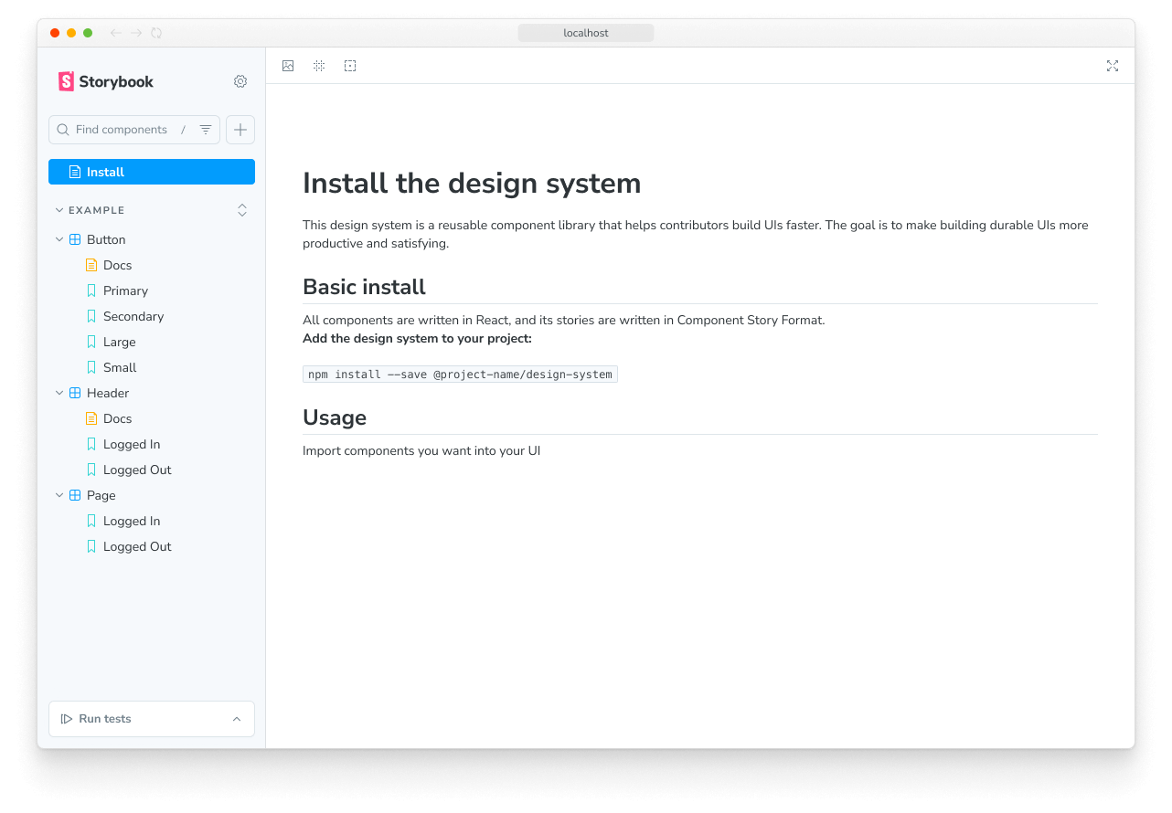
Using the File System
However, providing the Meta Doc Block may not be required for certain use cases, such as standalone pages or even as guidelines for testing your components. In that case, you can safely omit it. Storybook will instead rely on the file's physical location to place the documentation in the sidebar, overriding any pre-existent auto-generated documentation with your own. For example:
# Select

Select is a type of input that allows users to choose one or more options from a list of choices.

The options are hidden by default and revealed when a user interacts with an element.

It shows the currently selected option in its default collapsed state.

## Design implementation

To help users get acquainted with the existing UI elements, it is recommended to use check the Figma file to see how the select input is implemented.

### When to use?

In a select input where there are less than 3-4 items, consider using radio boxes, or radio inputs instead.

### How to use?

To help users understand the options available in a select input, include a default option that is unselectable and acts as a label.If you're overriding an existing auto-generated documentation page enabled via tags configuration property, we recommend removing it to avoid errors.
Once the custom MDX documentation is loaded, Storybook will infer the title and location using the same heuristic rules to generate auto-title stories and render it in the sidebar as a Docs entry.
Working with standalone documentation pages
Writing standalone documentation pages is a common use case that applies not only on a per-component but also on a per-project basis. For example, you might want to document your project's onboarding process with instructions on using it. To do so, you can create a new MDX file containing your documentation using a similar structure and content:
# Getting Started

Welcome! Whether you're a designer or a developer, this guide will help you get started and connect you to the essential resources you need.

## Table of Contents

- [Design Resources](#design-resources)

  - [Figma](#figma)
  - [UI/UX Design Guidelines](#uiux-design-guidelines)
  - [Design Assets](#design-assets)

- [Development Resources](#development-resources)
  - [Coding Standards](#coding-standards)
  - [Version Control](#version-control)
  - [Development Tools](#development-tools)

---

## Design Resources

### Figma

[Figma](https://www.figma.com/) is a collaborative design and prototyping tool. It's the heart of the design process, allowing designers to work together seamlessly.

- **Get Access**: If you're not already part of the Figma project, request access from the project lead or manager.

### UI/UX Design Guidelines

Before you dive into designing, familiarize yourself with our UI/UX design guidelines. They provide valuable insights into our design philosophy and standards.

- [UI/UX Guidelines Document](https://your-design-guidelines-link.com)

### Design Assets

All the essential design assets like logos, icons, and brand guidelines can be found in the Figma project. Ensure you have access and familiarize yourself with these assets for consistency.

---

## Development Resources

### Coding Standards

Maintaining a consistent code style is essential for collaborative development. Our coding standards document will guide you on best practices.

- [Coding Standards Document](https://your-coding-standards-link.com)

### Version Control

We use Git for version control. Make sure you have Git installed and are familiar with its basics.

### Development Tools

Your development environment is critical. Here are some tools and resources to help you set up your workspace:

- **Code Editor**: We recommend using [Visual Studio Code](https://code.visualstudio.com/) for development. It's highly customizable and supports a wide range of extensions.

- **Package Manager**: [npm](https://www.npmjs.com/) is the package manager we use for JavaScript projects. Install it to manage project dependencies.

---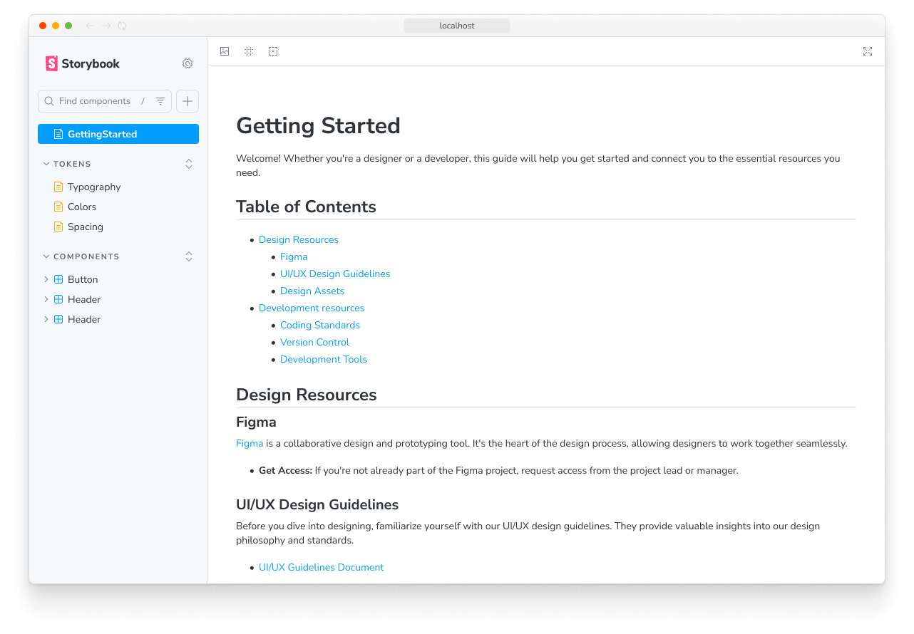
When Storybook loads the documentation, it will infer the placement of the page in the sidebar navigation menu using the file's physical location and render it as a Docs entry.
Fully control custom documentation
Documentation can be expensive to maintain and keep up to date when applied to every project component. To help simplify this process, Storybook provides a set of useful UI components (i.e., Doc Blocks) to help cover more advanced cases. If you need additional content, use them to help create your custom documentation.
import { Meta, Story } from '@storybook/addon-docs/blocks';

import * as ButtonStories from './Button.stories';

<Meta of={ButtonStories} />

# Button

Button is a clickable interactive element that triggers a response.

You can place text and icons inside of a button.

Buttons are often used for form submissions and to toggle elements into view.

## Usage

<Story of={ButtonStories.Basic} />
Working with multiple components
If you need to document multiple components in a single documentation page, you can reference them directly inside your MDX file. Internally, Storybook looks for the story metadata and composes it alongside your existing documentation. For example:
import { Canvas, Meta, Story } from '@storybook/addon-docs/blocks';

import * as ListStories from './List.stories';

import * as ListItemStories from './ListItem.stories';

import * as PageStories from './Page.stories';

<Meta of={PageStories} />

# Page

Page is a layout container that is used to position children in predetermined areas.

It's often used to apply consistent positioning for content across pages in an application

## Usage

<Canvas of={PageStories.Basic} />

# List

List is a grouping of related items. List can be ordered with multiple levels of nesting.

## Usage

<Story of={ListStories.Filled} />

# List Item

List items are used to group related content in a list. They must be nested within a List component.

## Usage

<Story of={ListItemStories.Starter} meta={ListItemStories} />
Generate documentation from Markdown
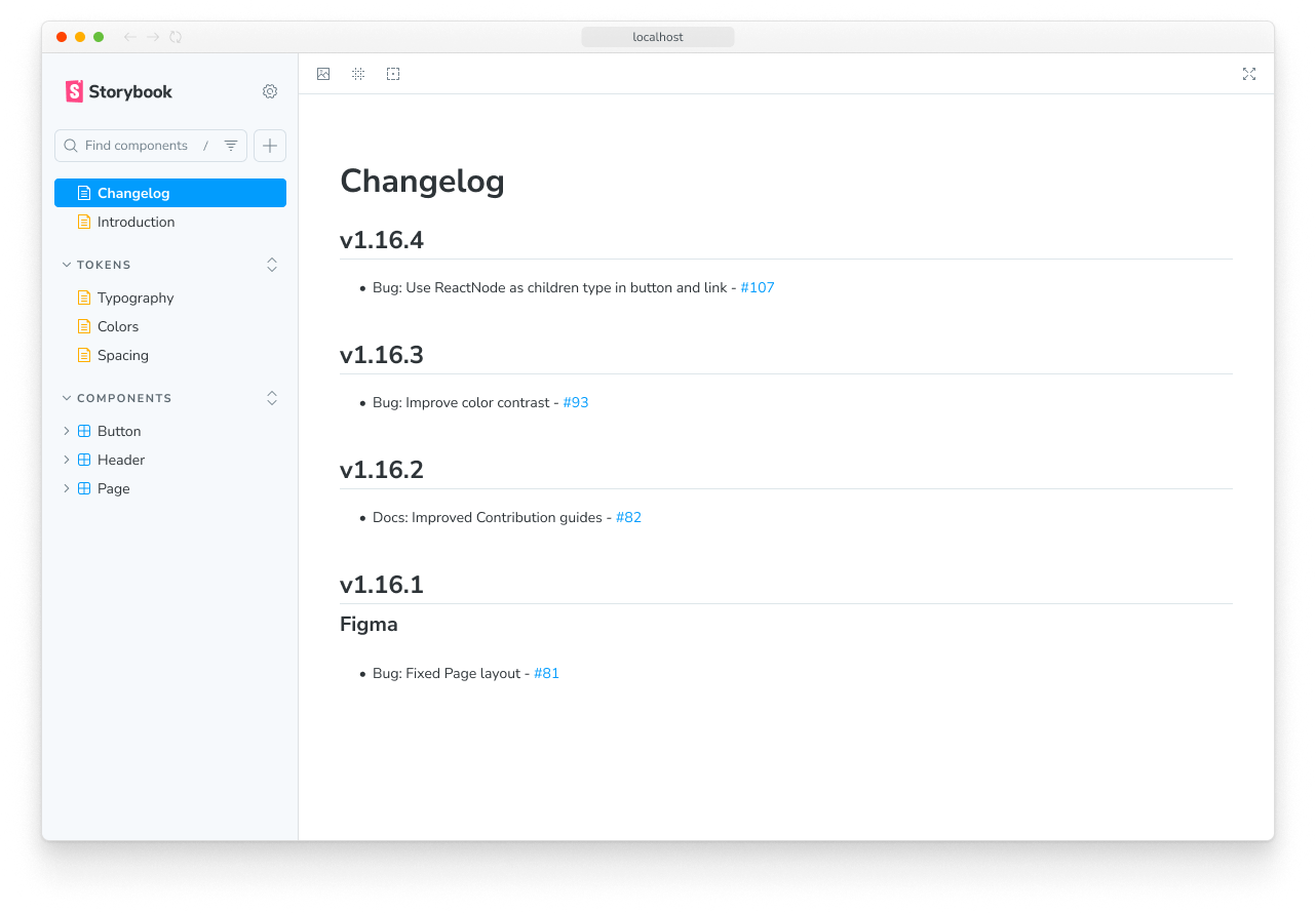
If you need to extend your documentation with additional content written in Markdown, you can use the Markdown Doc Block to import the available content, and Storybook will render it alongside your existing documentation. For example, if you have a CHANGELOG.md file, you can import it and render it in your documentation page as follows:
import { Meta, Markdown } from '@storybook/addon-docs/blocks';

import Readme from '../../Changelog.md?raw';

<Meta title="Changelog" />

# Changelog

<Markdown>{Readme}</Markdown>The Markdown Doc Block provides additional configuration options to customize the rendering of your documentation. For more information, refer to the API documentation.
Linking to other stories and pages
Another way to improve documentation is by linking to other stories and pages. Suppose you already have a component story with the following unique identifier, some--id, and you want to link it to your documentation page. In that case, you can use the path query string to redirect to the documentation entry related to the story:
[Go to specific documentation page](?path=/docs/some--id)Instead, if you need to target a specific documentation section, you can adjust the link to point at it. For example:
[Go to the conclusion of the documentation page](?path=/docs/some--id#conclusion)However, cross-linking documentation isn't restricted to documentation pages. You can adjust the path query and supply the story's unique identifier if you need to reference a specific one. For example:
[Go to specific story canvas](?path=/story/some--id)Applying this pattern with the Controls feature, all anchors will be ignored in Canvas based on how Storybook handles URLs to track the args values.
Troubleshooting
Markdown tables aren't rendering correctly
If you're extending your documentation to include specific features (e.g., tables, footnotes), you may run into some issues rendering them correctly using the current MDX version supported by Storybook. We recommend enabling the remark-gfm plugin in your configuration file (i.e., .storybook/main.js|ts) to render them correctly.
import remarkGfm from 'remark-gfm';

// Replace your-framework with the framework you are using, e.g. react-vite, nextjs, vue3-vite, etc.
import type { StorybookConfig } from '@storybook/your-framework';

const config: StorybookConfig = {
  framework: '@storybook/your-framework',
  stories: ['../src/**/*.mdx', '../src/**/*.stories.@(js|jsx|mjs|ts|tsx)'],
  addons: [
    // Other addons go here
    {
      name: '@storybook/addon-docs',
      options: {
        mdxPluginOptions: {
          mdxCompileOptions: {
            remarkPlugins: [remarkGfm],
          },
        },
      },
    },
  ],
};

export default config;The remark-gfm package is not included by default with Storybook and must be installed separately as a development dependency. To learn more about how to use it and the other breaking changes introduced by MDX, refer to the GFM guide and the migration guide provided by the MDX team for more information.
The MDX documentation doesn't render in my environment
As Storybook relies on MDX 3 to render documentation, some technical limitations may prevent you from migrating to this version. If that's the case, we've prepared a set of instructions to help you transition to this new version.
Storybook doesn't create documentation for my component stories
If you run into a situation where Storybook is not able to detect and render the documentation for your component stories, it may be due to a misconfiguration in your Storybook. Check your configuration file (i.e., .storybook/main.js|ts) and ensure the stories configuration element provides the correct path to your stories location (e.g., ../src/**/*.stories.@(js|jsx|mjs|ts|tsx)).
The migration seems flaky and keeps failing
By default, running the migration command will prompt you to update the existing MDX files in your project according to the MDX version supported by Storybook. However, this might be a disruptive process, specifically if you're upgrading from a previous version of Storybook where you were using the legacy MDX format. To help you troubleshoot those issues, we've prepared some recommendations that might help you.
Start by running the following command inside your project directory:
npx @hipster/mdx2-issue-checkerDepending on the volume, you may be required to run the command multiple times to fix all the issues.
When it finishes, it will output the list of files causing issues. You can then use this information to fix the problems manually.
Additionally, if you're working with VSCode, you can add the MDX extension and enable MDX experimental support for linting, type checking, and auto-completion by adding the following to your user settings:
{
  "mdx.server.enable": true
}
If you're still encountering issues, we recommend reaching out to the community using the default communication channels (e.g., GitHub discussions).
The controls are not updating the story within the MDX documentation page
If you turned off inline rendering for your stories via the inline configuration option, you would run into a situation where the associated controls are not updating the story within the documentation page. This is a known limitation of the current implementation and will be addressed in a future release.
The React version used is unexpected
For most projects, Storybook's addon-docs uses the React version listed in your project's dependencies. If it does not find one, it will use React 18.2.0. There are two exceptions to this:
- Preact projects will always use React 17
- Next.js projects will always use the canary version that comes with the Next.js version installed, regardless of which React version is listed in the project’s dependencies.
If you're having issues with the React version used, you may need to re-create your project's node_modules folder to ensure the correct version is used.
Learn more about Storybook documentation
- Autodocs for creating documentation for your stories
- MDX for customizing your documentation
- Doc Blocks for authoring your documentation
- Publishing docs to automate the process of publishing your documentation