
MDX
Currently, there's an issue using MDX stories with IE11, which doesn't affect the Docs page. It's a known MDX issue, and once it's solved, Storybook's MDX implementation will be updated accordingly.
MDX is a standard file format that combines Markdown with JSX. It means you can use Markdown’s terse syntax (such as # heading) for your documentation, write stories that compile to our component story format, and freely embed JSX component blocks at any point in the file. All at once.
In addition, you can write pure documentation pages in MDX and add them to Storybook alongside your stories.

Basic example
Let's get started with an example that combines Markdown with a single story:
import { Canvas, Meta, Story } from '@storybook/addon-docs';
import { Checkbox } from './Checkbox';
<Meta title="MDX/Checkbox" component={Checkbox} />
export const Template = (args) => <Checkbox {...args} />;
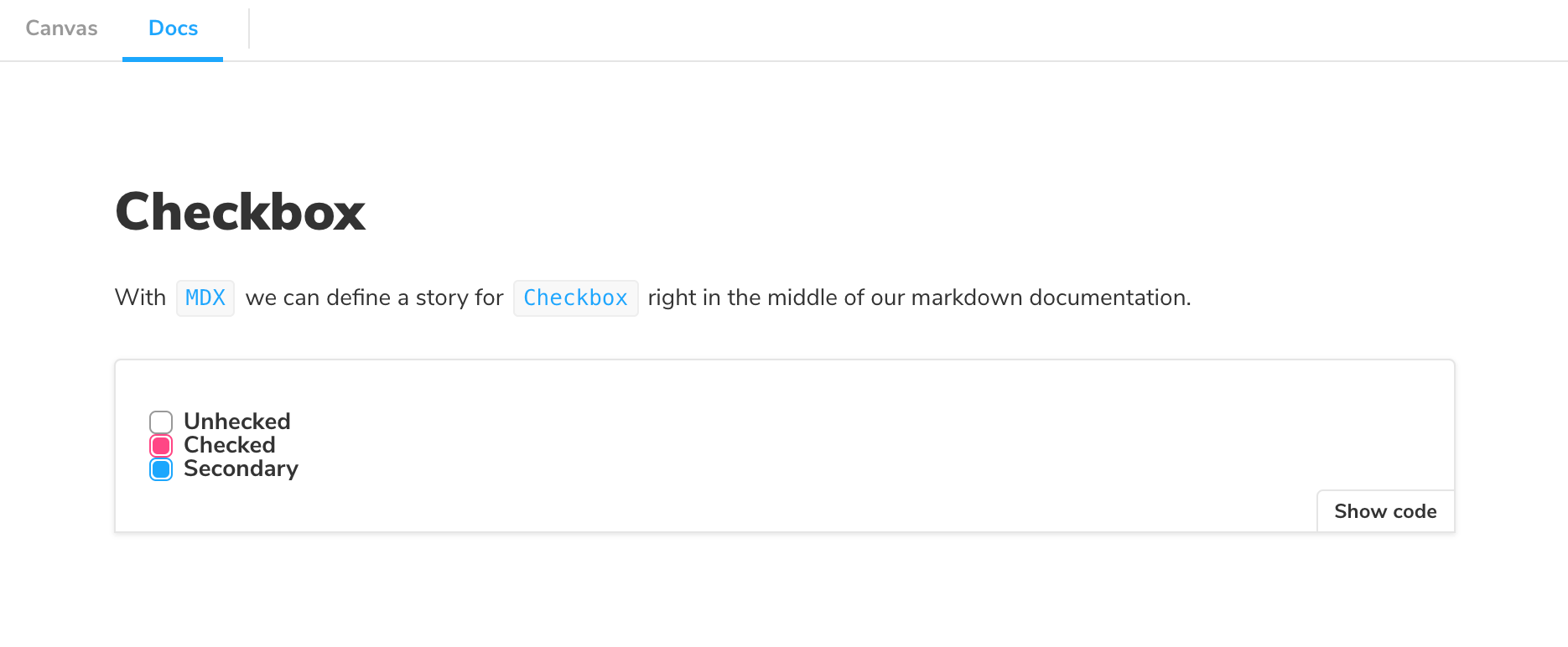
# Checkbox
With `MDX`, we can define a story for `Checkbox` right in the middle of our
Markdown documentation.
<Canvas>
<Story
name="Unchecked"
args={{
label: 'Unchecked',
}}>
{Template.bind({})}
</Story>
<Story
name="Checked"
args={{
label: 'Unchecked',
checked: true,
}}>
{Template.bind({})}
</Story>
<Story
name="Secondary"
args={{
label: 'Secondary',
checked: true,
appearance: 'secondary',
}}>
{Template.bind({})}
</Story>
</Canvas>And here's how that's rendered in Storybook:
As you can see, a lot is going on here. We're writing Markdown, we're writing JSX, and we're also defining Storybook stories that are drop-in compatible with the entire Storybook ecosystem.
Let's break it down.
MDX-flavored CSF
MDX-flavored Component Story Format (CSF) includes a collection of components called "Doc Blocks", that allow Storybook to translate MDX files into Storybook stories. MDX-defined stories are identical to regular Storybook stories, so they can be used with Storybook's entire ecosystem of addons and view layers.
For example, here's the first story from the Checkbox example above, rewritten in CSF:
import React from 'react';

import { ComponentMeta, ComponentStory } from '@storybook/react';

import { Checkbox } from './Checkbox';

export default {
  /* 👇 The title prop is optional.
  * See https://storybook.js.org/docs/6/configure#configure-story-loading
  * to learn how to generate automatic titles
  */
  title: 'Checkbox',
  component: Checkbox,
} as ComponentMeta<typeof Checkbox>;

export const allCheckboxes: ComponentStory<typeof Checkbox> = () => (
  <form>
    <Checkbox id="Unchecked" label="Unchecked" />
    <Checkbox id="Checked" label="Checked" checked />
    <Checkbox appearance="secondary" id="second" label="Secondary" checked />
  </form>
);
There's a one-to-one mapping from the code in MDX to CSF. As a user, this means your existing Storybook knowledge should translate between the two.
Writing stories
Let's look at a more realistic example to see how MDX works:
import { Canvas, Meta, Story } from '@storybook/addon-docs';
import { Badge } from './Badge';
import { Icon } from './Icon';
<Meta title="MDX/Badge" component={Badge} />
export const Template = (args) => <Badge {...args } />
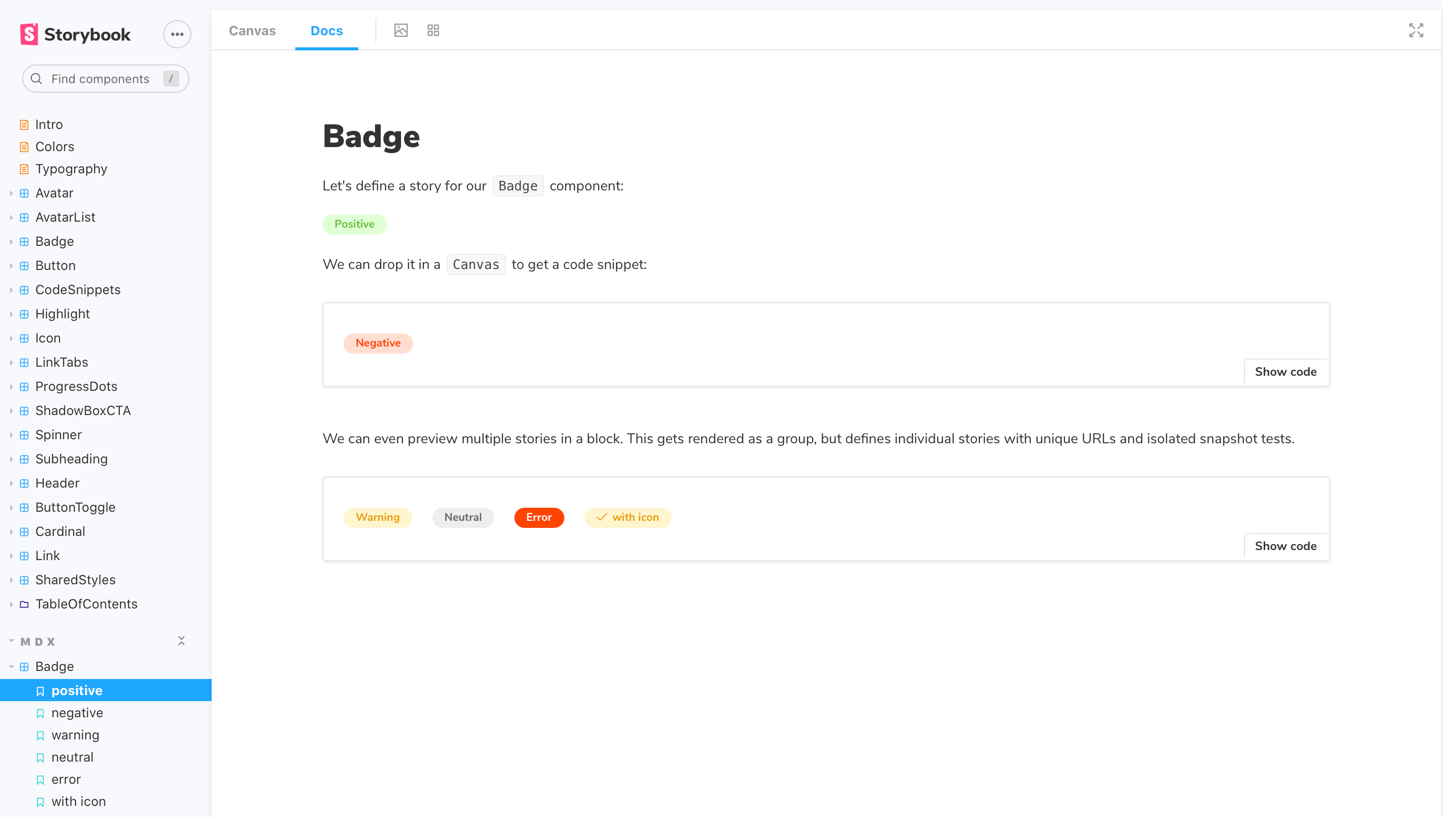
# Badge
Let's define a story for our `Badge` component:
<Story
name="positive"
args={{
status: 'positive',
label: 'Positive'
}}>
{Template.bind({})}
</Story>
We can drop it in a `Canvas` to get a code snippet:
<Canvas>
<Story
name="negative"
args={{
status: 'negative',
label: 'Negative'
}}>
{Template.bind({})}
</Story>
</Canvas>
We can even preview multiple Stories in a block. This
gets rendered as a group but defines individual stories
with unique URLs, which is great for review and testing.
<Canvas>
<Story
name="warning"
args={{
status: 'warning',
label: 'Warning'
}}>
{Template.bind({})}
</Story>
<Story
name="neutral"
args={{
status: 'neutral',
label: 'Neutral'
}}>
{Template.bind({})}
</Story>
<Story
name="error"
args={{
status: 'error',
label: 'Error'
}}>
{Template.bind({})}
</Story>
<Story
name="with icon"
args={{
status: 'warning',
label: (<Icon icon="check" inline /> with icon)
)}}>
{Template.bind({})}
</Story>
</Canvas>And here's how that gets rendered in Storybook:
Customizing ArgTypes with MDX
As already mentioned above, there's a one-to-one mapping between MDX and CSF.
Based on this principle, if the Badge story included the following ArgTypes:
import { Badge } from './Badge';

export default {
  /* 👇 The title prop is optional.
  * See https://storybook.js.org/docs/6/configure#configure-story-loading
  * to learn how to generate automatic titles
  */
  title: 'Badge',
  component: Badge,
  argTypes: {
    status: {
      name: 'Badge Status',
      description: 'Available options available to the Badge',
      options: ['positive', 'negative', 'warning', 'error', 'neutral'],
      table: {
        defaultValue: {
          summary: 'positive',
        },
        type: {
          summary: 'Shows options to the Badge',
          detail: 'Listing of available options',
        },
      },
    },
    label: {
      name: 'Badge Content',
      description: 'Text shown by Badge',
      control: {
        type: 'text',
      },
      table: {
        type: {
          summary: 'The label contents',
          detail: 'Text displayed by the Badge',
        },
      },
    },
  },
};
Transitioning them into MDX format is relatively seamless and would only require the following change to the story:
import { Badge } from './Badge';

export default {
  /* 👇 The title prop is optional.
  * See https://storybook.js.org/docs/6/configure#configure-story-loading
  * to learn how to generate automatic titles
  */
  title: 'Badge',
  component: Badge,
  argTypes: {
    status: {
      name: 'Badge Status',
      description: 'Available options available to the Badge',
      options: ['positive', 'negative', 'warning', 'error', 'neutral'],
      table: {
        defaultValue: {
          summary: 'positive',
        },
        type: {
          summary: 'Shows options to the Badge',
          detail: 'Listing of available options',
        },
      },
    },
    label: {
      name: 'Badge Content',
      description: 'Text shown by Badge',
      control: {
        type: 'text',
      },
      table: {
        type: {
          summary: 'The label contents',
          detail: 'Text displayed by the Badge',
        },
      },
    },
  },
};
And here's how that gets rendered in Storybook:
If you find yourself with a considerably sized argTypes implementation. You can extract them into a variable and pass them as a prop.
Embedding stories
Suppose you have an existing story and want to embed it into your docs. Here's how to show a story with ID some--id. Check the browser URL in Storybook v5+ to find a story's ID.
import { Story } from '@storybook/addon-docs';

# Some header

And Markdown here

<Story id="some--id" />
You can also use the rest of the MDX features in conjunction with embedding. That includes source, preview, and prop tables.
Decorators and parameters
To add decorators and parameters in MDX:
import { Meta, Story } from '@storybook/addon-docs';

import { MyComponent } from './MyComponent';

<Meta
  title="MyComponent"
  decorators={[ ... ]}
  parameters={{ ... }}
  component={MyComponent}
/>

<Story name="story" decorators={[ ... ]} parameters={{ ... }} >
...
</Story>
Global parameters and decorators work just like before.
Documentation-only MDX
Typically, when you use Storybook MDX, you define stories in the MDX, and documentation is automatically associated with those stories. But what if you want to write Markdown-style documentation without any stories inside?
Suppose you don't define stories in your MDX. In that case, you can write MDX documentation and associate it with an existing story or embed that MDX as its own documentation node in your Storybook's navigation.
If you don't define a Meta, you can write Markdown and associate with an existing story. See "CSF Stories with MDX Docs".
To get a "documentation-only story" in your UI, define a <Meta> as you normally would, but don't define any stories. It will show up in your UI as a documentation node:
Syntax highlighting
When writing your documentation with Storybook and MDX, you get syntax highlighting out of the box for a handful of popular languages (Javascript, Markdown, CSS, HTML, Typescript, GraphQL). For other formats, for instance, SCSS, you'll need to extend the syntax highlighter manually:
import { Meta } from '@storybook/addon-docs';

import { Prism as SyntaxHighlighter } from 'react-syntax-highlighter';

<Meta title="A Storybook story with a custom syntax highlight for SCSS" />

# SCSS example

This is a sample SCSS code block example highlighted in Storybook

{/* Don't forget to replace (") with (```) when you copy the snippet to your own app */}

"scss
$font-stack: Helvetica, sans-serif;
$primary-color: #333;

body {
  font: 100% $font-stack;
  color: $primary-color;
}
"

{/* The usage of this "Component" is intentional to enable react-syntax-highlighter's own highlighter */}

export const Component = () => {
  return <SyntaxHighlighter/>;
};For a list of available languages, check react-syntax-highlighter's documentation.
Once you've updated your documentation, you'll see the code block properly highlighted. You can also apply the same principle to other unsupported formats (i.e., diff, hbs).
You can also update your .storybook/preview.js and enable syntax highlighting globally. For example, to add support for SCSS, update your configuration to the following:
import { PrismLight as SyntaxHighlighter } from 'react-syntax-highlighter';
import scss from 'react-syntax-highlighter/dist/esm/languages/prism/scss';

// Registers and enables scss language support
SyntaxHighlighter.registerLanguage('scss', scss);

export const parameters = {
  actions: { argTypesRegex: '^on[A-Z].*' },
  controls: {
    matchers: {
      color: /(background|color)$/i,
      date: /Date$/,
    },
  },
};
Write your documentation as you usually would, and your existing SCSS code blocks will automatically be highlighted when Storybook reloads. For example:
import { Meta } from '@storybook/addon-docs';

<Meta title="A storybook story with syntax highlight registered globally" />

# SCSS example

This is a sample Sass snippet example with Storybook docs

{/* Don't forget to replace (") with (```) when you copy the snippet to your own app */}

"scss
$font-stack: Helvetica, sans-serif;
$primary-color: #333;

body {
font: 100% $font-stack;
  color: $primary-color;
}
"
Linking to other stories and pages
When writing MDX, you may want to provide links to other stories or documentation pages and sections. You can use the path query string.
Considering a story with ID some--id, this redirects to the Docs tab of the story:
[Go to specific documentation page](?path=/docs/some--id)This redirects to the Canvas tab of the story:
[Go to specific story canvas](?path=/story/some--id)You can also use anchors to target a specific section of a page:
[Go to the conclusion of the documentation page](?path=/docs/some--id#conclusion)By applying this pattern with the Controls addon, all anchors will be ignored in Canvas based on how Storybook handles URLs to track the args values.
MDX file names
Unless you use a custom Webpack configuration, all of your MDX files should have the suffix *.stories.mdx. This tells Storybook to apply its special processing to the <Meta> and <Story> elements in the file.
Be sure to update .storybook/main.js file to load .stories.mdx stories, as per the addon-docs installation instructions.
MDX 2
Starting with Storybook 6.5, MDX 2 is introduced as an experimental opt-in feature. To enable it, you'll need to take additional steps. Documented below is our recommendation.
Run the following command to add the necessary dependency.
npm install @storybook/mdx2-csf --save-devUpdate your Storybook configuration (in .storybook/main.js|ts) and add the previewMdx2 feature flag as follows:
module.exports = {
  stories: ['../stories/**/*.stories.mdx', '../stories/**/*.stories.@(js|jsx|ts|tsx)'],
  addons: ['@storybook/addon-links', '@storybook/addon-essentials'],
  features: {
    previewMdx2: true, // 👈 MDX 2 enabled here
  },
};