
MCP server
Storybook's MCP server connects your Storybook to AI agents, allowing them to understand your components and documentation, generate stories, run tests, and more. Agents will be equipped to reuse your existing components and follow your documented usage guidelines when generating UI, helping ensure the generated UI is consistent with your existing design system. Then they can write stories so you can preview the generated UI and automatically run interaction tests (and accessibility checks) on those stories to validate their work. If any issues are found, the agent can fix them and re-run the tests to confirm they are resolved, creating a self-healing loop that helps ensure the quality of the generated UI without requiring you to intervene.
Installation
1. Install the addon
Run this command to install and register the Storybook MCP addon:
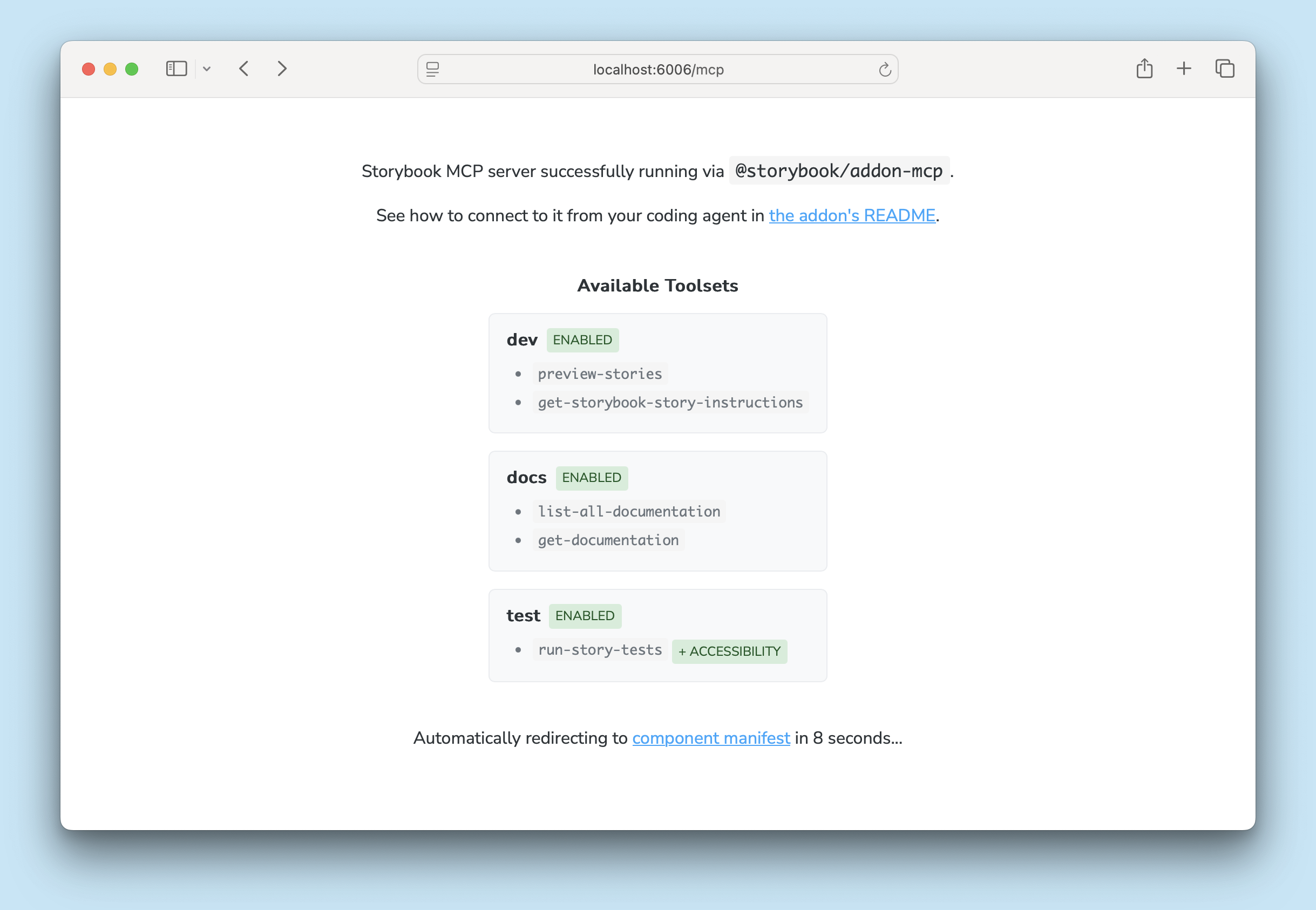
npx storybook add @storybook/addon-mcpNow, when running Storybook's dev server, you can access the MCP server at http://localhost:6006/mcp (your port may be different). When viewed in the browser, you'll see a page showing which tools are available and a link to the manifest debugger.
2. Add the MCP server to your agent
Then run this command to configure your agent to use the MCP server:
npx mcp-add --type http --url "http://localhost:6006/mcp" --scope projectYou may need to update the port number in the URL. You will be prompted for a name for your MCP server (e.g. "my-project-sb-mcp"). This is the name you'll use when calling the tools from your agent, so choose something descriptive and unique to avoid confusion with other tools.
mcp-add is a CLI tool designed to simplify adding MCP servers to various agents.
You can also follow your agent's documentation to add the MCP server as a tool provider manually, e.g. Claude Code, Google Gemini CLI, OpenAI Codex, VS Code Copilot, etc.
3. Adjust your agent instructions
To guide your agent to use your MCP server, you should adjust your AGENTS.md (or CLAUDE.md, if you're using Claude). The specifics will depend on your project and how you use agents in your development process, but something like this is a good starting point. Just make sure to replace your-project-sb-mcp with the name you chose for your MCP server toolset in the previous step.
When working on UI components, always use the `your-project-sb-mcp` MCP tools to access Storybook's component and documentation knowledge before answering or taking any action.

- **CRITICAL: Never hallucinate component properties!** Before using ANY property on a component from a design system (including common-sounding ones like `shadow`, etc.), you MUST use the MCP tools to check if the property is actually documented for that component.
- Query `list-all-documentation` to get a list of all components
- Query `get-documentation` for that component to see all available properties and examples
- Only use properties that are explicitly documented or shown in example stories
- If a property isn't documented, do not assume properties based on naming conventions or common patterns from other libraries. Check back with the user in these cases.
- Use the `get-storybook-story-instructions` tool to fetch the latest instructions for creating or updating stories. This will ensure you follow current conventions and recommendations.
- Check your work by running `run-story-tests`.

Remember: A story name might not reflect the property name correctly, so always verify properties through documentation or example stories before using them.
Finally, test your agent's access to the MCP server. First, make sure your Storybook is running, then run a prompt like "List all documented components". You should see a call to the list-all-documentation tool with a response listing components from your Storybook.
Usage
Once you have your MCP server and agent configured, using it is as simple as prompting your agent to do some UI development. Let's demonstrate how these toolsets can work together in some typical workflows.
1. Generating UI with existing components
Prompt: Build a login form
-
The agent queries the docs toolset to find components that match the requirements of a login form, e.g. a
TextInputcomponent for the username and password fields, and aButtoncomponent for the submit button. -
The agent queries the docs toolset again to reference more detailed information about specific components, e.g., it learns that the
TextInputcomponent has atypeprop that can be set to "password" to obscure the input. -
The agent generates a LoginForm component that composes those components together.
-
The agent uses the development toolset to generate stories that render LoginForm in its various states.
-
The agent uses the testing toolset to run tests on the generated component, and finds that the submit button does not have an accessible level of color contrast.
-
The agent updates the LoginForm component to use a different color (found by using the docs toolset to reference your documented theme colors) for the submit button.
-
The agent uses the testing toolset to re-run the tests to confirm that the issue is resolved.
-
The agent uses the development toolset to show you previews of each relevant story.
2. Previewing work with stories
Prompt: Show me the Button in dark mode
- The agent uses the development toolset to share a preview of or link to the default Button story in dark mode.
3. Running tests
Prompt: Run tests for all the stories that contain the Header component
-
Agent uses grep (or "file system lookup") to determine which components use Header.
-
Agent finds all the stories for those components.
-
The agent uses the testing toolset to run tests on those stories, and returns a summary of the results.
4. Generating tests
Prompt: Write a story to test the login form submit action
- The agent uses the development toolset to generate a story that demonstrates the submit action of the login form, e.g. by writing a play function to simulate a user filling out the form and clicking the submit button, then asserting that the expected outcome occurs (e.g. a success message appears, the user is redirected, etc.).
Toolsets
The MCP server provides a set of tools that an agent can call to interact with your Storybook. The available tools are organized into three toolsets: development, docs, and testing. Each toolset provides a different set of capabilities for the agent to use when developing UI.
Development
The development toolset provides tools for authoring well-considered stories (including interaction tests) and previewing those stories in the agent's chat interface. This allows you to easily check the agent's work, and the generated stories can serve as tests (which the agent can run, with the testing toolset, to validate that the generated UI works as intended).
The development toolset includes the following tools:
get-changed-stories
Returns a list of stories that are changed or possibly affected by local file changes (requires change detection to be enabled).
get-storybook-story-instructions
Returns instructions on how to write useful stories, including which props to capture and how to write interaction tests for the story (if applicable).
preview-stories
Returns story previews rendered in the agent's chat interface, if the agent supports MCP Apps. Otherwise, it returns links to relevant stories in Storybook.
Docs
The docs toolset provides tools that help the agent reuse components from your Storybook when generating UI. The agent can query the manifests to find components that match the requirements of the UI it's trying to build, and reference your documentation to understand how to use those components correctly. This helps ensure the generated UI is consistent with your existing design system and uses the components you've already built.
The docs toolset includes the following tools:
get-documentation
Returns the detailed documentation for a specific component, including its props, the first three stories, an index of the remaining stories, and any additional documentation you've provided.
get-documentation-for-story
Returns the full story and associated documentation for a specific story. The agent calls this tool when get-documentation doesn't provide enough information for the agent to use a component effectively.
list-all-documentation
Returns an index containing components and unattached docs entries.
Testing
If you have Storybook Test set up in your Storybook, the testing toolset provides tools that allow the agent to run component tests (including accessibility checks, if set up) and interpret their results. It also includes instructions to resolve issues. As the agent develops, it can choose to run tests to validate its work. If it finds issues, it can fix them and re-run the tests to confirm they are resolved. This creates a self-healing loop that helps ensure the quality of the generated UI, without requiring you to intervene.
The testing toolset includes the following tool:
run-story-tests
Runs tests for specific stories and returns results, including any accessibility issues (if configured). Also instructs the agent to interpret the results and resolve any issues found.
Composition
If you need to develop UI using components from multiple Storybooks, you can take advantage of Storybook composition. If a composed Storybook has manifests, the MCP server will automatically include the content from those manifests in its responses, allowing your agent to access the combined knowledge from all composed Storybooks. This means that your agent can find and reference components from any of the composed Storybooks when generating UI.
FAQ
Which agents are supported?
We built Storybook's capabilities as an MCP server, which is a standard protocol for AI agent tool providers. Any agent that supports MCP can be connected to Storybook's MCP server and use Storybook's manifests and tools. This includes popular agents like Claude Code, OpenAI Codex, Cursor, Google Gemini CLI, VS Code Copilot, and many more.
Why is the docs toolset React-only?
The docs toolset relies on the manifests generated by Storybook, which is currently limited to React projects. After we ensure a solid experience with React projects, we plan to expand support to the other core Storybook renderers: Vue, Angular, Web Components, and Svelte.
More AI resources