
DocsPage
When you install Storybook Docs, DocsPage is the zero-config default documentation that all stories get out of the box. It aggregates your stories, text descriptions, docgen comments, args tables, and code examples into a single page for each component.
The best practice for docs is for each component to have its own set of documentation and stories.
Component parameter
Storybook uses the component key in the story file’s default export to extract the component's description and props.
import { MyComponent } from './MyComponent';

export default {
  /* 👇 The title prop is optional.
  * See https://storybook.js.org/docs/6/configure#configure-story-loading
  * to learn how to generate automatic titles
  */
  title: 'MyComponent',
  component: MyComponent,
};

// Your stories
Subcomponents parameter
Sometimes it's helpful to document multiple components together. For example, a component library’s ButtonGroup and Button components might not make sense without one another.
DocsPage has the concept of a "primary" component defined by the component parameter. It also accepts one or more subcomponents.
import { Meta } from '@storybook/react';

import { Button, ButtonGroup } from './ButtonGroup';

export default {
  /* 👇 The title prop is optional.
  * See https://storybook.js.org/docs/6/configure#configure-story-loading
  * to learn how to generate automatic titles
  */
  title: 'ButtonGroup',
  component: ButtonGroup,
  subcomponents: { Button },
} as Meta;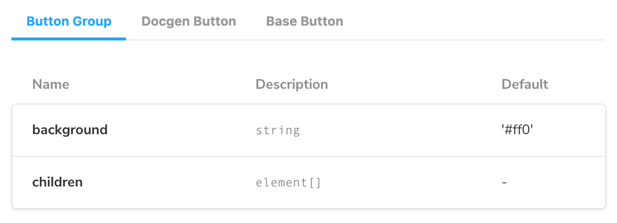
Subcomponent ArgsTables will show up in a tabbed interface along with the primary component. The tab titles will correspond to the keys of the subcomponents object.
If you want to organize your documentation differently for component groups, we recommend using MDX. It gives you complete control over how it's displayed and supports any configuration.
Replacing DocsPage
Replace the DocsPage template with your own to customize its contents.
With null to remove docs
Override the docs.page parameter with null to remove its contents.
import { Button } from './Button';

export default {
  /* 👇 The title prop is optional.
  * See https://storybook.js.org/docs/6/configure#configure-story-loading
  * to learn how to generate automatic titles
  */
  title: 'Button',
  component: Button,
  argTypes: {
    backgroundColor: { control: 'color' },
  },
  parameters: {
    docs: {
      page: null,
    },
  },
};
With MDX documentation
Write your documentation in MDX and update the docs.page parameter to display it. The id of reference follows the pattern: group-subgroup-...--name, where the groups and subgroups are defined as according to the Grouping Documentation.
import React from 'react';

export const CustomDocumentationComponent: React.VFC<{}> = () => {
  return (
    <div>
      <h1>Replacing DocsPage with a custom component</h1>
      <p>
        The Docs page can be customized with your own custom content written as a React Component.
      </p>
      <p>
       Write your own code here👇
      </p>
    </div>
  );
};
With a custom component
Storybook's UI is built using React. If you want to include a custom component to display documentation, you'll need to update your environment to allow React components to be correctly transpiled.
For example, with Angular start by adding a babel.config.js file at the root of the project with the following content:
// babel.config.js

module.exports = function (api) {
  process.env.NODE_ENV === 'development' ? api.cache(false) : api.cache(true);
  const presets = [
    [
      '@babel/preset-env',
      {
        targets: {
          node: 'current',
        },
      },
    ],
    '@babel/preset-typescript',
    '@babel/preset-react',
  ];
  const plugins = [];
  return {
    presets,
    plugins,
  };
};
Then, update your tsconfig.json to include the following:
{
  "compilerOptions": {
    ....
    "allowJs": true,
    "jsx": "react-jsx",
  },
}
Finally write your custom React component and update the docs.page parameter to render the custom documentation.
import React from 'react';

export const CustomDocumentationComponent: React.VFC<{}> = () => {
  return (
    <div>
      <h1>Replacing DocsPage with a custom component</h1>
      <p>
        The Docs page can be customized with your own custom content written as a React Component.
      </p>
      <p>
       Write your own code here👇
      </p>
    </div>
  );
};
Remixing DocsPage using doc blocks
Doc blocks are the basic building blocks of Storybook Docs. DocsPage composes them to provide a reasonable UI documentation experience out of the box.
If you want to make minor customizations to the default DocsPage but don’t want to write your MDX, you can remix DocsPage. That allows you to reorder, add, or omit doc blocks without losing Storybook’s automatic docgen capabilities.
Here's an example of rebuilding DocsPage for the Button component using doc blocks:
import React from 'react';

import { Meta } from '@storybook/react';

import {
  Title,
  Subtitle,
  Description,
  Primary,
  ArgsTable,
  Stories,
  PRIMARY_STORY,
} from '@storybook/addon-docs';

import { Button } from './Button';

export default {
  /* 👇 The title prop is optional.
  * See https://storybook.js.org/docs/6/configure#configure-story-loading
  * to learn how to generate automatic titles
  */
  title: 'Button',
  component: Button,
  parameters: {
    docs: {
      page: () => (
        <>
          <Title />
          <Subtitle />
          <Description />
          <Primary />
          <ArgsTable story={PRIMARY_STORY} />
          <Stories />
        </>
      ),
    },
  },
} as Meta;
In addition, you can interleave your own components to customize the auto-generated contents of the page or pass in different options to the blocks to customize their appearance.
Story file names
Unless you use a custom Webpack configuration, all of your story files should have the suffix *.stories.@(j|t)sx?. For example, "Badge.stories.js" or "Badge.stories.tsx". This tells Storybook and its docs preset to display the docs based on the file contents.
Inline stories vs. iframe stories
DocsPage displays all the stories of a component on one page. You have the option of rendering those stories inline or in an iframe.
The iframe creates a clean separation between your code and Storybook’s UI, which is useful if your stories are rendering correctly in the Canvas but not on the docs page, for instance with fixed positioned components like modals.
But using an iframe has disadvantages. For example, you have to set the height of iframe stories explicitly, or you’ll see a scroll bar. Having more than a few iframe stories on a page can lead to performance issues. And certain dev tools might not work right.
Therefore, we recommend inline rendering where possible. It's the default mode for all the frameworks in which we support it. The one exception is Angular, where it's opt-in.
To toggle the between the two settings, set docs.inlineStories in .storybook/preview.js. Like most parameters, you can also toggle at the component or story level:
export const parameters = {
  docs: {
    // Opt-out of inline rendering
    inlineStories: false,
  },
};
Custom inline rendering
If your framework doesn't support inline rendering, you also need to provide a prepareForInline function in addition to the inlineStories parameter.
Setting inlineStories to true tells Storybook to stop putting your stories in an iframe. The prepareForInline accepts a function that transforms story content from your given framework to something React can render (Storybook’s UI is built in React).
Different frameworks will need to approach this in different ways. Angular, for example, might convert its story content into a custom element (you can read about that here).
Here’s an example of how to render Vue stories inline. The following docs config block uses prepareForInline and an effect hook provided by @egoist/vue-to-react.
import React from 'react';
import { render } from 'react-dom';
import toReact from '@egoist/vue-to-react';

export const parameters = {
  docs: {
    prepareForInline: (storyFn, { args }) => {
      const Story = toReact(storyFn());
      return <Story {...args} />;
    },
  },
};
With this function, anyone using the docs addon for @storybook/vue can make their stories render inline, either globally with the inlineStories docs parameter, or on a per-story-basis using the inline prop on the <Story> doc block.
If you come up with an elegant and flexible implementation for the prepareForInline function for your framework, let us know. We'd love to make it the default configuration to make inline stories more accessible for a larger variety of frameworks!