Stories for multiple components
It's useful to write stories that render two or more components at once if those components are designed to work together. For example, ButtonGroups, Lists, and Page components. Here's an example with List and ListItem components:
import React from 'react';

import { ComponentStory, ComponentMeta } from '@storybook/react';

import { List } from './List';
import { ListItem } from './ListItem';

export default {
  /* 👇 The title prop is optional.
  * See https://storybook.js.org/docs/6/configure#configure-story-loading
  * to learn how to generate automatic titles
  */
  title: 'List',
  component: List,
  subcomponents: { ListItem }, //👈 Adds the ListItem component as a subcomponent
} as ComponentMeta<typeof List>;

const Empty: ComponentStory<typeof List> = (args) => <List {...args} />;

const OneItem: ComponentStory<typeof List> = (args) =>(
  <List {...args}>
    <ListItem />
  </List>
);
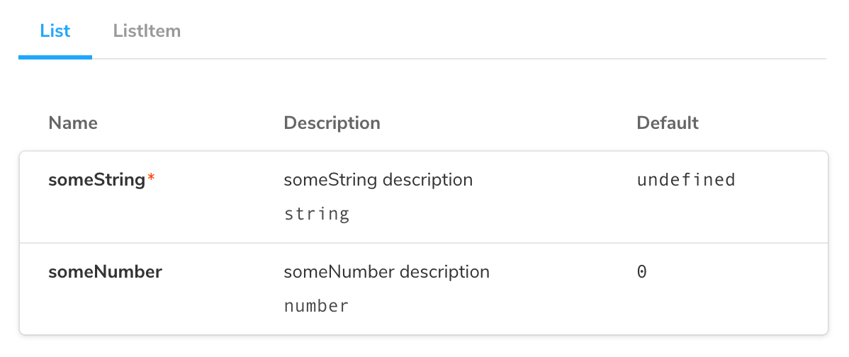
Note that by adding subcomponents to the default export, we get an extra panel on the ArgsTable, listing the props of ListItem:

The downside of the approach used above, where each story creates its own combination of components, is that it does not take advantage of Storybook Args meaning:
- You cannot change the stories via the controls panel
- There is no args reuse possible, which makes the stories harder to maintain.
Let's talk about some techniques you can use to mitigate the above, which are especially useful in more complicated situations.
Reusing subcomponent stories
The simplest change we can make to the above is to reuse the stories of the ListItem in the List:
import React from 'react';

import { ComponentStory, ComponentMeta } from '@storybook/react';

import { List } from './List';

//👇 Instead of importing ListItem, we import the stories
import { Unchecked } from './ListItem.stories';

export default {
  /* 👇 The title prop is optional.
  * See https://storybook.js.org/docs/6/configure#configure-story-loading
  * to learn how to generate automatic titles
  */
  title: 'List',
  component: List,
} as ComponentMeta<typeof List>;

const OneItem: ComponentStory<typeof List> = (args) => (
  <List {...args}>
    <Unchecked {...Unchecked.args} />
  </List>
);
By rendering the Unchecked story with its args, we are able to reuse the input data from the ListItem stories in the List.
However, we still aren’t using args to control the ListItem stories, which means we cannot change them with controls and we cannot reuse them in other, more complex component stories.
Using children as an arg
One way we improve that situation is by pulling the rendered subcomponent out into a children arg:
import React from 'react';

import { ComponentStory, ComponentMeta } from '@storybook/react';

import { List } from './List';

//👇 Instead of importing ListItem, we import the stories
import { Unchecked } from './ListItem.stories';

export default {
  /* 👇 The title prop is optional.
  * See https://storybook.js.org/docs/6/configure#configure-story-loading
  * to learn how to generate automatic titles
  */
  title: 'List',
  component: List,
} as ComponentMeta<typeof List>;

const Template: ComponentStory<typeof List> = (args) => <List {...args} />;

export const OneItem = Template.bind({});
OneItem.args = {
  children: <Unchecked {...Unchecked.args} />,
};
Now that children is an arg, we can potentially reuse it in another story.
However, there are some caveats when using this approach that you should be aware of.
The children args as any other arg needs to be JSON serializable. It means that you should:
- Avoid using empty values
- Use caution with components that include third party libraries
As they could lead into errors with your Storybook.
We're currently working on improving the overall experience for the children arg and allow you to edit children arg in a control and allow you to use other types of components in the near future. But for now you need to factor in this caveat when you're implementing your stories.
Creating a Template Component
Another option that is more “data”-based is to create a special “story-generating” template component:
import React from 'react';

import { ComponentStory, ComponentMeta } from '@storybook/react';

import { List } from './List';
import { ListItem } from './ListItem';

//👇 Imports a specific story from ListItem stories
import { Unchecked } from './ListItem.stories';

export default {
  /* 👇 The title prop is optional.
  * See https://storybook.js.org/docs/6/configure#configure-story-loading
  * to learn how to generate automatic titles
  */
  title: 'List',
  component: List,
} as ComponentMeta<typeof List>;

const ListTemplate: ComponentStory<typeof ButtonGroup> = (args) => {
  const { items } = args;
  return (
    <List>
      {items.map((item) => (
        <ListItem {...item} />
      ))}
  </List>
)};

export const Empty = ListTemplate.bind({});
Empty.args = { items: [] };

export const OneItem = ListTemplate.bind({});
OneItem.args = {
  items: [
    {
      ...Unchecked.args,
    },
  ],
};
This approach is a little more complex to setup, but it means you can more easily reuse the args to each story in a composite component. It also means that you can alter the args to the component with the Controls addon:
