Introduction to addons
Addons extend Storybook with features and integrations that are not built into the core. Most Storybook features are implemented as addons. For instance: documentation, accessibility testing, interactive controls, among others. The addon API makes it easy for you to configure and customize Storybook in new ways. There are countless addons made by the community that unlock time-saving workflows.
Browse our addon catalog to install an existing addon or as inspiration for your own addon.
Storybook basics
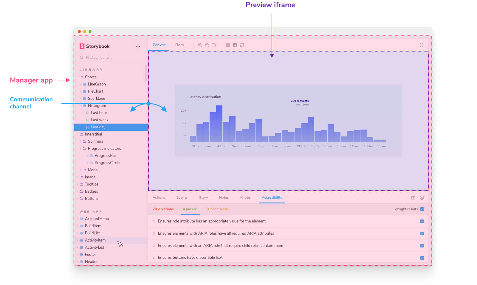
Before writing your first addon, let’s take a look at the basics of Storybook’s architecture. While Storybook presents a unified user interface, under the hood it’s divided down the middle into Manager and Preview.
The Manager is the UI responsible for rendering the:
- 🔍 Search
- 🧭 Navigation
- 🔗 Toolbars
- 📦 Addons
The Preview area is an iframe where your stories are rendered.

Because both elements run in their own separate iframes, they use a communication channel to keep in sync. For example when you select a story in the Manager an event is dispatched across the channel notifying the Preview to render the story.
Anatomy of an addon
Storybook addons allow you to extend what's already possible with Storybook, everything from the user interface to the API. Each one classified into two broader categories.
UI-based addons
UI-based addons focus on customizing Storybook's user interface to extend your development workflow. Examples of UI-based addons include: Controls, Docs and Accessibility.
Preset addons
Preset addons help you integrate Storybook with other technologies and libraries. Examples of preset addons are: preset-scss and preset-create-react-app.
