MDX Format
MDX is the syntax Storybook Docs uses to capture long-form Markdown documentation and stories in one file. You can also write pure documentation pages in MDX and add them to Storybook alongside your stories. Read the announcement to learn more about how and why it came to be.
Basic example
Let's get started with an example that combines Markdown with a single story:
import { Canvas, Meta, Story } from '@storybook/addon-docs';

import { Checkbox } from './Checkbox';

<Meta title="MDX/Checkbox" component={Checkbox} />

# Checkbox

With `MDX`, we can define a story for `Checkbox` right in the middle of our Markdown documentation.

<Canvas>
  <Story name="all checkboxes">
    <form>
      <Checkbox id="Unchecked" label="Unchecked" />
      <Checkbox id="Checked" label="Checked" checked />
      <Checkbox appearance="secondary" id="second" label="Secondary" checked />
    </form>
  </Story>
</Canvas>
And here's how it renders in Storybook:

As you can see, a lot is going on here. We're writing Markdown, we're writing JSX, and somehow we're also defining Storybook stories that are drop-in compatible with the entire Storybook ecosystem.
Let's break it down.
MDX-Flavored CSF
MDX is a standard file format that combines Markdown with JSX. It means you can use Markdown’s terse syntax (such as # heading) for your documentation and freely embed JSX component blocks at any point in the file.
MDX-flavored Component Story Format (CSF) includes a collection of components called "Doc Blocks", that allow Storybook to translate MDX files into Storybook stories. MDX-defined stories are identical to regular Storybook stories, so they can be used with Storybook's entire ecosystem of addons and view layers.
For example, here's the story from the Checkbox example above, rewritten in CSF:
import React from 'react';

import { ComponentMeta, ComponentStory } from '@storybook/react';

import { Checkbox } from './Checkbox';

export default {
  /* 👇 The title prop is optional.
  * See https://storybook.js.org/docs/6/configure#configure-story-loading
  * to learn how to generate automatic titles
  */
  title: 'Checkbox',
  component: Checkbox,
} as ComponentMeta<typeof Checkbox>;

export const allCheckboxes: ComponentStory<typeof Checkbox> = () => (
  <form>
    <Checkbox id="Unchecked" label="Unchecked" />
    <Checkbox id="Checked" label="Checked" checked />
    <Checkbox appearance="secondary" id="second" label="Secondary" checked />
  </form>
);
There's a one-to-one mapping from the code in MDX to CSF, which in turn directly corresponds to Storybook's internal storiesOf API. As a user, this means your existing Storybook knowledge should translate between the three constructs. And technically, this means that the transformations that happen under the hood are predictable and straightforward.
Writing stories
Now let's look at a more realistic example to see a few more things we can do:
import { Canvas, Meta, Story } from '@storybook/addon-docs';

import { Badge } from './Badge';
import { Icon } from './Icon';

<Meta title="MDX/Badge" component={Badge} />

# Badge

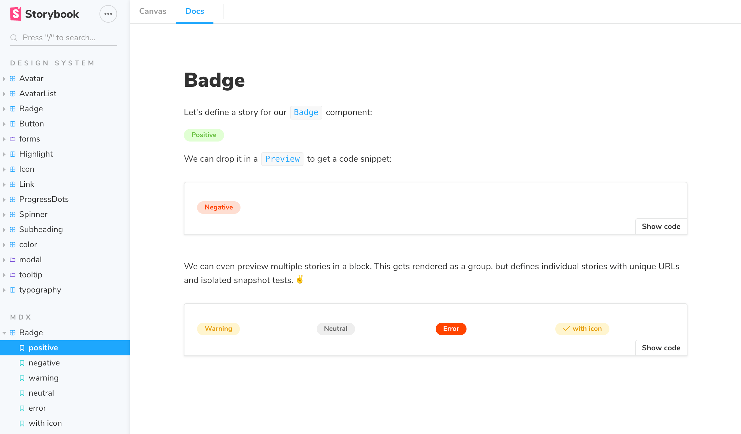
Let's define a story for our `Badge` component:

<Story name="positive">
  <Badge status="positive">Positive</Badge>
</Story>

We can drop it in a `Canvas` to get a code snippet:

<Canvas>
  <Story name="negative">
    <Badge status="negative">Negative</Badge>
  </Story>
</Canvas>

We can even preview multiple stories in a block. This
gets rendered as a group, but defines individual stories
with unique URLs and isolated snapshot tests.

<Canvas>
  <Story name="warning">
    <Badge status="warning">Warning</Badge>
  </Story>
  <Story name="neutral">
    <Badge status="neutral">Neutral</Badge>
  </Story>
  <Story name="error">
    <Badge status="error">Error</Badge>
  </Story>
  <Story name="with icon">
    <Badge status="warning">
      <Icon icon="check" inline />
      with icon
    </Badge>
  </Story>
</Canvas>
And here's how that gets rendered in Storybook:

Embedding stories
Suppose you have an existing story and want to embed it into your docs. Here's how to show a story with ID some--id (check the browser URL in Storybook v5+ to see a story's ID):
You can also use the rest of the MDX features in conjunction with embedding. That includes source, preview, and prop tables.
Decorators and parameters
To add decorators and parameters in MDX:
import { Meta, Story } from '@storybook/addon-docs';

import { MyComponent } from './MyComponent';
<Meta
  title="MyComponent"
  decorators={[ ... ]}
  parameters={{ ... }}
  component={MyComponent}
/>

<Story
  name="story"
  decorators={[ ... ]}
  parameters={{ ... }} >
...
</Story>
In addition, global decorators work just like before, e.g., adding the following to your .storybook/preview.js:
export const decorators = [
  // Your decorators go here
];

export const parameters = {
  // Your parameters go here
};
Play function
Storybook's play functions are small snippets of code that run after the story loads. They're helpful methods to help test scenarios that otherwise would require user intervention. For example, if you're working on a login component and want to interact with it and verify the component's workflow, you could write the following story:
import React from 'react';

import { ComponentStory, ComponentMeta } from '@storybook/react';

import { within, userEvent } from '@storybook/testing-library';

import { expect } from '@storybook/jest';

import { LoginForm } from './LoginForm';

export default {
  /* 👇 The title prop is optional.
  * See https://storybook.js.org/docs/6/configure#configure-story-loading
  * to learn how to generate automatic titles
  */
  title: 'Form',
  component: LoginForm,
} as ComponentMeta<typeof LoginForm>;

const Template: ComponentStory<typeof LoginForm> = (args) => <LoginForm {...args} />;

export const EmptyForm = Template.bind({});

/*
* See https://storybook.js.org/docs/6/writing-stories/play-function#working-with-the-canvas
* to learn more about using the canvasElement to query the DOM
*/
export const FilledForm = Template.bind({});
FilledForm.play = async ({ canvasElement }) => {
  const canvas = within(canvasElement);

  // 👇 Simulate interactions with the component
  await userEvent.type(canvas.getByTestId('email'), 'email@provider.com');

  await userEvent.type(canvas.getByTestId('password'), 'a-random-password');

  // See https://storybook.js.org/docs/6/essentials/actions#automatically-matching-args to learn how to setup logging in the Actions panel
  await userEvent.click(canvas.getByRole('button'));

  // 👇 Assert DOM structure
  await expect(
    canvas.getByText(
      'Everything is perfect. Your account is ready and we should probably get you started!'
    )
  ).toBeInTheDocument();
};
Documentation-only MDX
Typically, when you use the MDX format, you define your stories and are automatically generated by Storybook. But what if you want to write Markdown-style documentation and have it show up in your Storybook?
Suppose you don't define stories in your MDX. In that case, you can write MDX documentation and associate it with an existing story or embed that MDX as its documentation node in your Storybook's navigation.
If you don't define a Meta, you can write Markdown and associate it with an existing story. See "CSF Stories with MDX Docs".
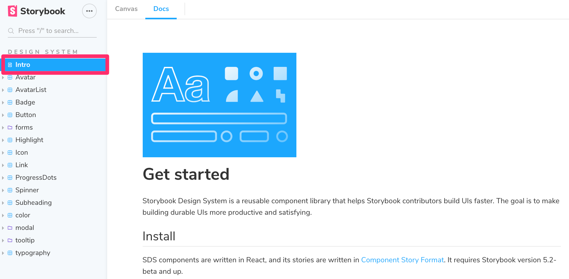
To get a "documentation-only story" in your UI, define a <Meta> as you usually would, but don't define any stories. It will show up in your UI as a documentation node:

MDX file names
Unless you use a custom webpack configuration, all of your MDX files should have the suffix *.stories.mdx. It tells Storybook to apply its special processing to the <Meta> and <Story> elements in the file.
Be sure to update your Storybook config file to load .stories.mdx stories, as per the addon-docs installation instructions.
