
Description
Storybook's Description Doc Block displays the component's description obtained from its source code or user-generated content.
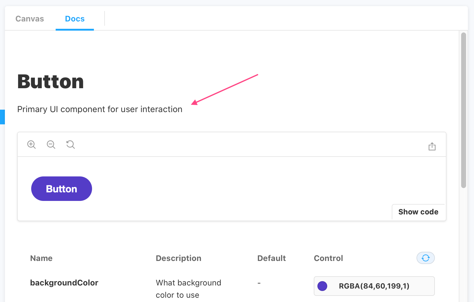
Working with the DocsPage
Storybook extracts the component's description and renders it at the top of the page. It is automatically generated from the docgen component for the supported frameworks based on the component's source code. Below is an abridged example and available options.
Button.stories.js|jsx|ts|tsx
import { Button } from './Button';

export default {
  /* 👇 The title prop is optional.
  * See https://storybook.js.org/docs/6/configure#configure-story-loading
  * to learn how to generate automatic titles
  */
  title: 'Button',
  component: Button,
  parameters: {
    docs: {
      description: {
        component: 'Some component _markdown_',
      },
    },
  },
};

const Template = (args) => ({
 //👇  Your template goes here
});

export const WithStoryDescription = Template.bind({});
WithStoryDescription.parameters = {
  docs: {
    description: {
      story: 'Some story **markdown**',
    },
  },
};| Option | Description |
|---|---|
component | Overrides the default component description. description: { component:'An example component description' } |
markdown | Provides custom Markdown for the component description. Only applicable to MDX. <Description markdown={dedent'# Custom Description'} /> |
story | Overrides the story description. description: { story: 'An example story description' } |
of | Sets the description based either on a component or story. Only applicable to MDX. <Description of={Component} /> <Description of={'.'} /> |
Working with MDX
If you need, you can also include the Description Doc Block in your MDX stories. It relies on the same heuristics as the one applied in the DocsPage. For example:
Button.stories.mdx
import { Description } from '@storybook/addon-docs';

import dedent from 'ts-dedent';

import { Button } from './Button';

<Description of={Button} />

<Description markdown={dedent`

  ## Custom description

  Insert fancy markdown here.

`}/>