
Source
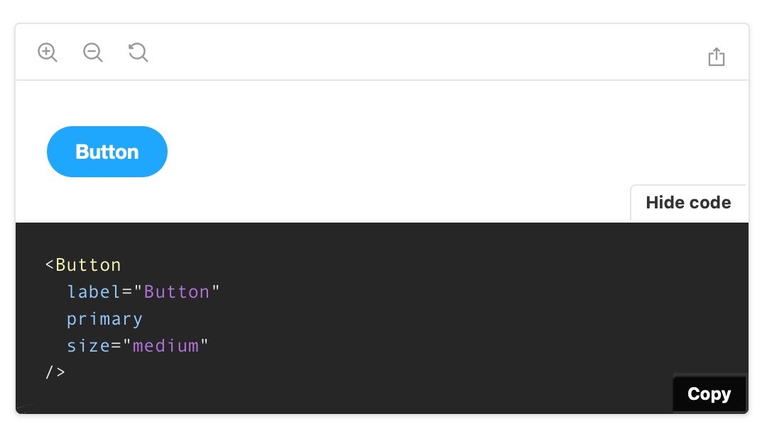
Storybook's Source Doc Block displays the story's source code. It supports syntax highlighting for most languages (e.g., javascript, jsx, json, yml, md, bash, css, html) and can be copied with the click of a button.
Working with the DocsPage
Storybook automatically generates a Source Doc Block within the Canvas to display the story's code snippet.
It includes additional customization via parameters. Below is a condensed example and tables featuring all the available options.
Button.stories.js|jsx|ts|tsx
import { Button } from './Button';

export default {
  /* 👇 The title prop is optional.
  * See https://storybook.js.org/docs/6/configure#configure-story-loading
  * to learn how to generate automatic titles
  */
  title: 'Button',
  component: Button,
};

const Template = (args) => ({
  //👇 Your template goes here
});

export const CustomSource = Template.bind({});
CustomSource.parameters = {
  docs: {
    source: {
      code: 'Your code snippet goes here.',
      language: "yml",
      type: "auto",
    },
  },
};The pattern demonstrated here applies only to the story. If you need, you can apply this to all the component stories, introducing a component parameter.
| Option | Description |
|---|---|
code | Customizes the code snippet to be displayed. Requires language for proper syntax highlighting.docs: { source: { code: '<h1>Hello world</h1>' } } |
dark | Sets the background to dark mode. Applies only to MDX. <Source dark/> |
id | Supplies a unique story identifier. Applies only to MDX. <Source id="example-mycomponent--starter" /> |
language | Sets the language for syntax highlighting. docs: { source: { language: 'html'} } |
format | Formats the code snippet. docs: { source: { format:false } } |
type | Sets how the story source snippet is auto-generated. See table below for available values. |
| Value | Description | Support |
|---|---|---|
| auto (default) | Use dynamic snippets if the story is written using Args and the framework supports it.docs: { source: { type: 'auto' } } | All |
| dynamic | Dynamically generated code snippet based on the output of the story function (e.g., JSX code for React). docs: { source: { type: 'dynamic' } } | Limited |
| code | Use the raw story source as written in the story file. docs: { source: { type: 'code' } } | All |
Working with MDX
If you need, you can also include the Source Doc Block in your MDX stories. It accepts either a story ID or a code snippet. For example:
MyComponent.stories.mdx
import { Source } from '@storybook/addon-docs';

import dedent from 'ts-dedent';

## With code snippet

<Source
  language='css'
  dark
  format={false}
  code={dedent`
     .container {
       display: grid | inline-grid;
     }
  `}
/>

## With Story Id

<Source id="example-mycomponent--starter" />