
Typeset
Storybook's Typeset Doc Block helps document the fonts used throughout your project.
Working with MDX
Similar to other documentation related Doc Blocks (e.g., ColorPalette, IconGallery), the TypeSet Doc Block is also commonly used with MDX. It allows additional customization via options. Below is a condensed example and table featuring all the available options.
Typography.stories.mdx
import { Meta, Typeset } from '@storybook/addon-docs/blocks';
<Meta title="Typography" />
export const typography = {
type: {
primary: '"Nunito Sans", "Helvetica Neue", Helvetica, Arial, sans-serif',
},
weight: {
regular: '400',
bold: '700',
extrabold: '800',
black: '900',
},
size: {
s1: 12,
s2: 14,
s3: 16,
m1: 20,
m2: 24,
m3: 28,
l1: 32,
l2: 40,
l3: 48,
},
};
export const SampleText = 'Lorem ipsum dolor sit amet, consectetur adipiscing elit.';
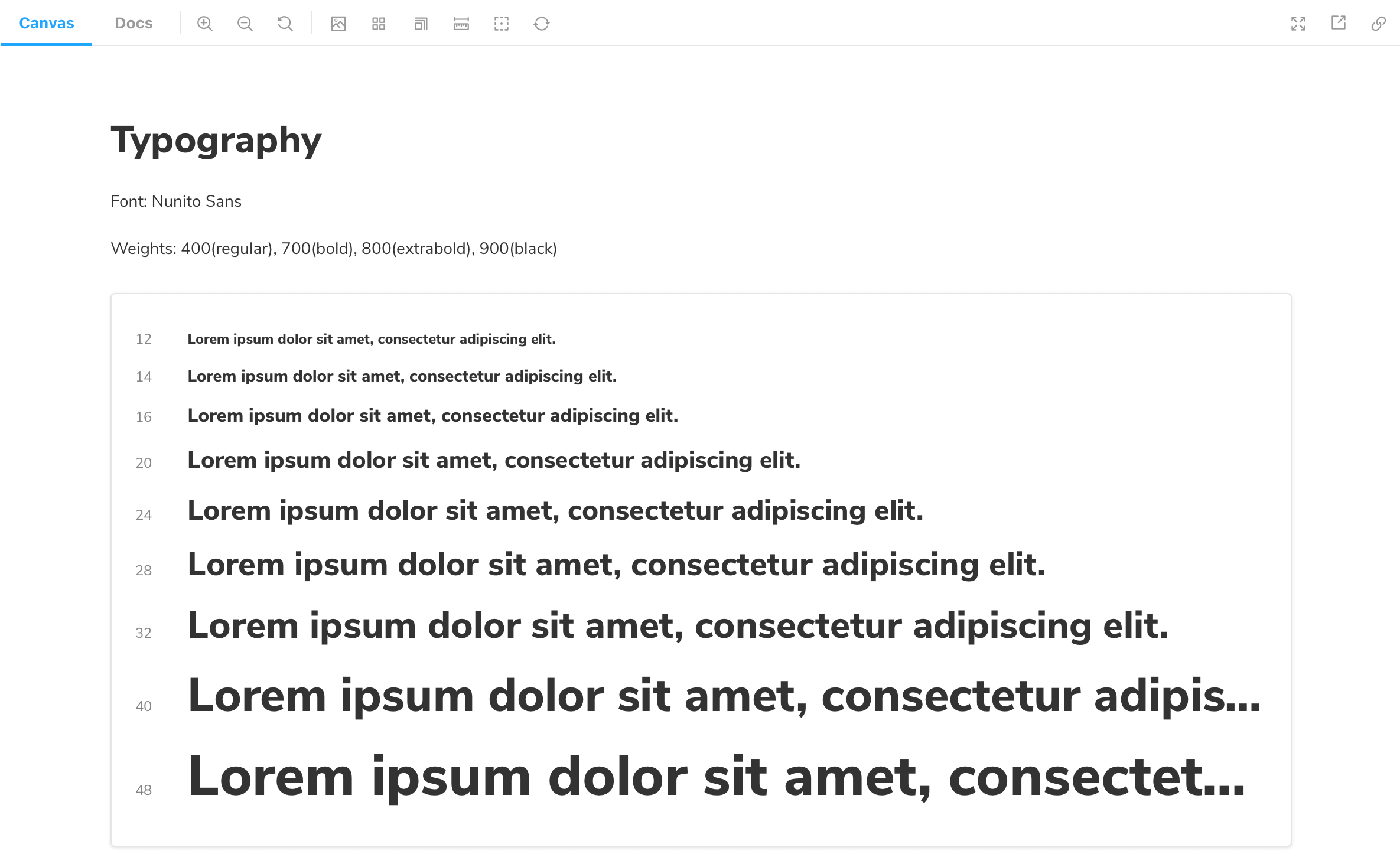
# Typography
**Font:** Nunito Sans
**Weights:** 400(regular), 700(bold), 800(extrabold), 900(black)
<Typeset
fontSizes={[
Number(typography.size.s1),
Number(typography.size.s2),
Number(typography.size.s3),
Number(typography.size.m1),
Number(typography.size.m2),
Number(typography.size.m3),
Number(typography.size.l1),
Number(typography.size.l2),
Number(typography.size.l3),
]}
fontWeight={typography.weight.black}
sampleText={SampleText}
fontFamily={typography.type.primary}
/>| Option | Description |
|---|---|
fontFamily | Provides a font family to be displayed . <Typeset fontFamily={"Nunito Sans"} /> |
fontSizes | Provides a list of available font sizes. <Typeset fontSizes={[ 12, 14, 20 ]} /> |
fontWeight | Defines the weight of the font to be displayed. <Typeset fontWeight={800} /> |
sampleText | Defines the text to be displayed. <Typeset sampleText='Example Text' /> |