
Write an addon
One of Storybook's main features is its robust addon ecosystem. Use addons to enhance and extend your development workflow. This page shows you how to create your own addon.
What we're building
For this example, we're going to build a bare-bones addon which:
- Adds a new panel in Storybook.
- Retrieves a custom parameter from the stories.
- Displays the parameter data in the panel.
Addon kit
This guide shows you how to setup an addon from scratch. Alternatively, you can jumpstart your addon development with the addon-kit.
Addon directory structure
We recommend a common addon file and directory structure for consistency.
| Files/Directories | Description |
|---|---|
| dist | Transpiled directory for the addon |
| src | Source code for the addon |
| .babelrc.js | Babel configuration |
| preset.js | Addon entry point |
| package.json | Addon metadata information |
| README.md | General information for the addon |
Get started
Open a new terminal and create a new directory called my-addon. Inside it, run npm init to initialize a new node project. For your project's name, choose my-addon and for entry point dist/preset.js.
Once you've gone through the prompts, your package.json should look like:
{
  "name": "my-addon",
  "version": "1.0.0",
  "description": "A barebones Storybook addon",
  "main": "dist/preset.js",
  "files": ["dist/**/*", "README.md", "*.js"],
  "keywords": ["storybook", "addons"],
  "author": "YourUsername",
  "license": "MIT"
}
Build system
We'll need to add the necessary dependencies and make some adjustments. Run the following command to install the required dependencies:
npm install react react-dom @babel/cliInitialize a local Storybook instance to allow you to test your addon.
npx storybook initInitializing Storybook adds the building blocks for our addon. If you're building a standalone Storybook addon, set the React and Storybook packages as peer dependencies. It prevents the addon from breaking Storybook when there are different versions available.
Next, create a .babelrc.js file in the root directory with the following:
module.exports = {
  presets: ["@babel/preset-env", "@babel/preset-react"],
};Babel configuration is required because our addon uses ES6 and JSX.
Change your package.json and add the following script to build the addon:
{
  "scripts": {
    "build": "babel ./src --out-dir ./dist"
  }
}Running yarn build at this stage will output the code into the dist directory, transpiled into a ES5 module ready to be installed into any Storybook.
Finally, create a new directory called src and inside a new file called preset.js with the following:
function managerEntries(entry = []) {
  return [...entry, require.resolve("./register")]; //👈 Addon implementation
}

module.exports = { managerEntries }
Presets are the way addons hook into Storybook. Among other tasks they allow you to:
- Add to Storybook's UI
- Add to the preview iframe
- Modify babel and webpack settings
For this example, we'll modify Storybook's UI.
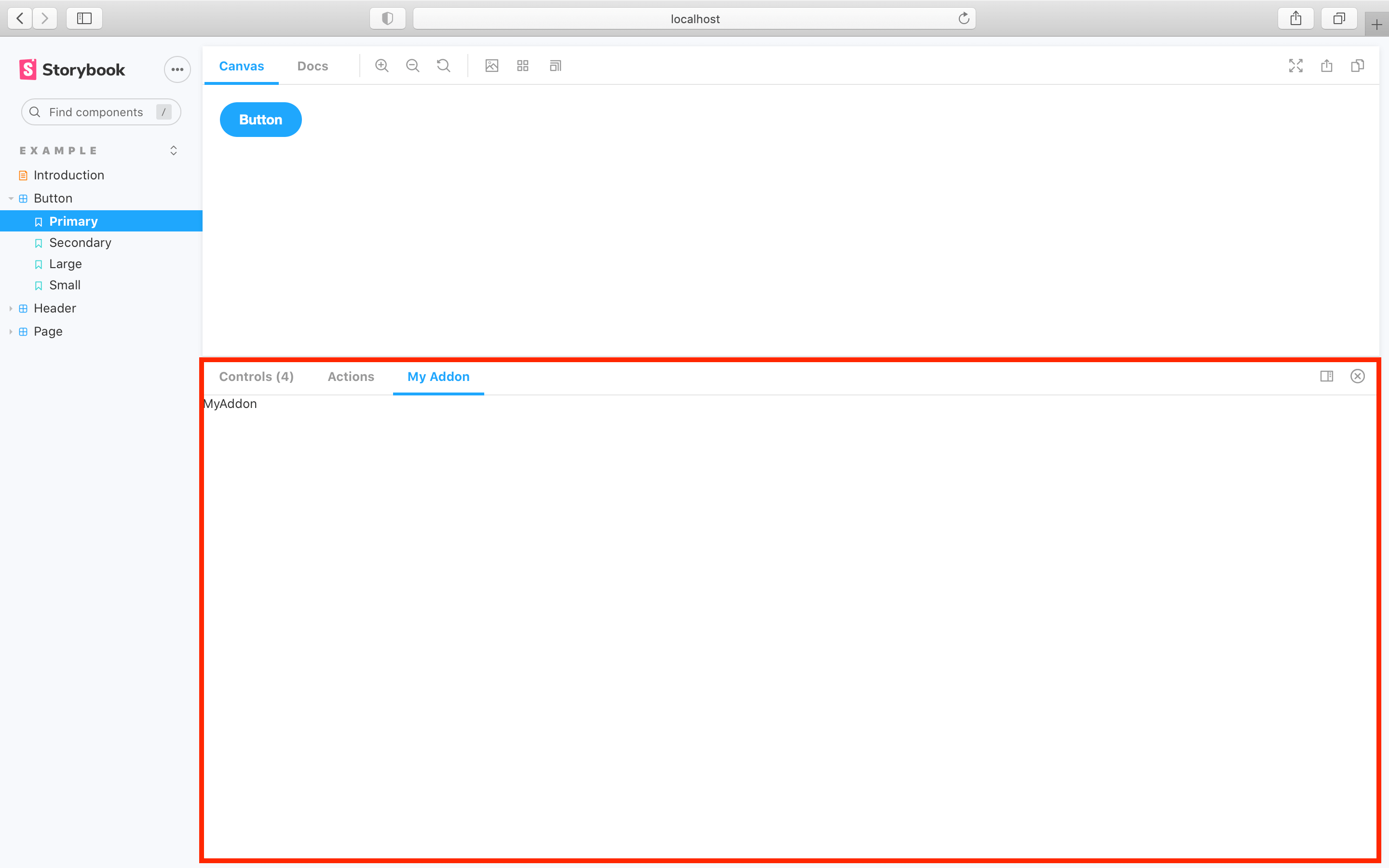
Add a panel
Now let’s add a panel to Storybook. Inside the src directory, create a new file called register.js and add the following:
import React from 'react';

import { addons, types } from '@storybook/addons';

import { AddonPanel } from '@storybook/components';

const ADDON_ID = 'myaddon';
const PANEL_ID = `${ADDON_ID}/panel`;

// give a unique name for the panel
const MyPanel = () => <div>MyAddon</div>;

addons.register(ADDON_ID, (api) => {
  addons.add(PANEL_ID, {
    type: types.PANEL,
    title: 'My Addon',
    render: ({ active, key }) => (
      <AddonPanel active={active} key={key}>
        <MyPanel />
      </AddonPanel>
    ),
  });
});Make sure to include the key when you register the addon. It will prevent any issues when the addon renders.
Going over the code snippet in more detail. When Storybook starts up:
- It registers the addon
- Adds a new
paneltitledMy Addonto the UI - When selected, the
panelrenders the staticdivcontent
Register the addon
Finally, let’s hook it all up. Change .storybook/main.js to the following:
module.exports = {
  stories: [],
  addons: [
    "@storybook/addon-links",
    "@storybook/addon-essentials",
    "@storybook/preset-create-react-app",
    "../src/preset.js" //👈 Our addon registered here
  ]
}When you register a Storybook addon, it will look for either register.js or preset.js as the entry points.
Run yarn storybook and you should see something similar to:
Display story parameter
Next, let’s replace the MyPanel component from above to show the parameter.
import { useParameter } from '@storybook/api';

const PARAM_KEY = 'myAddon';

const MyPanel = () => {
  const value = useParameter(PARAM_KEY, null);
  const item = value ? value.data : 'No story parameter defined';
  return <div>{item}</div>;
};
The new version is made smarter by useParameter, which is a React hook that updates the parameter value and re-renders the panel every time the story changes.
The addon API provides hooks like this, so all of that communication can happen behind the scenes. That means you can focus on your addon's functionality.
Using the addon with a story
When Storybook was initialized, it provided a small set of example stories. Change your Button.stories.js to the following:
import React from 'react';

import { ComponentStory, ComponentMeta } from '@storybook/react';

import { Button } from './Button';

export default {
  /* 👇 The title prop is optional.
  * See https://storybook.js.org/docs/6/configure#configure-story-loading
  * to learn how to generate automatic titles
  */
  title: 'Button',
  component: Button,
  //👇 Creates specific parameters for the story
  parameters: {
    myAddon: {
      data: 'this data is passed to the addon',
    },
  },
} as ComponentMeta<typeof Button>;

const Basic: ComponentStory<typeof Button> = () => <Button>hello</Button>;
After applying the changes to the story, the Storybook UI will show the following:
Root level preset.js
Before publishing the addon, we'll need to make one last change. In the root directory of the addon, create a new file called preset.js and add the following:
module.exports = require('./dist/preset.js');This auto-registers the addon without any additional configuration from the user. Storybook looks for either a preset.js or a register.js file located at the root level.
Packaging and publishing
Now that you've seen how to create a bare-bones addon let's see how to share it with the community. Before we begin, make sure your addon meets the following requirements:
package.jsonfile with metadata about the addon- Peer dependencies of
reactand@storybook/addons preset.jsfile at the root level written as an ES5 modulesrcdirectory containing the ES6 addon codedistdirectory containing transpiled ES5 code on publish- GitHub account to host your code
- NPM account to publish the addon
Reference the storybook-addon-outline to see a project that meets these requirements.
Learn how to add to the addon catalog.
More guides and tutorials
In the previous example, we introduced the structure of an addon but barely scratched the surface of what addons can do.
To dive deeper, we recommend Storybook's creating an addon tutorial. It’s an excellent walkthrough covering the same ground as the above introduction but goes further and leads you through the entire process of creating a realistic addon.
Addon kit
To help you jumpstart the addon development, the Storybook maintainers created an addon-kit, use it to bootstrap your next addon.