ArgTypes
This API is experimental and may change outside of the typical semver release cycle
ArgTypes are a first-class feature in Storybook for specifying the behaviour of Args. By specifying the type of an arg, you constrain the values that it can take and provide information about args that are not explicitly set (i.e., not required).
You can also use argTypes to “annotate” args with information used by addons that make use of those args. For instance, to instruct the controls addon to render a color, you could choose a string-valued arg.
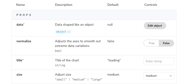
The most concrete realization of argTypes is the Args Table doc block. Each row in the table corresponds to a single argType and the current value of that arg.

Automatic argType inference
If you are using the Storybook docs addon (installed by default as part of essentials), then Storybook will infer a set of argTypes for each story based on the component specified in the default export of the CSF file.
To do so, Storybook uses various static analysis tools depending on your framework.
- React
- Vue
- Angular
- WebComponents
- Ember
The format of the generated argType will look something like this:
const argTypes = {
  label: {
    name: 'label',
    type: { name: 'string', required: false },
    defaultValue: 'Hello',
    description: 'demo description',
    table: {
      type: { summary: 'string' },
      defaultValue: { summary: 'Hello' },
    },
    control: {
      type: 'text'
    }
  }
}
This ArgTypes data structure, name, type, defaultValue, and description are standard fields in all ArgTypes (analogous to PropTypes in React). The table and control fields are addon-specific annotations. So, for example, the table annotation provides extra information to customize how the label gets rendered, and the control annotation includes additional information for the control editing the property.
The @storybook/addon-docs provide a shorthand for common tasks:
type: 'number'is shorthand fortype: { name: 'number' }control: 'radio'is shorthand forcontrol: { type: 'radio' }
Manual specification
If you want more control over the args table or any other aspect of using argTypes, you can overwrite the generated argTypes for your component on a per-arg basis. For instance, with the above-inferred argTypes and the following default export:
import { Button } from './Button';

export default {
  /* 👇 The title prop is optional.
  * See https://storybook.js.org/docs/6/configure#configure-story-loading
  * to learn how to generate automatic titles
  */
  title: 'Button',
  component: Button,
  argTypes: {
    label: {
      description: 'overwritten description',
      table: {
        type: {
          summary: 'something short',
          detail: 'something really really long'
        },
      },
      control: {
        type: null,
      },
    },
  },
};
The values.description, table.type, and controls.type are merged into the defaults extracted by Storybook. The final merged values would be:
const argTypes = {
  label: {
    name: 'label',
    type: { name: 'string', required: false },
    defaultValue: 'Hello',
    description: 'overwritten description',
    table: {
      type: {
        summary: 'something short',
        detail: 'something really really long'
      },
      defaultValue: { summary: 'Hello' },
    },
    control: {
      type: null
    }
  }
}
In particular, this would render a row with a modified description, a type display with a dropdown that shows the detail, and no control.
As with other Storybook properties (e.g., args, decorators), you can also override ArgTypes per story basis.
Global argTypes
You can also define arg types at the global level; they will apply to every component's stories unless you overwrite them. To do so, export the argTypes key in your preview.js:
// All stories expect a theme arg
export const argTypes = { theme: { control: 'select', options: ['light', 'dark'] } };

// The default value of the theme arg to all stories
export const args = { theme: 'light' };If you define a global arg type for a story that does not have that arg (e.g., if there is no corresponding global arg definition), then the arg type will have no effect.
Using argTypes in addons
If you want to access the argTypes of the current component inside an addon, you can use the useArgTypes hook from the @storybook/api package:
import { useArgTypes } from '@storybook/api';

// inside your panel
const { argTypes } = useArgTypes();