ArgsTable
Storybook Docs automatically generates component args tables for components in supported frameworks. These tables list the arguments (args for short) of the component, and even integrate with controls to allow you to change the args of the currently rendered story.
This is extremely useful, but it can be further expanded. Additional information can be added to the component to better document it:
import React from 'react';

export interface ButtonProps {
  /**
   * Checks if the button should be disabled
   */
  isDisabled: boolean;
  /**
  The display content of the button
  */
  content: string;
}

export const Button: React.FC<ButtonProps> = ({ isDisabled = false, content = '' }) => {
  return (
    <button type="button" disabled={isDisabled}>
      {content}
    </button>
  );
};
The args tables will be updated accordingly by including the additional information (e.g., JSDocs comments), offering a richer experience for any stakeholders involved.
Working with the DocsPage
To use the ArgsTable in DocsPage, export a component property on your stories metadata:
import { MyComponent } from './MyComponent';

export default {
  /* 👇 The title prop is optional.
  * See https://storybook.js.org/docs/6/configure#configure-story-loading
  * to learn how to generate automatic titles
  */
  title: 'MyComponent',
  component: MyComponent,
};

// Your stories
Working with MDX
If you need, you can also include the ArgsTable block in your MDX stories. Below is a condensed table of available options and examples:
| Option | Description |
|---|---|
of | Infers the args table from the component. <ArgsTable of={MyComponent} /> |
story | Infers the args table based on a story. <ArgsTable story="example-mycomponent--my-story" /> |
import { ArgsTable } from '@storybook/addon-docs';

import { MyComponent } from './MyComponent';

# My Component!

<ArgsTable of={MyComponent} />
Customizing
ArgsTables are generated based on an internal data structure called ArgTypes. When you define the component's metadata element in your story, Storybook's Docs will automatically extract the ArgTypes based on available properties.
If you need, you can customize what is displayed in the ArgsTable by extending the ArgTypes data, unless you're using the ArgsTable of={component} />. In this case, Storybook will infer the data automatically from the component.
Below is an abridged table and example featuring the available options.
| Field | Description |
|---|---|
name | The name of the property. argTypes: { label: { name: 'Something' } } |
type.name | Sets a type for the property. argTypes: { label: { type: { name: 'number' } } } |
type.required | Sets the property as optional or required. argTypes: { label: { type: { required: true } } |
description | Sets a Markdown description for the property. argTypes: { label: { description: 'Something' } } |
table.type.summary | Provide a short version of the type. argTypes: { label: { table: { type: { summary: 'a short summary' } }}} |
table.type.detail | Provides an extended version of the type. argTypes: { label: { table: { type: { detail: 'something' } }}} |
table.defaultValue.summary | Provide a short version of the default value. argTypes: { label: { table: { defaultValue: { summary: 'Hello World' } }}} |
table.defaultValue.detail | Provides a longer version of the default value. argTypes: { label: { table: { defaultValue: { detail: 'Something' } }}} |
control | Associates a control for the property. Read the Essentials documentation to learn more about controls. argTypes: { label: { control: { type: 'text'} } } |
import { Button } from './Button';

export default {
  /* 👇 The title prop is optional.
  * See https://storybook.js.org/docs/6/configure#configure-story-loading
  * to learn how to generate automatic titles
  */
  title: 'Button',
  component: Button,
  argTypes: {
    label: {
      description: 'Overwritten description',
      table: {
        type: {
          summary: 'Something short',
          detail: 'Something really really long',
        },
      },
      control: {
        type: null,
      },
    },
  },
};This API is experimental and may change outside the typical semver release cycle. Read the documentation to learn more about ArgTypes.
This would render a row with a modified description, a type display with a dropdown that shows the detail, and no control.
Shorthands
To reduce the boilerplate code you have to write, Storybook provides some convenient shorthands to help you streamline your work. Below are some of the available shorthands.
| Type | Shorthand |
|---|---|
type.name | Assigns the type to a number property. argTypes: { label: { type: number } } |
control.type | Assigns a radio control for the property. argTypes: { size: { control: 'radio' } } |
Grouping
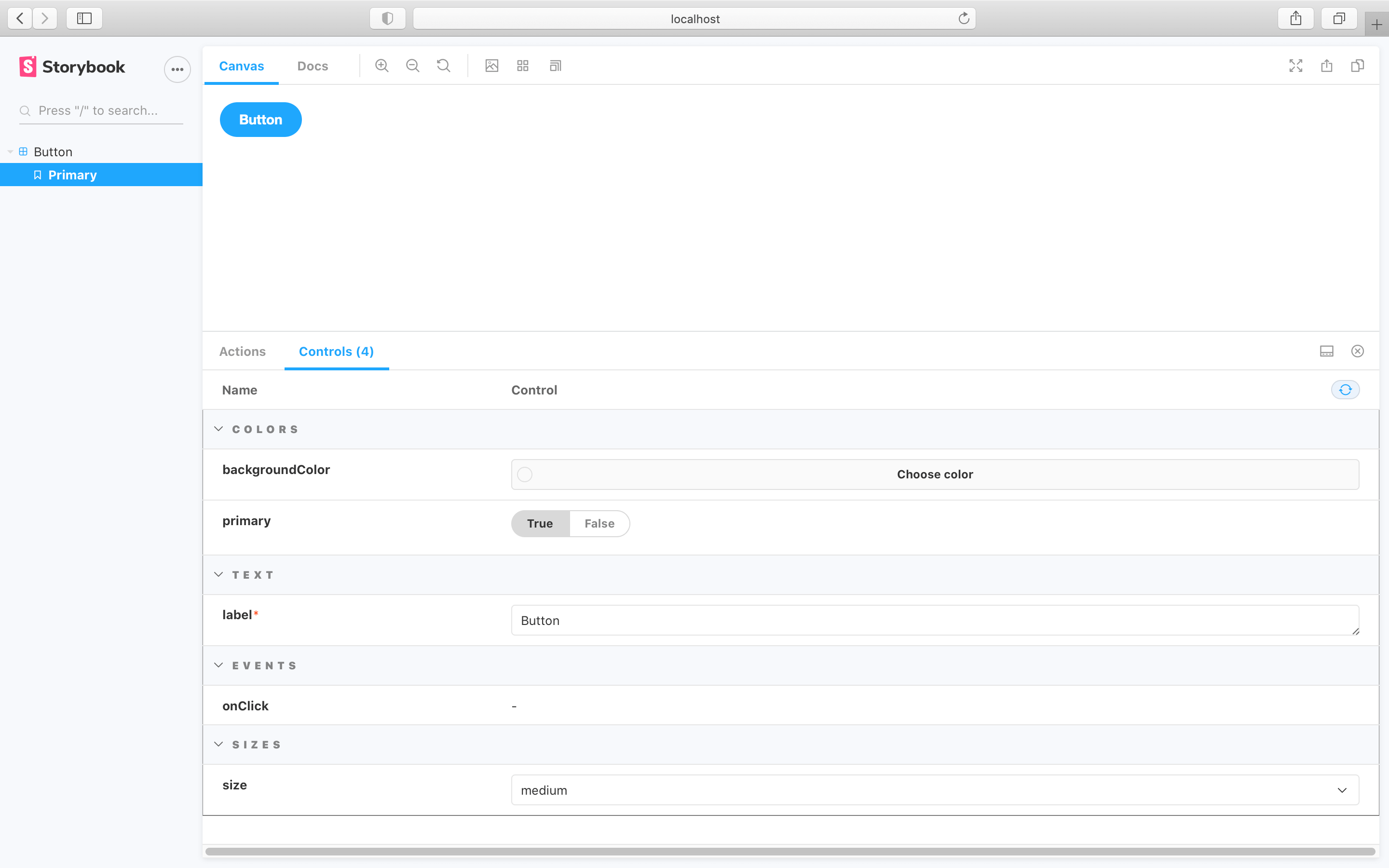
You can also extend the ArgsTable's customization by grouping related argTypes into categories or even subcategories. Based on the following component implementation:
import React from 'react';

export interface ButtonProps {
  /**
   * Is this the principal call to action on the page?
   */
  primary?: boolean;
  /**
   * What background color to use
   */
  backgroundColor?: string;
  /**
   * How large should the button be?
   */
  size?: 'small' | 'medium' | 'large';
  /**
   * Button contents
   */
  label: string;
  /**
   * Optional click handler
   */
  onClick?: () => void;
}

/**
 * Primary UI component for user interaction
 */
export const Button: React.FC<ButtonProps> = ({
  primary = false,
  size = 'medium',
  backgroundColor,
  label,
  ...props
}) => {
  // the component implementation
};
You could group similar properties for better organization and structure. Using the table below as a reference:
| Field | Category |
|---|---|
| backgroundColor | Colors |
| primary | Colors |
| label | Text |
| onClick | Events |
| size | Sizes |
Results in the following change into your story and UI.
import { Button } from './Button';

export default {
  /* 👇 The title prop is optional.
  * See https://storybook.js.org/docs/6/configure#configure-story-loading
  * to learn how to generate automatic titles
  */
  title: 'Button',
  component: Button,
  argTypes: {
    // Assigns the argTypes to the Colors category
    backgroundColor: {
      control: 'color',
      table: {
        category: 'Colors',
      },
    },
    primary: {
      table: {
        category: 'Colors',
      },
    },
    // Assigns the argType to the Text category
    label: {
      table: {
        category: 'Text',
      },
    },
    // Assigns the argType to the Events category
    onClick: {
      table: {
        category: 'Events',
      },
    },
    // Assigns the argType to the Sizes category
    size: {
      table: {
        category: 'Sizes',
      },
    },
  },
};
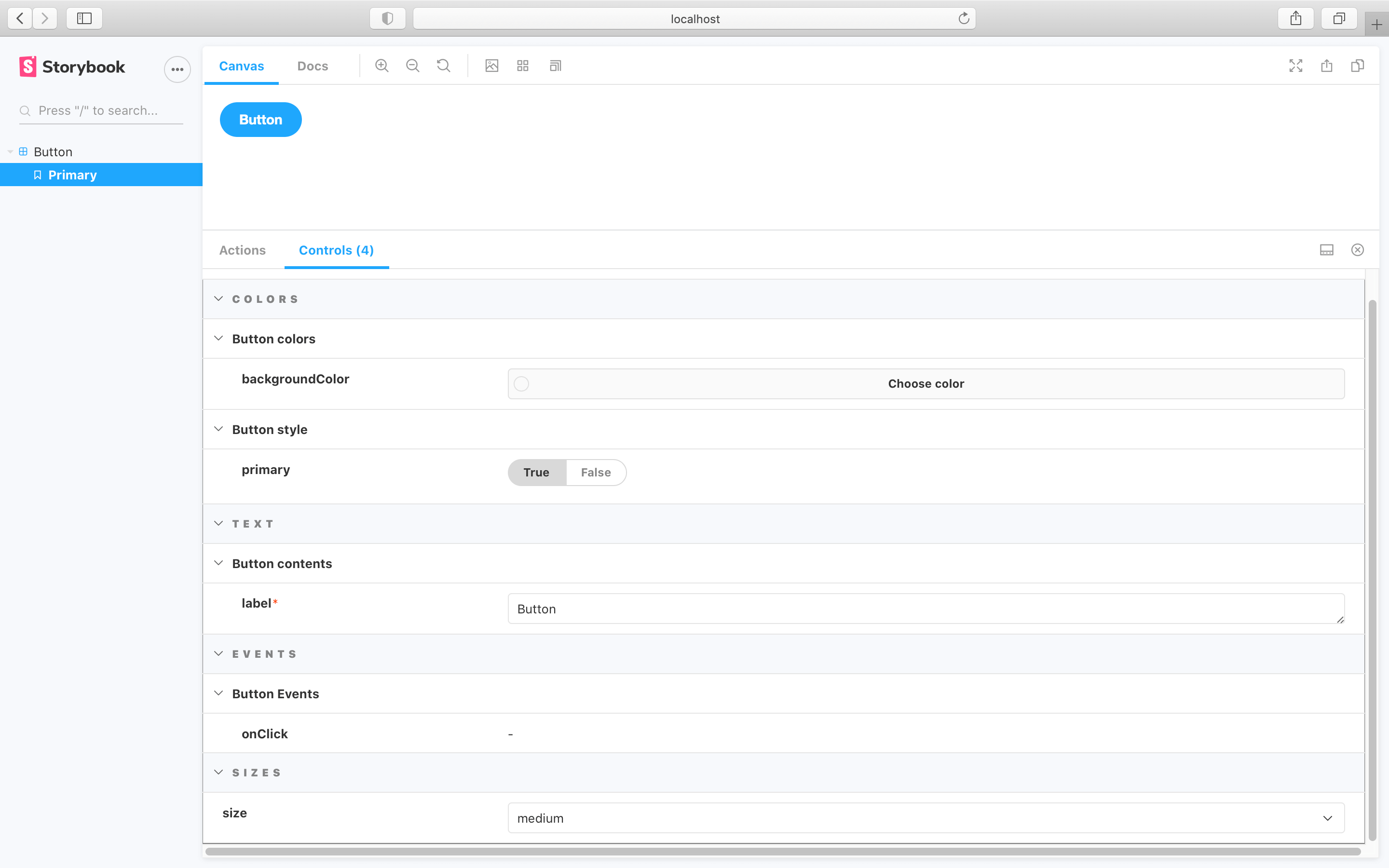
You can also extend the formula above and introduce subcategories, allowing better structuring and organization. Using the table below as a reference leads to the following change to your story and UI:
| Field | Category | Subcategory |
|---|---|---|
| backgroundColor | Colors | Button colors |
| primary | Colors | Button style |
| label | Text | Button contents |
| onClick | Events | Button Events |
| size | Sizes |
import { Button } from './Button';

export default {
  /* 👇 The title prop is optional.
  * See https://storybook.js.org/docs/6/configure#configure-story-loading
  * to learn how to generate automatic titles
  */
  title: 'Button',
  component: Button,
  argTypes: {
    // Assigns the argTypes to the Colors category
    backgroundColor: {
      control: 'color',
      table: {
        category: 'Colors',
        // Assigns the argTypes to a specific subcategory
        subcategory: 'Button colors',
      },
    },
    primary: {
      table: {
        category: 'Colors',
        subcategory: 'Button style',
      },
    },
    label: {
      table: {
        category: 'Text',
        subcategory: 'Button contents',
      },
    },
    // Assigns the argType to the Events category
    onClick: {
      table: {
        category: 'Events',
        subcategory: 'Button Events',
      },
    },
    // Assigns the argType to the Sizes category
    size: {
      table: {
        category: 'Sizes',
      },
    },
  },
};
Controls
The controls inside an ArgsTable are configured in exactly the same way as the controls addon pane. You’ll probably notice the table is very similar! It uses the same component and mechanism behind the scenes.
