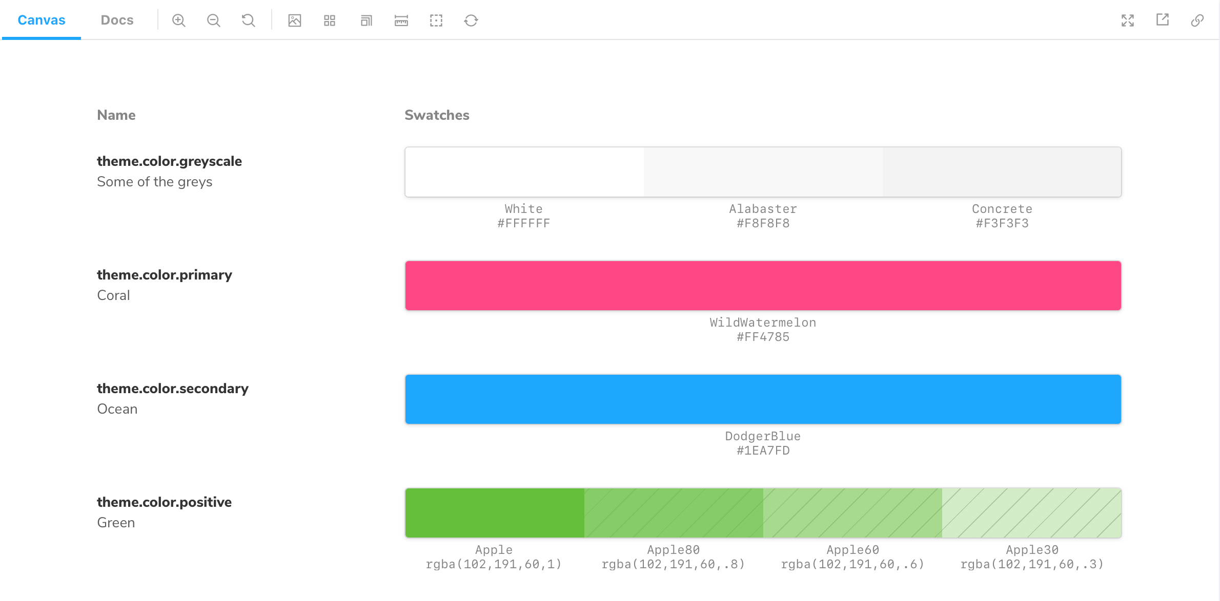
ColorPalette
Storybook's ColorPalette Doc block allows you to document all color-related items (e.g., swatches) used throughout your project.

Working with MDX
Similar to Typeset, the ColorPalette Doc Block is also typically used with MDX. It supports additional customization via options. Below are some examples and a table with all the available options.
Colors.stories.mdx
import { Meta, ColorPalette, ColorItem } from '@storybook/addon-docs';

<Meta title="Colors" />

<ColorPalette>
  <ColorItem
    title="theme.color.greyscale"
    subtitle="Some of the greys"
    colors={{ White: '#FFFFFF', Alabaster: '#F8F8F8', Concrete: '#F3F3F3' }}
  />
  <ColorItem
    title="theme.color.primary"
    subtitle="Coral"
    colors={{ WildWatermelon: '#FF4785' }}
  />
  <ColorItem
    title="theme.color.secondary"
    subtitle="Ocean"
    colors={{ DodgerBlue: '#1EA7FD' }}
  />
  <ColorItem
    title="theme.color.positive"
    subtitle="Green"
    colors={{
      Apple: 'rgba(102,191,60,1)',
      Apple80: 'rgba(102,191,60,.8)',
      Apple60: 'rgba(102,191,60,.6)',
      Apple30: 'rgba(102,191,60,.3)',
    }}
  />
</ColorPalette>| Option | Description |
|---|---|
title | Sets the name of the color to be displayed. <ColorItem title='tomato' /> |
subtitle | Provides an additional description to the color. <ColorItem subtitle='This is a bright red color' /> |
colors | Provides the list of colors to be displayed. <ColorItem colors={{ White: '#FFFFFF', Concrete: '#F3F3F3 }} /> |
