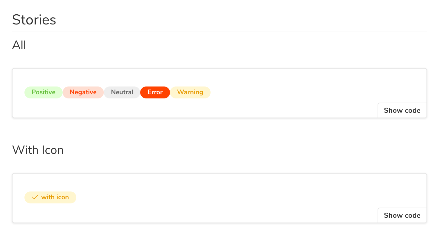
Story
Stories (component tests) are Storybook's fundamental building blocks.
In Storybook Docs, stories are rendered in the Story block.

Working with the DocsPage
With each story you write, Storybook will automatically generate a new Story Doc Block, wrapped inside a Canvas (with a toolbar if it's the first "primary" story) alongside a source code preview underneath it. Below is a condensed table of the available configuration options.
| Option | Description |
|---|---|
inlineStories | Configures Storybook to render stories inline. Read the documentation for inline rendering framework support. docs: { inlineStories: false } |
Working with MDX
With MDX, the Story block is not only a way of rendering stories, but how you define them. Internally, Storybook looks for named Story instances located at the top of your document, or inside a Canvas. Below is an abridged example and table featuring all the available options.
| Option | Description |
|---|---|
args | Provide the required component inputs (e.g., props). Read the documentation to learn more. <Story args={{ text: 'Button' }}/> |
decorators | Provide additional markup or mock a data provider to allow proper story rendering. Read the documentation to learn more. <Story decorators={[(Story) => ( <div style={{ margin: '3em' }}><Story/></div>)]}/> |
id | Storybook's internal story identifier. Used for embedding Storybook stories inside Docs. Read the documentation to learn more. <Story id="example-mycomponent--starter"/> |
inline | Enables Storybook's inline renderer. Read the documentation to learn more. <Story inline={false}/> |
loaders | (Experimental) Asynchronous function for data fetching with stories. Read the documentation to learn more. <Story loaders={[async () => ({ data: await (await fetch('your-endpoint'))}) ]}/> |
name | Adds a name to the component story. <Story name="Example"/> . |
parameters | Provides the necessary static named metadata related to the story. Read the documentation to learn more. Story parameters={{ backgrounds: { values: [{ name:'red', value:'#f00' }] } }} /> |
play | Generate component interactions. Read the documentation to learn more. <Story play={async () => { await userEvent.click(screen.getByRole('button')) }}/> |
import { Meta, Story } from '@storybook/addon-docs';

import { Button } from './Button';

<Meta title="Button" component={Button} />

export const Template = (args) => <Button {...args} />;

<Story
  name="Basic"
  args={{
    label: 'hello'
  }}>
  {Template.bind({})}
<Story>
Inline rendering
All stories are rendered in the Preview iframe for isolated development in Storybook's Canvas. With Docs, if your framework supports inline rendering, it will be used by default for both performance and convenience. However, you can force this feature by providing the required configuration option (see tables above).
